31. Earth’s atmosphere

Earth’s atmosphere is held on by gravity, pulling it towards the centre of the planet. This means the air can move sideways around the planet in a relatively unrestricted manner, creating wind and weather systems, but it has trouble flying upwards into space.

It is possible for a planet’s atmosphere to leak away into space, if the gravity is too weak to hold it. Planets have an escape velocity, which is the speed at which an object fired directly upwards must have in order for it to fly off into space, rather than slow down and fall back down. For Earth, this escape velocity is 11.2 km/s. Almost nothing on Earth goes this fast – but there are some things that do. Gas molecules.

Air is made up of a mixture of molecules of different gases. The majority, around 78%, is nitrogen molecules, made of two atoms of nitrogen bonded together, followed by 21% oxygen molecules, similarly composed of two bonded oxygen atoms. Almost 1% is argon, which is a noble gas, its atoms going around as unbonded singletons. Then there are traces of carbon dioxide, helium, neon, methane, and a few others. On top of these is a variable amount of water vapour, which depending on local weather conditions can range from almost zero to around 3% of the total.

Gas is the state of matter in which the component atoms and molecules are separated and free to move mostly independently of one another, except for when they collide. This contrasts with a solid, in which the atoms are rigidly connected, a liquid, in which the atoms are in close proximity but able to flow and move past one another, and a plasma, in which the atoms are ionised and surrounded by a freely moving electrically charged cloud of electrons. The deciding factors on which state a material exists in are temperature and pressure.

Diagram of gas

Diagram of a gas. The gas particles are free to move anywhere and travel at high speeds.

Temperature is a measurable quantity related to the amount of thermal energy in an object. This is the form of energy which exists in the individual motion of atoms and molecules. In a solid, the atoms are vibrating slightly. As they increase in thermal energy they vibrate faster, until the energy breaks the bonds holding them together, and they form molecules and start to flow, becoming a liquid. As the temperature rises and more thermal energy is added, the molecules begin to fly off the mass of liquid completely, dispersing as a gas. And if more energy is added, it eventually strips the outer electrons off the atoms, ionising the gas into a plasma.

The speed at which molecules move in a gas is determined by the relationship between temperature and the kinetic energy of the molecules. The equipartition theorem of thermodynamics says that the average kinetic energy of molecules in a gas is equal to (3/2)kT, where T is the temperature and k is the Boltzmann constant. If T is measured in kelvins, the Boltzmann constant is about 1.38×10⁻²³ joules per kelvin. So the kinetic energy of the molecules depends linearly on the temperature, but kinetic energy equals (1/2)mv2, where m is the mass of a molecule and v is the velocity. So the average speed of a gas molecule is then √(3kT/m). This means that more massive molecules move more slowly.

For example, here are the molecular masses of some gases and the average speed of the molecules at room temperature:

Gas Molecular mass (g/mol) Average speed (m/s)
Hydrogen (H2) 2.016 1920
Helium 4.003 1362
Water vapour (H2O) 18.015 642
Neon 20.180 607
Nitrogen (N2) 28.014 515
Oxygen (O2) 32.000 482
Argon 39.948 431
Carbon dioxide (CO2) 44.010 411

Remember that these are the average speeds of the gas molecules. The speeds actually vary according to a statistical distribution known as the Maxwell-Boltzmann distribution. Most molecules have speeds around the average, but there are some with lower speeds all the way down to zero, and some with higher speeds. At the upper end, the speed distribution is not limited (except by the speed of light), although very few molecules have speeds more than 2 or 3 times the average.

Maxwell-Boltzmann distribution

Maxwell-Boltzmann distribution for helium, neon, argon, and xenon at room temperature. Although the average speed for helium atoms is 1362 m/s, a significant number of atoms have speeds well above 2500 m/s. For the heavier gases, the number of atoms moving this fast is extremely close to zero. (Public domain image from Wikimedia Commons.)

These speeds are low enough that essentially all the gas molecules are gravitationally bound to Earth. At least in the lower atmosphere. As you go higher the air rapidly gets thinner—because gravity is pulling it down to the surface—but the pressure means it can’t all just pile up on the surface, so it spreads ever thinly upwards. The pressure drops exponentially with altitude: at 5 km the pressure is half what it is at sea level, at 10 km it’s one quarter, at 15 km one eighth, and so on.

The physics of the atmosphere changes as it moves to higher altitudes and lower pressures. Some 99.998% of the atmosphere by mass is below 85 km altitude. The gas above this altitude, in the thermosphere and exosphere, is so rarefied that it is virtually outer space. Incoming solar radiation heats the gas and it is so thin that heat transport to lower layers is inefficient and slow. Above about 200 km the gas temperature is over 1000 K, although the gas is so thin that virtually no thermal energy is transferred to orbiting objects. At this temperature, molecules of hydrogen have an average speed of 3516 m/s, and helium 2496 m/s, while nitrogen is 943 m/s.

Atmosphere diagram

Diagram of the layers of Earth’s atmosphere, with altitude plotted vertically, and temperature horizontally. The dashed line plots the electron density of the ionosphere, the regions of the atmosphere that are partly ionised by incident solar and cosmic radiation. (Public domain image from Wikimedia Commons.)

While these average speeds are still well below the escape velocity, a small fraction of molecules at the high end of the Maxwell-Boltzmann distribution do have speeds above escape velocity, and if moving in the right direction they fly off into space, never to return to Earth. Our atmosphere leaks hydrogen at a rate of about 3 kg/s, and helium at 50 g/s. The result of this is that any molecular hydrogen in Earth’s atmosphere leaks away rapidly, as does helium.

There is virtually no molecular hydrogen in Earth’s atmosphere. Helium exists at an equilibrium concentration of about 0.0005%, at which the leakage rate is matched by the replacement of helium in the atmosphere produced by alpha decay of radioactive elements. Recall that in alpha decay, an unstable isotope emits an alpha particle, which is the nucleus of a helium atom. Radioactive decay is the only source of helium we have. Decaying isotopes underground can have their alpha particles trapped in petroleum and natural gas traps underground, creating gas reservoirs with up to a few percent helium; this is the source of all helium used by industry. Over the billions of years of Earth’s geological history, it has only built up enough helium to last our civilisation for another decade or two. Any helium that we use and is released to the atmosphere will eventually be lost to space. It will become increasingly important to capture and recycle helium, lest we run out.

Because of the rapid reduction in probabilities for high speeds of the Maxwell-Boltzmann distribution, the leakage rate for nitrogen, oxygen, and heavier gases is much slower. Fortunately for us, these gases leak so slowly from our atmosphere that they take billions of years for any appreciable loss to occur.

This is the case for a spherical Earth. What if the Earth were flat? Well, the atmosphere would spill over the sides and be lost in very quick time. But wait, a common feature of flat Earth models is impassable walls of ice near the Antarctic rim to keep adventurous explorers (and presumably animals) from falling off the edge. Is it possible that such walls could hold the atmosphere in?

If they’re high enough, sure! Near the boundary between the thermosphere and the exosphere, the gas density is extremely low, and most (but not all) of the molecules that make it this high are hydrogen and helium. If the walls were this high, it would stop virtually all of the nitrogen and oxygen from escaping. However, if the walls were much lower, nitrogen and oxygen would start leaking at faster and faster rates. So how high do the walls need to be? Roughly 500-600 kilometres.

That’s well and truly impassable to any explorer using anything less than a spacecraft, so that’s good. But walls of ice 500 km high? We saw when discussing hydrostatic equilibrium that rock has the structural strength to be piled up only around 10 km high before it collapses under its own gravity. The compressive strength of ice, however, is of the order 5-25 megapascals[1][2], about a tenth that of granite.

Compressive strength of ice

Compressive yield (i.e. failure) strength of ice versus confining (applied) pressure, for varying rates of applied strain. The maximum yield strength ranges from around 3 MPa to 25 MPa. (Figure reproduced from [1].)

Ice is also less dense than rock, so a mountain of ice has a lot less mass than a mountain of granite. However, doing the sums shows that an Everest-sized pile of ice would produce a pressure of 30 MPa at its base, meaning it would collapse under its own weight. And that’s more than 50 times shorter than the walls we need to keep the atmosphere in.

So the fact that we can breathe is a consequence of our Earth being spherical. If it were flat, there would be no physically plausible way to keep the atmosphere in. (There are other models, such as the Earth being covered by a fixed firmament, like a roof, to which the stars are affixed, but these have even more physical problems – which will be discussed another day.)

References:

[1] Jones, S. J. “The confined compressive strength of polycrystalline ice”. Journal of Glaciology, 28 (98), p. 171-177, 1982. https://doi.org/10.1017/S0022143000011874

[2] Petrovic, J. J. “Review: Mechanical properties of ice and snow”. Journal of Materials Science, 38, p. 1-6, 2003. https://doi.org/10.1023/A:1021134128038

30. Pulsar timing

In our last entry on neutrino beams, we met James Chadwick, who discovered the existence of the neutron in 1932. The neutron explained radioactive beta decay as a process in which a neutron decays into a proton, an electron, and an electron antineutrino. This also means that a reverse process, known as electron capture, is possible: a proton and an electron may combine to form a neutron and an electron neutrino. This is sometimes also known as inverse beta decay, and occurs naturally for some isotopes with a relative paucity of neutrons in the nucleus.

Electron capture

Electron capture. A proton and electron combine to form a neutron. An electron neutrino is emitted in the process.

In most circumstances though, an electron will not approach a proton close enough to combine into a neutron, because there is a quantum mechanical energy barrier between them. The electron is attracted to the proton by electromagnetic force, but if it gets too close then its position becomes increasingly localised and by Heisenberg’s uncertainty principle its energy goes up correspondingly. The minimum energy state is the orbital distance where the electron’s probability distribution is highest. In electron capture, the weak nuclear force overcomes this energy barrier.

Electron capture energy diagram

Diagram of electron energy at different distances from a proton. Far away, electrostatic attraction pulls the electron closer, but if it gets too close, Heisenberg uncertainty makes the kinetic energy too large, so the electron settles around the minimum energy distance.

But you can also overcome the energy barrier by providing external energy in the form of pressure. Squeeze the electron and proton enough and you can push through the energy barrier, forcing them to combine into a neutron. In 1934 (less than 2 years after Chadwick discovered the neutron), astronomers Walter Baade and Fritz Zwicky proposed that this could happen naturally, in the cores of large stars following a supernova explosion (previously discussed in the article on supernova 1987A).

During a star’s lifetime, the enormous mass of the star is prevented from collapsing under its own gravity by the energy produced by nuclear fusion in the core. When the star begins to run out of nuclear fuel, that energy is no longer sufficient to prevent further gravitational collapse. Small stars collapse to a state known as a white dwarf, in which the minimal energy configuration has the atoms packed closely together, with electrons filling all available quantum energy states, so it’s not possible to compress the matter further. However, if the star has a mass greater than about 1.4 times the mass of our own sun, then the resulting pressure is so great that it overwhelms the nuclear energy barrier and forces the electrons to combine with protons, forming neutrons. The star collapses even further, until it is essentially a giant ball of neutrons, packed shoulder to shoulder.

These collapses, to a white dwarf or a so-called neutron star, are accompanied by a huge and sudden release of gravitational potential energy, which blows the outer layers of the star off in a tremendously violent explosion, which is what we can observe as a supernova. Baade and Zwicky proposed the existence of neutron stars based on the understanding of physics at the time. However, they could not imagine any method of ever detecting a neutron star. A neutron star would, they imagined, simply be a ball of dead neutrons in space. Calculations showed that a neutron star would have a radius of about 10 kilometres, making them amazingly dense, but correspondingly difficult to detect at interstellar distances. So neutron stars remained nothing but a theoretical possibility for decades.

In July 1967, Ph.D. astronomy student Jocelyn Bell was observing with the Interplanetary Scintillation Array at the Mullard Radio Astronomy Observatory in Cambridge, under the tutelage of her supervisor Antony Hewish. She was looking for quasars – powerful extragalactic radio sources which had recently been discovered using the new observation technique of radio astronomy. As the telescope direction passed through one particular patch of sky in the constellation of Vulpecula, Bell found some strange radio noise. Bell and Hewish had no idea what the signal was. At first they assumed it must be interference from some terrestrial or known spacecraft radio source, but over the next few days Bell noticed the signal appearing 4 minutes earlier each day. It was rising and setting with the stars, not in synch with anything on Earth. The signal was from outside our solar system.

Bell suggested running the radio signal strength plotter at faster speeds to try to catch more details of the signal. It took several months of persistent work, examining kilometres of paper plots. Hewish considered it a waste of time, but Bell persisted, until in November she saw the signal drawn on paper moving extremely rapidly through the plotter. The extraterrestrial radio source was producing extremely regular pulses, about 1 1/3 seconds apart.

PSR B1919+21 trace

The original chart recorder trace containing the detection signal of radio pulses from the celestial coordinate right ascension 1919. The pulses are the regularly spaced downward deflections in the irregular line near the top. (Reproduced from [1].)

This was exciting! Bell and Hewish thought that it might possibly be a signal produced by alien life, but they wanted to test all possible natural sources before making any sort of announcement. Bell soon found another regularly pulsating radio source in a different part of the sky, which convinced them that it was probably a natural phenomenon.

They published their observations[2], speculating that the pulses might be caused by radial oscillation in either white dwarfs or neutron stars. Fellow astronomers Thomas Gold and Fred Hoyle, however, immediately recognised that the pulses could be produced by the rotation of a neutron star.

Stars spin, relatively leisurely, due to the angular momentum in the original clouds of gas from which they formed. Our own sun rotates approximately once every 24 days. During a supernova explosion, as the core of the star collapses to a white dwarf or neutron star, the moment of inertia reduces in size and the rotation rate must increase correspondingly to conserve angular momentum, in the same way that a spinning ice skater speeds up by pulling their arms inward. Collapsing from stellar size down to 10 kilometres produces an increase in rotation rate from once per several days to the incredible rate of about once per second. At the same time, the star’s magnetic field is pulled inward, greatly strengthening it. Far from being a dead ball of neutrons, a neutron star is rotating rapidly, and has one of the strongest magnetic fields in nature. And when a magnetic field oscillates, it produces electromagnetic radiation, in this case radio waves.

The magnetic poles of a neutron star are unlikely to line up exactly with the rotational axis. Radio waves are generated by the rotation and funnelled out along the magnetic poles, forming beams of radiation. So as the neutron star rotates, these radio beams sweep out in rotating circles, like lighthouse beacons. A detector in the path of a radio beam will see it flash briefly once per rotation, at regular intervals of the order of one second – exactly what Bell observed.

Pulsar diagram

Diagram of a pulsar. The neutron star at centre has a strong magnetic field, represented by field lines in blue. I the star rotates about a vertical axis, the magnetic field generates radio waves beamed in the directions shown by the purple areas, sweeping through space like lighthouse beacons. (Public domain image by NASA, from Wikimedia Commons.)

Radio-detectable neutron stars quickly became known as pulsars, and hundreds more were soon detected. For the discovery of pulsars, Antony Hewish was awarded the Nobel Prize in Physics in 1974, however Jocelyn Bell (now Jocelyn Bell Burnell after marriage) was overlooked, in what has become one of the most notoriously controversial decisions ever made by the Nobel committee.

Jocelyn Bell Building

Image of Jocelyn Bell Burnell on the Jocelyn Bell Building in the Parque Tecnológico de Álava, Araba, Spain. (Public domain image from Wikimedia Commons.)

Astronomers found pulsars in the middle of the Crab Nebula supernova remnant (recorded as a supernova by Chinese astronomers in 1054), the Vela supernova remnant, and several others, cementing the relationship between supernova explosions and the formation of neutron stars. Popular culture even got in on the act, with Joy Division’s iconic 1979 debut album cover for Unknown Pleasures featuring pulse traces from pulsar B1919+21, the very pulsar that Bell first detected.

By now, the strongest and most obvious pulsars have been discovered. To discover new pulsars, astronomers engage in pulsar surveys. A radio telescope is pointed at a patch of sky and the strength of radio signals received is recorded over time. The radio trace is noisy and often the pulsar signal is weaker than the noise, so it’s not immediately visible like B1919+21. To detect it, one method is to perform a Fourier transform on the signal, to look for a consistent signal at a specific repetition period. Unfortunately, this only works for relatively strong pulsars, as weak ones are still lost in the noise.

A more sensitive method is called epoch folding, which is performed by cutting the signal trace into pieces of equal time length and summing them all up. The noise, being random, tends to cancel out, but if a periodic signal is present at the same period as the sliced time length then it will stack on top of itself and become more prominent. Of course, if you don’t know the period of a pulsar present in the signal, you need to try doing this for a large range of possible periods, until you find it.

To further increase the sensitivity, you can add in signals recorded at different radio frequencies as well – most radio telescopes can record signals at multiple frequencies at once. A complication is that the thin ionised gas of the interstellar medium slows down the propagation of radio waves slightly, and it slows them down by different amounts depending on the frequency. So as the radio waves propagate through space, the different frequencies slowly drift out of synch with one another, a phenomenon known as dispersion. The total amount of dispersion depends in a known way on the amount of plasma travelled through—known as the dispersion measure—so measuring the dispersion of a pulsar gives you an estimate of how far away it is. The estimate is a bit rough, because the interstellar medium is not uniform – denser regions slow down the waves more and produce greater dispersion.

Pulsar dispersion

Dispersion of pulsar pulses. Each row is a folded and summed pulse profile over many observation periods, as seen at a different radio frequency. Note how the time position of the pulse drifts as the frequency varies. If you summed these up without correction for this dispersion, the signal would disappear. The bottom trace shows the summed signal after correction for the dispersion by shifting all the pulses to match phase. (Reproduced from [3].)

So to find a weak pulsar of unknown period and dispersion measure, you fold all the signals at some speculative period, then shift the frequencies by a speculative dispersion measure and add them together. Now we have a two-dimensional search space to go through. This approach takes a lot of computer time, trying many different time folding periods and dispersion measures, and has been farmed out as part of distributed “home science” computing projects. The pulsar J2007+2722 was the first pulsar to be discovered by a distributed home computing project[4].

But wait – there’s one more complication. The observed period of a pulsar is equal to the emission period if you observe it from a position in space that is not moving relative to the pulsar. If the observer is moving with respect to the pulsar, then the period experiences a Doppler shift. Imagine you are moving away from a pulsar that is pulsing exactly once per second. A first pulse arrives, but in the second that it takes the next pulse to arrive, you have moved further away, so the radio signal has to travel further, and it arrives a fraction of a second more than one second after the previous pulse. The difference is fairly small, but noticeable if you are moving fast enough.

The Earth moves around the sun at an orbital speed of 29.8 km/s. So if it were moving directly away from a pulsar, dividing this by the speed of light, each successive pulse would arrive 0.1 milliseconds later than if the Earth were stationary. This would actually not be a problem, because instead of folding at a period of 1.0000 seconds, we could detect the pulsar by folding at a period of 1.0001 seconds. But the Earth doesn’t move in a straight line – it orbits the sun in an almost circular ellipse. On one side of the orbit the pulsar period is measured to be 1.0001 s, but six months later it appears to be 0.999 s.

This doesn’t sound like much, but if you observe a pulsar for an hour, that’s 3600 seconds, and the cumulative error becomes 0.36 seconds, which is far more than enough to completely ruin your signal, smearing it out so that it becomes undetectable. Hewish and Bell, in their original pulsar detection paper, used the fact that they observed this timing drift consistent with Earth’s orbital velocity to narrow down the direction that the pulsar must lie in (their telescope received signals from a wide-ish area of sky, making pinpointing the direction difficult).

Timing drift of pulsar B1919+21

Timing drift of pulsar B1919+21 from Hewish and Bell’s discovery paper. Cumulative period timing difference on the horizontal axis versus date on the vertical axis. If the Earth were not moving through space, all the detection periods for different dates would line up on the 0. With no other data at all, you can use this graph to work out the period of Earth’s orbit. (Figure reproduced from [2].)

What’s more, not just the orbit of the Earth, but also the rotation of the Earth affects the arrival times of pulses. When a pulsar is overhead, it is 6370 km (the radius of the Earth) closer than when it is on the horizon. Light takes over 20 milliseconds to travel that extra distance – a huge amount to consider when folding pulsar data. So if you observe a pulsar over a single six-hour session, the period can drift by more than 0.02 seconds due to the rotation of the Earth.

These timing drifts can be corrected in a straightforward manner, using the astronomical coordinates of the pulsar, the latitude and longitude of the observatory, and a bit of trigonometry. So in practice these are the steps to detect undiscovered pulsars:

  1. Observe a patch of sky at multiple radio frequencies for several hours, or even several days, to collect enough data.
  2. Correct the timing of all the data based on the astronomical coordinates, the latitude and longitude of the observatory, and the rotation and orbit of the Earth. This is a non-linear correction that stretches and compresses different parts of the observation timeline, to make it linear in the pulsar reference frame.
  3. Perform epoch folding with different values of period and dispersion measure, and look for the emergence of a significant signal above the noise.
  4. Confirm the result by observing with another observatory and folding at the same period and dispersion measure.

This method has been wildly successful, and as of September 2019 there are 2796 known pulsars[5].

If step 2 above were omitted, then pulsars would not be detected. The timing drifts caused by the Earth’s orbit and rotation would smear the integrated signal out rather than reinforcing it, resulting in it being undetectable. The latitude and longitude of the observatory are needed to ensure the timing correction calculations are done correctly, depending on where on Earth the observatory is located. It goes almost without saying that the astronomers use a spherical Earth model to get these corrections right. If they used a flat Earth model, the method would not work at all, and we would not have detected nearly as many pulsars as we have.

Addendum: Pulsars are dear to my own heart, because I wrote my physics undergraduate honours degree essay on the topic of pulsars, and I spent a summer break before beginning my Ph.D. doing a student project at the Australia Telescope National Facility, taking part in a pulsar detection survey at the Parkes Observatory Radio Telescope, and writing code to perform epoch folding searches.

Some of the data I worked on included observations of pulsar B0540-69, which was first detected in x-rays by the Einstein Observatory in 1984[6], and then at optical wavelengths in 1985[7], flashing with a period of 0.0505697 seconds. I made observations and performed the data processing that led to the first radio detection of this pulsar[8]. (I’m credited as an author on the paper under my unmarried name.) I can personally guarantee you that I used timing corrections based on a spherical model of the Earth, and if the Earth were flat I would not have this publication to my name.

References:

[1] Lyne, A. G., Smith, F. G. Pulsar Astronomy. Cambridge University Press, Cambridge, 1990.

[2] Hewish, A., Bell, S. J., Pilkington, J. D. H., Scott, P. F., Collins, R. A. “Observation of a Rapidly Pulsating Radio Source”. Nature, 217, p. 709-713, 1968. https://doi.org/10.1038/217709a0

[3] Lorimer, D. R., Kramer, M. Handbook of Pulsar Astronomy. Cambridge University Press, Cambridge, 2012.

[4 Allen, B., Knispel, B., Cordes, J.; et al. “The Einstein@Home Search for Radio Pulsars and PSR J2007+2722 Discovery”. The Astrophysical Journal, 773 (2), p. 91-122, 2013. https://doi.org/10.1088/0004-637X/773/2/91

[5] Hobbs, G., Manchester, R. N., Toomey, L. “ATNF Pulsar Catalogue v1.61”. Australia Telescope National Facility, 2019. https://www.atnf.csiro.au/people/pulsar/psrcat/ (accessed 2019-10-09).

[6] Seward, F. D., Harnden, F. R., Helfand, D. J. “Discovery of a 50 millisecond pulsar in the Large Magellanic Cloud”. The Astrophysical Journal, 287, p. L19-L22, 1984. https://doi.org/10.1086/184388

[7] Middleditch, J., Pennypacker, C. “Optical pulsations in the Large Magellanic Cloud remnant 0540–69.3”. Nature. 313 (6004). p. 659, 1985. https://doi.org/10.1038/313659a0

[8] Manchester, R. N., Mar, D. P., Lyne, A. G., Kaspi, V. M., Johnston, S. “Radio Detection of PSR B0540-69”. The Astrophysical Journal, 403, p. L29-L31, 1993. https://doi.org/10.1086/186714

29. Neutrino beams

We’ve met neutrinos before, when talking about supernova 1987A.

Historically, the early quantum physicist Wolfgang Pauli first proposed the existence of the neutrino in 1930, to explain a problem with then-current understanding of radioactive beta decay. In beta decay, an atomic nucleus emits an electron, which has a negative electric charge, and the resulting nucleus increases in positive charge, transmuting into the element with the next highest atomic number. The law of conservation of energy applied to this nuclear reaction implied that the electron should be emitted from any given isotope with a specific energy, balancing the change in mass as given by Einstein’s famous E = mc2 (energy equals mass times the speed of light squared). Alpha particles emitted during alpha decay, and gamma rays emitted during gamma decay appear at fixed energies.

beta decay, early conception

Illustration of beta decay. The nucleus at left emits an electron. (Public domain image from Wikimedia Commons.)

However, this was not what was observed for beta decay electrons. The ejected electrons had a maximum energy as predicted, but also appeared with a spread of lower energies. Pauli suggested that another particle was involved in the beta decay reaction, which carried off some of the energy. In a three-body reaction, the energy could be split between the electron and the new particle in a continuous fashion, thus explaining the spread of electron energies. Pauli suggested the new particle must be very light, so as to evade detection up to that time. He called it a “neutron”, a neutral particle following the word-ending convention of electron and proton.

However, in the same year German physicists Walther Bothe and Herbert Becker produced some strange radiation by bombarding light elements with alpha particles from radioactive polonium. This radiation had properties unlike other forms known at the time, and several experimenters tried to understand it. In 1932, James Chadwick performed experiments that demonstrated the radiation was made of neutral particles of about the same mass as a proton. The name “neutron” had been floating around nuclear physics for some time (Pauli wasn’t the first to use it; “neutron” appears in the literature as a name for proposed hypothetical neutral particles as early as 1899), but Chadwick was the first experimenter to demonstrate the existence of a neutral particle, so the name got attached to his discovery. Italian physicist Enrico Fermi responded by referring to Pauli’s proposed very light neutral particle as a “neutrino”, or “little neutron” in Italian coinage.

beta decay

Beta decay. A neutron decays to produce a proton, an electron, and an electron anti-neutrino. The neutrino produced has to be an antiparticle to maintain matter/antimatter balance, though it is often referred to simply as a “neutrino” rather than an anti-neutrino. (Public domain image from Wikimedia Commons.)

Detection of the neutrino had to wait until 1956, when a sensitive enough experiment could be performed, by American physicists Clyde Cowan and Frederick Reines, for which Reines received the 1995 Nobel Prize in Physics (Cowan had unfortunately died in 1974). In 1962, Leon Lederman, Melvin Schwartz, and Jack Steinberger of Fermilab discovered that muons—particles similar to electrons but with more mass—had their own associated neutrinos, distinct from electron neutrinos. They received the Nobel Prize for this discovery in 1988 (only a 26 year wait, unlike Reines’ 39 year wait). Finally, Martin Perl discovered a third, even more massive electron-like particle, named the tau lepton, in 1975, for which he shared that 1995 Prize with Reines. The tau lepton, like the electron and muon, has its own distinct associated neutrino.

Meanwhile, other researchers had been building neutrino detectors to observe neutrinos emitted by the sun’s nuclear reactions. Neutrinos interact only extremely weakly with matter, so although approximately 7×10¹⁴ solar neutrinos hit every square metre of Earth every second, almost none of them affect anything, and in fact almost all of them pass straight through the Earth and continue into space without stopping. To detect neutrinos you need a large volume of transparent material; water is usually used. Occasionally one neutrino of the trillions that pass through every second will interact, causing a single-atom nuclear reaction that produces a brief flash of light, which can then be seen by light detectors positioned around the periphery of the transparent material.

Daya Bay neutrino detector

Interior of the Daya Bay Reactor neutrino detector, China. The glassy bubbles house photodetectors to detect the flashes of light produced by neutrino interactions in the liquid filled interior (not filled in this photo). (Public domain image by U.S. Department of Energy, from Wikimedia Commons.)

When various solar neutrino detectors were turned on, there was a problem. They detected only about one third to one half of the number of neutrinos expected from models of how the sun works. The physics was thought to be well understood, so there was great trouble trying to reconcile the observations with theory. One of the least “break everything else we know about nuclear physics” proposals was that perhaps neutrinos could spontaneously and randomly change flavour, converting between electron, muon, and tau neutrinos. The neutrino detectors could only detect electron neutrinos, so if the neutrinos generated by the sun could change flavour (a process known as neutrino oscillation) during the time it took them to arrive at Earth, the result would be a roughly equal mix of the three flavours, so the detectors would only see about a third of them.

Another unanswered question about neutrinos was whether they had mass or not. Neutrinos have only ever been detected travelling at speeds so close to the speed of light that we weren’t sure if they were travelling at the speed of light (in which case they must be massless, like photons) or just a tiny fraction below it (in which case they must have a non-zero mass). Even the neutrinos detected from supernova 1987A, 168,000 light years away, arrived before the initial light pulse from the explosion (because the neutrinos passed immediately out of the star’s core, while the light had to contend with thousands of kilometres of opaque gas before being released), so we weren’t sure if they were travelling at the speed of light or just very close to it. Interestingly, the mass of neutrinos is tied to whether they can change flavour: if neutrinos are massless, then they can’t change flavour, whereas if they have mass, then they must be able to change flavour.

To test these properties, particle physicists began performing experiments to see if neutrinos could change flavour. To do this, you need to produce some neutrinos and then measure them a bit later to see if you can detect any that have changed flavour. But because neutrinos move at very close to the speed of light, you can’t detect them at the same place you create them; you need to have your detector a long way away. Preferably hundreds of kilometres or more.

The first such experiment was the KEK to Kamioka, or K2K experiment, running from 1999-2004. This involved the Japanese KEK laboratory in Tsukuba generating a beam of muon neutrinos and aiming the beam at the Super-Kamiokande neutrino detector at Kamioka, a distance of 250 kilometres away.

K2K map

Map of central Japan, showing the locations of KEK and Super-Kamiokande. (Figure reproduced from [1].)

The map is from the official website of KEK. Notice that Super-Kamiokande is on the other side of a mountain range from KEK. But this doesn’t matter, because neutrinos travel straight through solid matter! Interestingly, here’s another view of the neutrino path from the KEK website:

K2K cross section

Cross sectional view of neutrino beam path from KEK to Super-Kamiokande. (Figure reproduced from [1].)

You can see that the neutrino beam passes underneath the mountains from KEK to the underground location of the Super-Kamiokande detector, in a mine 1000 metres below Mount Ikeno (altitude 1360 m). KEK at Tsukuba is at an altitude of 35 m. Now because of the curvature of the Earth, the neutrino beam passes in a straight line 1000 m below sea level at its middle point. With the radius of the Earth 6367 km, Pythagoras’ theorem tells us that the centre of the beam path is 6365.8 km from the centre of the Earth, so 1200 m below the mean altitude of KEK and Super-Kamiokande – the maths works out. Importantly, the neutrino beam cannot be fired horizontally, it has to be aimed at an angle of about 0.5° into the ground for it to emerge correctly at Super-Kamiokande.

The K2K experiment succeeded in detecting a loss of muon neutrinos, establishing that some of them were oscillating into other neutrino flavours.

A follow up experiment, MINOS, began in 2005, this time using a neutrino beam generated at Fermilab in Illinois, firing at a detector located in the Soudan Mine in Minnesota, some 735 km away.

MINOS map and cross section

Map and sectional view of the MINOS experiment. (Figure reproduced from [2].)

In this case, the straight line neutrino path passes 10 km below the surface of the Earth, requiring the beam to be aimed downwards at an angle of 1.6° in order to successfully reach the detector. Another thing that MINOS did was to measure the time of flight of the neutrino beam between Fermilab and Soudan. When they sent a pulsed beam and measured the time taken for the pulse to arrive at Soudan, then divided it by the distance, they concluded that the speed of the neutrinos was between 0.999976 and 1.000126 times the speed of light, which is consistent with them not violating special relativity by exceeding the speed of light[3].

If you measure the distance from Fermilab to Soudan along the curvature of the Earth, as you would do for normal means of travel (or if the Earth were flat), you get a distance about 410 metres (or 0.06%) longer than the straight line distance through the Earth that the neutrinos took. If the scientists had used that distance, then their neutrino speed measurements would have given values 0.06% higher: 1.00053 to 1.00068 times the speed of light. In other words, to get a result that doesn’t violate known laws of physics, you have to take account of the fact that the Earth is spherical, and not flat.

This result has been reproduced with reduced uncertainty bounds by the CERN Neutrinos to Gran Sasso (CNGS) experiment in Europe, which fires a neutrino beam from CERN in Switzerland to the OPERA detector at the Gran Sasso National Laboratory in Italy.

CNGS cross section

Sectional view of the CNGS experiment neutrino beam path. (Image is Copyright CERN, used under CERN Terms of Use, from [4].)

The difference between the neutrino travel times and the speed of light over the 732 km beam path was measured to be -1.9±3.7 nanoseconds, consistent with zero difference[5]. In this case, if a flat Earth model had been used, the beam path distance would be equal to the surface distance from CERN to Gran Sasso, again about 410 metres longer. This would have given the neutrino travel time difference to be an extra 410/c = 1370 ns, making the neutrinos travel significantly faster than the speed of light.

All of these experiments have shown that neutrino oscillation does occur, which means neutrinos have a non-zero mass. But we still don’t know what that mass is. It must be small enough that for all our existing experiments we can’t detect any any difference between the neutrino speed and the speed of light. More experiments are underway to try and pin down the nature of these elusive particles.

But importantly for our purposes, these neutrino beam experiments make no sense if the Earth is flat, and can only be interpreted correctly because we know the Earth is a globe.

References:

[1] “Long Baseline neutrino oscillation experiment, from KEK to Kamioka (K2K)”. KEK website. http://neutrino.kek.jp/intro/ (accessed 2019-10-01.)

[2] Louis, W. C. “Viewpoint: The antineutrino vanishes differently”. Physics, 4, p. 54, 2011. https://physics.aps.org/articles/v4/54

[3] MINOS collaboration, Adamson, P. et al. “Measurement of neutrino velocity with the MINOS detectors and NuMI neutrino beam”. Physical Review D, 76, p. 072005, 2007. https://doi.org/10.1103/PhysRevD.76.072005

[4] “Old accelerators image gallery”. CERN. https://home.cern/resources/image/accelerators/old-accelerators-images-gallery (accessed 2019-10-01).

[5] The OPERA collaboration, Adam, T., Agafonova, N. et al. “Measurement of the neutrino velocity with the OPERA detector in the CNGS beam”. Journal of High Energy Physics, 2012, p. 93, 2012. https://doi.org/10.1007/JHEP10(2012)093

28. Stereo imaging

We see the world in 3D. What this means is that our visual system—comprising the eyes, optic nerves, and brain—takes the sensory input from our eyes and interprets it in a way that gives us the sensation that we exist in a three-dimensional world. This sensation is often called depth perception.

In practical terms, depth perception means that we are good at estimating the relative distances from ourselves to objects in our field of vision. You can tell if an object is nearer or further away just by looking at it (weird cases like optical illusions aside). A corollary of this is that you can tell the three-dimensional shape of an object just by looking at it (again, optical illusions aside). A basketball looks like a sphere, not like a flat circle. You can tell if a surface that you see is curved or flat.

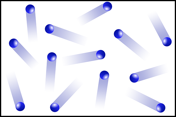
To do this, our brain relies on various elements of visual data known as depth cues. The best known depth cue is stereopsis, which is interpreting the different views of left and right eyes caused by the parallax effect, your brain innately using this information to triangulate distances. You can easily observe parallax by looking at something in the distance, holding up a finger at arms length, and alternately closing left and right eyes. In the view from each eye, your finger appears to move left/right relative to the background. And with both eyes open, if you focus on the background, you see two images of your finger. This tells your brain that your finger is much closer than the background.

Parallax effect

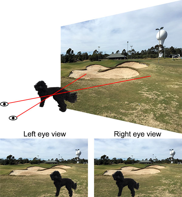
Illustration of parallax. The dog is closer than the background scene. Sightlines from your left and right eyes passing through the dog project to different areas of the background. So the view seen by your left and right eyes show the dog in different positions relative to the background. (The effect is exaggerated here for clarity.)

We’ll discuss stereopsis in more detail below, but first it’s interesting to know that stereopsis is not the only depth cue our brains use. There are many physically different depth cues, and most of them work even with a single eye.

Cover one eye and look at the objects nearby, such as on your desk. Reach out and try to touch them gently with a fingertip, as a test for how well you can judge their depth. For objects within an easy hand’s reach you can probably do pretty well; for objects you need to stretch to touch you might do a little worse, but possibly not as bad as you thought you might. The one eye that you have looking at nearby things needs to adjust the focus of its lens in order to keep the image focused on the retina. Muscles in your eye squeeze the lens to change its shape, thus adjusting the focus. Nerves send these muscle signals to your brain, which subconsciously uses them to help gauge distance to the object. This depth cue is known as accommodation, and is most accurate within a metre or two, because it is within this range that the greatest lens adjustments need to be made.

With one eye covered, look at objects further away, such as across the room. You can tell that some objects are closer and other objects further away (although you may have trouble judging the distances as accurately as if you used both eyes). Various cues are used to do this, including:

Perspective: Many objects in our lives have straight edges, and we use the convergence of straight lines in visual perspective to help judge distances.

Relative sizes: Objects that look smaller are (usually) further away. This is more reliable if we know from experience that certain objects are the same size in reality.

Occultation: Objects partially hidden behind other objects are further away. It seems obvious, but it’s certainly a cue that our brain uses to decide which object is nearer and which further away.

Texture: The texture on an object is more easily discernible when it is nearer.

Light and shadow: The interplay of light direction and the shading of surfaces provides cues. A featureless sphere such as a cue ball still looks like a sphere rather than a flat disc because of the gradual change in shading across the surface.

Shaded circle

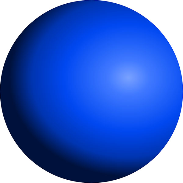
A circle shaded to present the illusion that it is a sphere, using light and shadow as depth cues. If you squint your eyes so your screen becomes a bit fuzzy, the illusion of three dimensionality can become even stronger.

Motion parallax: With one eye covered, look at an object 2 or 3 metres away. You have some perception of its distance and shape from the above-mentioned cues, but not as much as if both your eyes were open. Now move your head from side to side. The addition of motion produces parallax effects as your eye moves and your brain integrates that information into its mental model of what you are seeing, which improves the depth perception. Pigeons, chickens, and some other birds have limited binocular vision due to their eyes being on the sides of their heads, and they use motion parallax to judge distances, which is why they bob their heads around so much.

Motion parallax animation

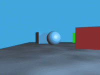
Demonstration of motion parallax. You get a strong sense of depth in this animation, even though it is presented on your flat computer screen. (Creative Commons Attribution 3.0 Unported image by Nathaniel Domek, from Wikimedia Commons.)

There are some other depth cues that work with a single eye as well – I don’t want to try to be exhaustive here.

If you uncover both eyes and look at the world around you, your sense of three dimensionality becomes stronger. Now instead of needing motion parallax, you get parallax effects simply by looking with two eyes in different positions. Stereopsis is one of the most powerful depth cues we have, and it can often be used to override or trick the other cues, giving us a sense of three-dimensionality where none exists. This is the principle behind 3D movies, as well as 3D images printed on flat paper or displayed on a flat screen. The trick is to have one eye see one image, and the other eye see a slightly different image of the same scene, from an appropriate parallax viewpoint.

In modern 3D movies this is accomplished by projecting two images onto the screen simultaneously through two different polarising filters, with the planes of polarisation oriented at 90° to one another. The glasses we wear contain matched polarising filters: the left eye filter blocks the right eye projection while letting the left eye projection through, and vice versa for the right eye. The result is that we see two different images, one with each eye, and our brains combine them to produce the sensation of depth.

Another important binocular depth cue is convergence. To look at an object nearby, your eyes have to point inwards so they are both focused on the same point. For an object further away, your eyes look more parallel. Like your lenses, the muscles that control this send signals to your brain, which it interprets as a distance measure. Convergence can be a problem with 3D movies and images if the image creator is not careful. Although stereopsis can provide the illusion of depth, if it’s not also matched with convergence then there can be conflicting depth cues to your brain. Another factor is that accommodation tells you that all objects are at the distance of the display screen. The resulting disconnects between depth cues are what makes some people feel nauseated or headachy when viewing 3D images.

To create 3D images using stereopsis, you need to have two images of the same scene, as seen from different positions. One method is to have two cameras side by side. This can be used for video too, and is the method used for live 3D broadcasts, such as sports. Interestingly, however, this is not the most common method of making 3D movies.

Coronet 3D camera

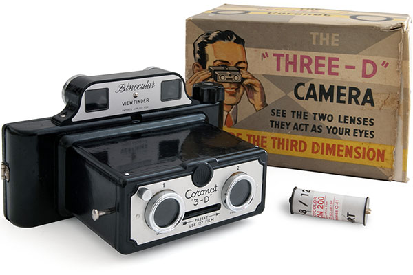
A 3D camera produced by the Coronet Camera Company. Note the two lenses at the front, separated by roughly the same spacing as human eyes. (Creative Commons Attribution 3.0 Unported image by Wikimedia Commons user Bilby, from Wikimedia Commons.)

3D movies are generally shot with a single camera, and then an artificial second image is made for each frame during the post-production phase. This is done by a skilled 3D artist, using software to model the depths to various objects in each shot, and then manipulate the pixels of the image by shifting them left or right by different amounts, and painting in any areas where pixel shifts leave blank pixels behind. The reason it’s done this way is that this gives the artist control over how extreme the stereo depth effect is, and this can be manipulated to make objects appear closer or further away than they were during shooting. It’s also necessary to match depth disparities of salient objects between scenes on either side of a scene cut, to avoid the jarring effect of the main character or other objects suddenly popping backwards and forwards across scene cuts. Finally, the depth disparity pixel shifts required for cinema projection are different to the ones required for home video on a TV screen, because of the different viewing geometries. So a high quality 3D Blu-ray of a movie will have different depth disparities to the cinematic release. Essentially, construction of the “second eye” image is a complex artistic and technical consideration of modern film making, which cannot simply be left to chance by shooting with two cameras at once. See “Nonlinear disparity mapping for stereoscopic 3D” by Lang et al.[1], for example, which discusses these issues in detail.

For a still photo however, shooting with two cameras at the same time is the best method. And for scientific shape measurement using stereographic imaging, two cameras taking real images is necessary. One application of this is satellite terrain mapping.

The French space agency CNES launched the SPOT 1 satellite in 1986 into a sun-synchronous polar orbit, meaning it orbits around the poles and maintains a constant angle to the sun, as the Earth rotates beneath it. This brought any point on the surface into the imaging field below the satellite every 26 days. SPOT 1 took multiple photos of areas of Earth in different orbital passes, from different locations in space. These images could then be analysed to match features and triangulate the distances to points on the terrain, essentially forming a stereoscopic image of the Earth’s surface. This reveals the height of topographic features: hills, mountains, and so on. SPOT 1 was the first satellite to produce directly imaged stereo altitude data for the Earth. It was later joined and replaced by SPOT 2 through 7, as well as similar imaging satellites launched by other countries.

Diagram of satellite stereo imaging

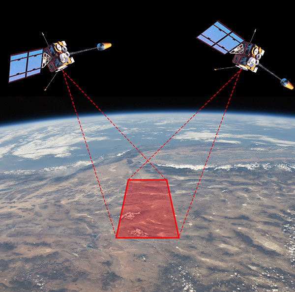
Diagram illustrating the principle of satellite stereo terrain mapping. As the satellite orbits Earth, it takes photos of the same region of Earth from different positions. These are then triangulated to give altitude data for the terrain. (Background image is a public domain photo from the International Space Station by NASA. Satellite diagram is a public domain image of GOES-8 satellite by U.S. National Oceanic and Atmospheric Administration.)

Now, if we’re taking photos of the Earth and using them to calculate altitude data, how important is the fact that the Earth is spherical? If you look at a small area, say a few city blocks, the curvature of the Earth is not readily apparent and you can treat the underlying terrain as flat, with modifications by strictly local topography, without significant error. But as you image larger areas, getting up to hundreds of kilometres, the 3D shape revealed by the stereo imaging consists of the local topography superimposed on a spherical surface, not on a flat plane. If you don’t account for the spherical baseline, you end up with progressively larger altitude errors as your imaged area increases.

A research paper on the mathematics of registering stereo satellite images to obtain altitude data includes the following passage[2]:

Correction of Earth Curvature

If the 3D-GK coordinate system X, Y, Z and the local Cartesian coordinate system Xg, Yg, Zg are both set with their origins at the scene centre, the difference in Xg and X or Yg and Y will be negligible, but for Z and Zg [i.e. the height coordinates] the difference will be appreciable as a result of Earth curvature. The height error at a ground point S km away from the origin is given by the well-known expression:

ΔZ = Y2/2R km

Where R = 6367 km. This effect amounts to 67 m in the margin of the SPOT scene used for the reported experiments.

The size of the test scene was 50×60 km, and at this scale you get altitude errors of up to 67 metres if you assume the Earth is flat, which is a large error!

Another paper compares the mathematical solution of stereo satellite altitude data to that of aerial photography (from a plane)[3]:

Some of the approximations used for handling usual aerial photos are not acceptable for space images. The mathematical model is based on an orthogonal coordinate system and perspective image geometry. […] In the case of direct use of the national net coordinates, the effect of the earth curvature is respected by a correction of the image coordinates and the effect of the map projection is neglected. This will lead to [unacceptable] remaining errors for space images. […] The influence of the earth curvature correction is negligible for aerial photos because of the smaller flying height Zf. For a [satellite] flying height of 300 km we do have a scale error of the ground height of 1:20 or 5%.

So the terrain mappers using stereo satellite data need to be aware of and correct for the curvature of the Earth to get their data to come out accurately.

Terrain mapping is done on relatively small patches of Earth. But we’ve already seen in our first proof photos of Earth taken from far enough away that you can see (one side of) the whole planet, such as the Blue Marble photo. Can we do one better, and look at two photos of the Earth taken from different positions at the same time? Yes, we can!

The U.S. National Oceanic and Atmospheric Administration operates the Geostationary Operational Environmental Satellite (GOES) system, manufactured and launched by NASA. Since 1975, NASA has launched 17 GOES satellites, the last four of which are currently operational as Earth observation platforms. The GOES satellites are in geostationary orbit 35790 km above the equator, positioned over the Americas. GOES-16 is also known as GOES-East, providing coverage of the eastern USA, while GOES-17 is known as GOES-West, providing coverage of the western USA. This means that these two satellites can take images of Earth at the same time from two slightly different positions (“slightly” here means a few thousand kilometres).

This means we can get stereo views of the whole Earth. We could in principle use this to calculate the shape of the Earth by triangulation using some mathematics, but there’s an even cooler thing we can do. If we view a GOES-16 image with our right eye, while viewing a GOES-17 image taken at the same time with our left eye, we can get a 3D view of the Earth from space. Let’s try it!

The following images show cross-eyed and parallel viewing pairs for GOES-16/GOES-17 images. Depending on your ability to deal with these images, you should be able to view a stereo 3D image of Earth. (Cross-eyed stereo viewing seems to be the most popular method on the Internet, but personally I’ve never been able to get it to work for me, whereas I find the parallel method fairly easy. I find it works best if I put my face very close to the screen to lock onto the initial image fusion, and then slowly pull my head backwards. Another option if you have a VR viewer for your phone, like Google Cardboard, is to load the parallel image onto your phone and view it with your VR viewer.)

GOES stereo image, cross-eyed

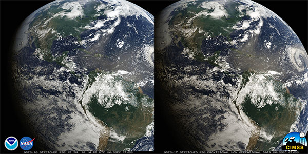
Stereo pair images of Earth from NASA’s GOES-16 (left) and GOES-17 (right) satellites taken at the same time on the same date, 1400 UTC, 12 July 2018. This is a cross-eyed viewing pair: to see the 3D image, cross your eyes until three images appear, and focus on the middle image. It will probably be easier if you reduce the size of the image on your screen using your browser’s zoom function. (Public domain image by NASA, from [4].)

GOES stereo image, parallel

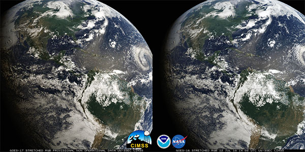
The same stereo pair presented with GOES-16 view on the right and GOES-17 on the left. This is a parallel viewing pair: to see the 3D image relax your eyes so the left eye views the left image and the right eye views the right image, until three images appear, and focus on the middle image. It will probably be easier if you reduce the size of the image on your screen using your browser’s zoom function. (Public domain image by NASA, from [4].)

Unfortunately these images are cropped, but if you managed to get the 3D viewing to work, you will have seen that your brain automatically does the distance calculation ting as it would with a real object, and you can see for yourself with your own eyes that the Earth is rounded, not flat.

I’ve saved the best for last. The Japan Meteorological Agency operates the Himawari-8 weather satellite, and the Korea Meteorological Administration operates the GEO-KOMPSAT-2A satellite. Again these are both on geosynchronous orbits above the equator, this time placed so that Himawari-8 has the best view of Japan, while GEO-KOMPSAT-2A has the best view of Korea, situated slightly to the west. And here I found uncropped whole Earth images from these two satellites taken at the same time, presented again as cross-eyed and then parallel viewing pairs:

Himawari-KOMPSAT stereo image, cross-eyed

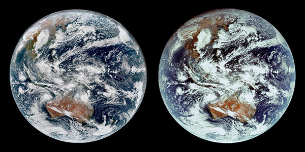
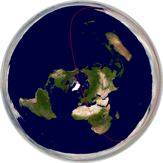
Stereo pair images of Earth from Japan Meteorological Agency’s Himawari-8 (left) and Korea Meteorological Administration’s GEO-KOMPSAT-2A (right) satellites taken at the same time on the same date, 0310 UTC, 26 January 2019. This is a cross-eyed viewing pair. (Image reproduced and modified from [5].)

Himawari-KOMPSAT stereo image, parallel

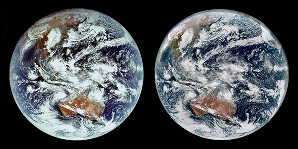
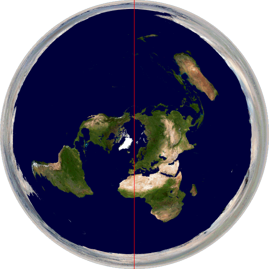
The same stereo pair presented with Himawari-8 view on the right and GEO-KOMPSAT-2A on the left. This is a parallel viewing pair. (Image reproduced and modified from [5].)

For those who have trouble with free stereo viewing, I’ve also turned these photos into a red-cyan anaglyphic 3D image, which is viewable with red-cyan 3D glasses (the most common sort of coloured 3D glasses)

Himawari-KOMPSAT stereo image, anaglyph

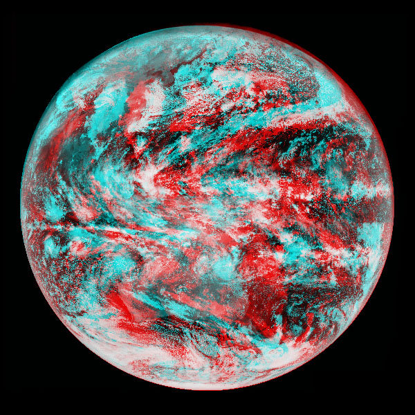
The same stereo pair rendered as a red-cyan anaglyph. The stereo separation of the viewpoints is rather large, so it may be difficult to see the 3D effect at full size – it should help to reduce the image size using your browser’s zoom function, place your head close to your screen, and gently move side to side until the image fuses, then pull back slowly.

Hopefully you managed to get at least one of these 3D images to work for you (unfortunately some people find viewing stereo 3D images difficult). If you did, well, I don’t need to point out what you saw. The Earth is clearly, as seen with your own eyes, shaped like a sphere, not a flat disc.

References:

[1] Lang, M., Hornung, A., Wang, O., Poulakos, S., Smolic, A., Gross, M. “Nonlinear disparity mapping for stereoscopic 3D”. ACM Transactions on Graphics, 29 (4), p. 75-84. ACM, 2010. http://dx.doi.org/10.1145/1833349.1778812

[2] Hattori, S., Ono, T., Fraser, C., Hasegawa, H. “Orientation of high-resolution satellite images based on affine projection”. International Archives of Photogrammetry and Remote Sensing, 33(B3/1; PART 3) p. 359-366, 2000. https://www.isprs.org/proceedings/Xxxiii/congress/part3/359_XXXIII-part3.pdf

[3] Jacobsen, K. “Geometric aspects of high resolution satellite sensors for mapping”. ASPRS The Imaging & Geospatial Information Society Annual Convention 1997 Seattle. 1100(305), p. 230, 1997. https://www.ipi.uni-hannover.de/uploads/tx_tkpublikationen/jac_97_geom_hrss.pdf

[4] CIMSS Satellite blog, Space Science and Engineering Center, University of Wisconsin-Madison, “Stereoscopic views of Convection using GOES-16 and GOES-17”. 2018-07-12. https://cimss.ssec.wisc.edu/goes/blog/archives/28920 (accessed 2019-09-26).

[5] CIMSS Satellite blog, Space Science and Engineering Center, University of Wisconsin-Madison, “First GEOKOMPSAT-2A imagery (in stereo view with Himawari-8)”. 2019-02-04. https://cimss.ssec.wisc.edu/goes/blog/archives/31559 (accessed 2019-09-26).

27. Camera image stabilisation

Cameras are devices for capturing photographic images. A camera is basically a box with an opening in one wall that lets light enter the box and form an image on the opposite wall. The earliest such “cameras” were what are now known as camera obscuras, which are closed rooms with a small hole in one wall. The name “camera obscura” comes from Latin: “camera” meaning “room” and “obscura” meaning “dark”. (Which is incidentally why in English “camera” refers to a photographic device, while in Italian “camera” means a room.)

A camera obscura works on the principle that light travels in straight lines. How it forms an image is easiest to see with reference to a diagram:

Camera obscura diagram

Diagram illustrating the principle of a camera obscura. (Public domain image from Wikimedia Commons.)

In the diagram, the room on the right is enclosed and light can only enter through the hole C. Light from the head region A of a person standing outside enters the hole C, travelling in a straight line, until it hits the far wall of the room near the floor. Light from the person’s feet B travels through the hole C and ends up hitting the far wall near the ceiling. Light from the person’s torso D hits the far wall somewhere in between. We can see that all of the light from the person that enters through the hole C ends up projected on the far wall in such a way that it creates an image of the person, upside down. The image is faint, so the room needs to be dark in order to see it.

If you have a modern photographic camera, you can expose it for a long time to capture a photo of the faint projected image inside the room (which is upside down).

Camera obscura photo

A room turned into a camera obscura, at the Camden Arts Centre, London. (Creative Commons Attribution 2.0 image by Flickr user Kevan, from Flickr.)

The hole in the wall needs to be small to keep the image reasonably sharp. If the hole is large, the rays of light from a single point in the scene outside project to multiple points on the far wall, making the image blurry – the larger the hole, the brighter the image, but blurrier it is. You can overcome this by placing a lens in the hole, which focuses the incoming light back down to a sharper focus on the wall.

Camera obscura photo

Camera obscura using a lens to focus the incoming light for a brighter, sharper image. (Creative Commons Attribution 2.0 image by Flickr user Willi Winzig, from Flickr.)

A photographic camera is essentially a small, portable camera obscura, using a lens to focus an image of the outside world onto the inside of the back of the camera. The critical difference is that where the image forms on the back wall, there is some sort of light-sensitive device that records the pattern of light, shadow, and colour. The first cameras used light-sensitive chemicals, coated onto a flat surface. The light causes chemical reactions that change physical properties of the chemicals, such as hardness or colour. Various processes can then be used to convert the chemically coated surface into an image, that more or less resembles the scene that was projected into the camera. Modern chemical photography uses film as the chemical support medium, but glass was popular in the past and is still used for specialty purposes today.

More recently, photographic film has been largely displaced by digital electronic light sensors. Sensor manufacturers make silicon chips that contain millions of tiny individual light sensors arranged in a rectangular grid pattern. Each one records the amount of light that hits it, and that information is recorded as one pixel in a digital image file – the file holding millions of pixels that encode the image.

Camera cross section

Cross section of a modern camera, showing the light path through the lens to the digital image sensor. In this camera, a partially silvered fixed mirror reflects a fraction of the light to a dedicated autofocus sensor, and the viewfinder is electronic (this is not a single-lens reflex (SLR) design). (Photo by me.)

One important parameter in photography is the exposure time (also known as “shutter speed”). The hole where the light enters is covered by a shutter, which opens when you press the camera button, and closes a little bit later, the amount of time controlled by the camera settings. The longer you leave open the shutter, the more light can be collected and the brighter the resulting image is. In bright sunlight you might only need to expose the camera for a thousandth of a second or less. In dimmer conditions, such as indoors, or at night, you need to leave the shutter open for longer, sometimes up to several seconds to make a satisfactory image.

A problem is that people are not good at holding a camera still for more than a fraction of a second. Our hands shake by small amounts which, while insignificant for most things, are large enough to cause a long exposure photograph to be blurry because the camera points in slightly different directions during the exposure. Photographers use a rule of thumb to determine the longest shutter speed that can safely be used: For a standard 35 mm SLR camera, take the reciprocal of the focal length of the lens in millimetres, and that is the longest usable shutter speed for hand-held photography. For example, when shooting with a 50 mm lens, your exposure should be 1/50 second or less to avoid blur caused by hand shake. Longer exposures will tend to be blurry.

Camera shake

A photo I took with a long exposure (0.3 seconds) on a (stationary) train. Besides the movement of the people, the background is also blurred by the shaking of my hands; the signs above the door are blurred to illegibility.

The traditional solution has been to use a tripod to hold the camera still while taking a photo, but most people don’t want to carry around a tripod. Since the mid-1990s, another solution has become available: image stabilisation. Image stabilisation uses technology to mitigate or undo the effects of hand shake during image capture. There are two types of image stabilisation:

1. Optical image stabilisation was the first type invented. The basic principle is to move certain optical components of the camera to compensate for the shaking of the camera body, maintaining the image on the same location on the sensor. Gyroscopes are used to measure the tilting of the camera body caused by hand shake, and servo motors physically move the lens elements or the image sensor (or both) to compensate. The motions are very small, but crucial, because the size of a pixel on a modern camera sensor is only a few micrometres, so if the image moves more than a few micrometres it will become blurry.

Image stabilised photo

Optically image stabilised photo of a dim lighthouse interior. The exposure is 0.5 seconds, even longer than the previous photo, but the image stabilisation system mitigates the effects of hand shake, and details in the photo remain relatively unblurred. (Photo by me.)

2. Digital image stabilisation is a newer technology, which relies on image processing, rather than moving physical components in the camera. Digital image processing can go some way to remove the blur from an image, but this is never a perfect process because blurring loses some of the information irretrievably. Another approach is to capture multiple shorter exposure images and combine them after exposure. This produces a composite longer exposure, but each sub-image can be shifted slightly to compensate for any motion of the camera before adding them together. Although digital image stabilisation is fascinating, for this article we are actually concerned with optical image stabilisation, so I’ll say no more about digital.

Early optical image stabilisation hardware could stabilise an image by about 2 to 3 stops of exposure. A “stop” is a term referring to an increase or decrease in exposure by a factor of 2. With 3 stops of image stabilisation, you can safely increase your exposure by a factor of 23 = 8. So if using a 50 mm lens, rather than need an exposure of 1/50 second or less, you can get away with about 1/6 second or less, a significant improvement.

Image stabilisation system diagram

Optical image stabilisation system diagram from a US patent by Canon. The symbols p and y refer to pitch and yaw, which are rotations as defined by the axes shown at 61. 63p and 63y are pitch and yaw sensors (i.e. gyroscopes), which send signals to electronics (65p and 65y) to control actuator motors (67p and 67y) to move the lens element 5, in order to keep the image steady on the sensor 69. 68p and 68y are position feedback sensors. (Figure reproduced from [1].)

Newer technology has improved optical image stabilisation to about 6.5 stops. This gives a factor of 26.5 = 91 times improvement, so that 1/50 second exposure can now be stretched to almost 2 seconds without blurring. Will we soon see further improvements giving even more stops of optical stabilisation?

Interestingly, the answer is no. At least not without a fundamentally different technology. According to an interview with Setsuya Kataoka, Deputy Division Manager of the Imaging Product Development Division of Olympus Corporation, 6.5 stops is the theoretical upper limit of gyroscope-based optical image stabilisation. Why? In his words[2]:

6.5 stops is actually a theoretical limitation at the moment due to rotation of the earth interfering with gyro sensors.

Wait, what?

This is a professional camera engineer, saying that it’s not possible to further improve camera image stabilisation technology because of the rotation of the Earth. Let’s examine why that might be.

As calculated above, when we’re in the realm of 6.5 stops of image stabilisation, a typical exposure is going to be of the order of a second or so. The gyroscopes inside the camera are attempting to keep the camera’s optical system effectively stationary, compensating for the photographer’s shaky hands. However, in one second the Earth rotates by an angle of 0.0042° (equal to 360° divided by the sidereal rotation period of the Earth, 86164 seconds). And gyroscopes hold their position in an inertial frame, not in the rotating frame of the Earth. So if the camera is optically locked to the angle of the gyroscope at the start of the exposure, one second later it will be out by an angle of 0.0042°. So what?

Well, a typical digital camera sensor contains pixels of the order of 5 μm across. With a focal length of 50 mm, a pixel subtends an angle of 5/50000×(180/π) = 0.006°. That’s very close to the same angle. In fact if we change to a focal length of 70 mm (roughly the border between a standard and telephoto lens, so very reasonable for consumer cameras), the angles come out virtually the same.

What this means is that if we take a 1 second exposure with a 70 mm lens (or a 2 second exposure with a 35 mm lens, and so on), with an optically stabilised camera system that perfectly locks onto a gyroscopic stabilisation system, the rotation of the Earth will cause the image to drift by a full pixel on the image sensor. In other words, the image will become blurred. This theoretical limit to the performance of optical image stabilisation, as conceded by professional camera engineers, demonstrates that the Earth is rotating once per day.

To tie this in to our theme of comparing to a flat Earth, I’ll concede that this current limitation would also occur if the flat Earth rotated once per day. However, the majority of flat Earth models deny that the Earth rotates, preferring the cycle of day and night to be generated by the motion of a relatively small, near sun. The current engineering limitations of camera optical image stabilisation rule out the non-rotating flat Earth model.

You could in theory compensate for the angular error caused by Earth rotation, but to do that you’d need to know which direction your camera was pointing relative to the Earth’s rotation axis. Photographers hold their cameras in all sorts of orientations, so you can’t assume this; you need to know both the direction of gravity relative to the camera, and your latitude. There are devices which measure these (accelerometers and GPS), so maybe some day soon camera engineers will include data from these to further improve image stabilisation. At that point, the technology will rely on the fact that the Earth is spherical – because the orientation of gravity relative to the rotation axis changes with latitude, whereas on a rotating flat Earth gravity is always at a constant angle to the rotation axis (parallel to it in the simple case of the flat Earth spinning like a CD).

And the fact that your future camera can perform 7+ stops of image stabilisation will depend on the fact that the Earth is a globe.

References:

[1] Toyoda, Y. “Image stabilizer”. US Patent 6064827, filed 1998-05-12, granted 2000-05-16. https://pdfpiw.uspto.gov/.piw?docid=06064827

[2] Westlake, Andy. “Exclusive interview: Setsuya Kataoka of Olympus”. Amateur Photographer, 2016. https://www.amateurphotographer.co.uk/latest/photo-news/exclusive-interview-setsuya-kataoka-olympus-95731 (accessed 2019-09-18).

26. Skyglow

Skyglow is the diffuse illumination of the night sky by light sources other than large astronomical objects. Sometimes this is considered to include diffuse natural sources such as the zodiacal light (discussed in a previous proof), or the faint glow of the atmosphere itself caused by incoming cosmic radiation (called airglow), but primarily skyglow is considered to be the product of artificial lighting caused by human activity. In this context, skyglow is essentially the form of light pollution which causes the night sky to appear brighter near large sources of artificial light (i.e. cities and towns), drowning out natural night sky sources such as fainter stars.

Skyglow from Keys View

Skyglow from the cities of the Coachella Valley in California, as seen from Keys View lookout, Joshua Tree National Park, approximately 20 km away. (Public domain image by U.S. National Park Service/Lian Law, from Flickr.)

The sky above a city appears to glow due to the scattering of light off gas molecules and aerosols (i.e. dust particles, and suspended liquid droplets in the air). Scattering of light from air molecules (primarily nitrogen and oxygen) is called Rayleigh scattering. This is the same mechanism that causes the daytime sky to appear blue, due to scattering of sunlight. Although blue light is scattered more strongly, the overall colour effect is different for relatively nearby light sources than it is for sunlight. Much of the blue light is also scattered away from our line of sight, so skyglow caused by Rayleigh scattering ends up a similar colour to the light sources. Scattering off aerosol particles is called Mie scattering, and is much less dependent on wavelength, so also has little effect on the colour of the scattered light.

Skyglow from Cholla

Skyglow from the cities of the Coachella Valley in California, as seen from Cholla Cactus Garden, Joshua Tree National Park, approximately 40 km away. (Public domain image by U.S. National Park Service/Hannah Schwalbe, from Flickr.)

Despite the relative independence of scattered light on wavelength, bluer light sources result in a brighter skyglow as perceived by humans. This is due to a psychophysical effect of our optical systems known as the Purkinje effect. At low light levels, the rod cells in our retinas provide most of the sensory information, rather than the colour-sensitive cone cells. Rod cells are more sensitive to blue-green light than they are to redder light. This means that at low light levels, we are relatively more sensitive to blue light (compared to red light) than we are at high light levels. Hence skyglow caused by blue lights appears brighter than skyglow caused by red lights of similar perceptual brightness.

Artificially produced skyglow appears prominently in the sky above cities. It makes the whole night sky as seen from within the city brighter, making it difficult or impossible to see fainter stars. At its worst, skyglow within a city can drown out virtually all night time astronomical objects other than the moon, Venus, and Jupiter. The skyglow from a city can also be seen from dark places up to hundreds of kilometres away, as a dome of bright sky above the location of the city on the horizon.

Skyglow from Ashurst Lake

Skyglow from the cities of Phoenix and Flagstaff, as seen from Ashurst Lake, Arizona, rendered in false colour. Although the skyglow from each city is visible, the cities themselves are below the horizon and not visible directly. The arc of light reaching up into the sky is the Milky Way. (Public domain image by the U.S. National Park Service, from Wikipedia.)

However, although the skyglow from a city can be seen from such a distance, the much brighter lights of the city itself cannot be seen directly – because they are below the horizon. The fact that you can observe the fainter glow of the sky above a city while not being able to see the lights of the city directly is because of the curvature of the Earth.

This is not the only effect of Earth’s curvature on the appearance of skyglow; it also effects the brightness of the glow. In the absence of any scattering or absorption, the intensity of light falls off with distance from the source following an inverse square law. Physically, this is because the surface area of spherical shells of increasing radius from a light source increase as the square of the radius. So the same light flux has to “spread out” to cover an area equal to the square of the distance, thus by the conservation of energy its brightness at any point is proportional to one divided by the square of the distance. (The same argument applies to many phenomena whose strengths vary with distance, and is why inverse square laws are so common in physics.)

Skyglow, however, is also affected by scattering and absorption in the atmosphere. The result is that the brightness falls off more rapidly with distance from the light source. In 1977, Merle F. Walker of Lick Observatory in California published a study of the sky brightness caused by skyglow at varying distances from several southern Californian cities[1]. He found an empirical relationship that the intensity of skyglow varies as the inverse of distance to the power of 2.5.

Skyglow intensity versus distance from Salinas

Plot of skyglow intensity versus distance from Salinas, California. V is the “visual” light band and B the blue band of the UBV photometric system, which are bands of about 90 nanometres width centred around wavelengths of 540 and 442 nm respectively. The fitted line corresponds to intensity ∝ (distance)-2.5. (Figure reproduced from [1].)

This relationship, known as Walker’s law, has been confirmed by later studies, with one notable addition. It only holds for distances up to 50-100 kilometres from the city. When you travel further away from a city, the intensity of the skyglow starts to fall off more rapidly than Walker’s law suggests, a little bit faster at first, but then more and more rapidly. This is because as well as the absorption effect, the scattered light path is getting longer and more complex due to the curvature of the Earth.

A later study by prominent astronomical light pollution researcher Roy Henry Garstang published in 1989 examined data from multiple cities in Colorado, California, and Ontario to produce a more detailed model of the intensity of skyglow[2]. The model was then tested and verified for multiple astronomical sites in the mainland USA, Hawaii, Canada, Australia, France, and Chile. Importantly for our perspective, the model Garstang came up with requires the Earth’s surface to be curved.

Skyglow intensity model geometry

Geometrical diagrams for calculating intensity of skyglow caused by cities, from Garstang. The observer is located at O, atop a mountain A. Light from a city C travels upward along the path s until it is scattered into the observer’s field of view at point Q. The centre of the spherical Earth is at S, off the bottom of the figure. (Figure reproduced from [2].)

Interestingly, Garstang also calculated a model for the intensity of skyglow if you assume the Earth is flat. He did this because it greatly simplifies the geometry and the resulting algebra, to see if it produced results that were good enough. However, quoting directly from the paper:

In general, flat-Earth models are satisfactory for small city distances and observations at small zenith distances. As a rough rule of thumb we can say that for calculations of night-sky brightnesses not too far from the zenith the curvature of the Earth is unimportant for distances of the observer of up to 50 km from a city, at which distance the effect of curvature is typically 2%. For larger distances the curved-Earth model should always be used, and the curved-Earth model should be used at smaller distances when calculating for large zenith distances. In general we would use the curved-Earth model for all cases except for city-center calculations. […] As would be expected, we find that the inclusion of the curvature of the Earth causes the brightness of large, distant cities to fall off more rapidly with distance than for a flat-Earth model.

In other words, to get acceptably accurate results for either distances over 50 km or for large zenith angles at any distance, you need to use the spherical Earth model – because assuming the Earth is flat gives you a significantly wrong answer.

This result is confirmed experimentally again in a 2007 paper[3], as shown in the following diagram:

Skyglow intensity versus distance from Salinas from Las Vegas

Plot of skyglow intensity versus distance from Las Vegas as observed at various dark sky locations in Nevada, Arizona, and California. The dashed line is Walker’s Law, with an inverse power relationship of 2.5. Skyglow at Rogers Peak, more than 100 km away, is less than predicted by Walker’s Law, “due to the Earth’s curvature complicating the light path” (quoted from the paper). (Figure reproduced from [3].)

So astronomers, who are justifiably concerned with knowing exactly how much light pollution from our cities they need to contend with at their observing sites, calculate the intensity of skyglow using a model that is significantly more accurate if you include the curvature of the Earth. Using a flat Earth model, which might otherwise be preferred for simplicity, simply isn’t good enough – because it doesn’t model reality as well as a spherical Earth.

References:

[1] Walker, M. F. “The effects of urban lighting on the brightness of the night sky”. Publications of the Astronomical Society of the Pacific, 89, p. 405-409, 1977. https://doi.org/10.1086/130142

[2] Garstang, R. H. “Night sky brightness at observatories and sites”. Publications of the Astronomical Society of the Pacific, 101, p. 306-329, 1989. https://doi.org/10.1086/132436

[3] Duriscoe, Dan M., Luginbuhl, Christian B., Moore, Chadwick A. “Measuring Night-Sky Brightness with a Wide-Field CCD Camera”. Publications of the Astronomical Society of the Pacific, 119, p. 192-213, 2007. https://dx.doi.org/10.1086/512069

25. Planetary formation

Why does Earth exist at all?

The best scientific model we have for understanding how the Earth exists begins with the Big Bang, the event that created space and time as we know and understand it, around 14 billion years ago. Scientists are interested in the questions of what possibly happened before the Big Bang and what caused the Big Bang to happen, but haven’t yet converged on any single best model for those. However, the Big Bang itself is well established by multiple independent lines of evidence and fairly uncontroversial.

The very early universe was a hot, dense place. Less than a second after the Big Bang, it was essentially a soup of primordial matter and energy. The energy density was so high that the equivalence of mass and energy (discovered by Albert Einstein) allowed energy to convert into particle/antiparticle pairs and vice versa. The earliest particles we know of were quarks, electrons, positrons, and neutrinos. The high energy density also pushed space apart, causing it to expand rapidly. As space expanded, the energy density reduced. The particles and antiparticles annihilated, converting back to energy, and this process left behind a relatively small residue of particles.

Diagram of the Big Bang

Schematic diagram of the evolution of the universe following the Big Bang. (Public domain image by NASA.)

After about one millionth of a second, the quarks no longer had enough energy to stay separated, and bound together to form the protons and neutrons more familiar to us. The universe was now a plasma of charged particles, interacting strongly with the energy in the form of photons.

After a few minutes, the strong nuclear force could compete with the ambient energy level, and free neutrons bonded together with protons to form a few different types of atomic nuclei, in a process known as nucleosynthesis. A single proton and neutron could pair up to form a deuterium nucleus (an isotope of hydrogen, also known as hydrogen-2). More rarely, two protons and a neutron could combine to make a helium-3 nucleus. More rarely still, three protons and four neutrons occasionally joined to form a lithium-7 nucleus. Importantly, if two deuterium nuclei collided, they could stick together to form a helium-4 nucleus, the most common isotope of helium. The helium-4 nucleus (or alpha particle as it is also known in nuclear physics) is very stable, so the longer this process went on, the more helium nuclei were formed and the more depleted the supply of deuterium became. Ever since the Big Bang, natural processes have destroyed more of the deuterium, but created only insignificant additional amounts – which means that virtually all of the deuterium now in existence was created during the immediate aftermath of the Big Bang. This is important because measuring the abundance of deuterium in our universe now gives us valuable evidence on how long this phase of Big Bang nucleosynthesis lasted. Furthermore, measuring the relative abundances of helium-3 and lithium-7 also give us other constraints on the physics of the Big Bang. This is one method we have of knowing what the physical conditions during the very early universe must have been like.

Nuclei formed during the Big Bang

Diagrams of the nuclei (and subsequent atoms) formed during Big Bang nucleosynthesis.

The numbers all point to this nucleosynthesis phase lasting approximately 380,000 years. All the neutrons had been bound into nuclei, but the vast majority of protons were left bare. At this time, something very important happened. The energy level had lowered enough for the electrostatic attraction of protons and electrons to form the first atoms. Prior to this, any atoms formed would quickly be ionised again by the surrounding energy. The bare protons attracted an electron each and become atoms of hydrogen. The deuterium nuclei also captured an electron to become atoms of deuterium. The helium-3 and helium-4 nuclei captured two electrons each, while the lithium nuclei attracted three. There were two other types of atoms almost certainly formed which I haven’t mentioned yet: hydrogen-3 (or tritium) and beryllium-7 – however both of these are radioactive and have short half-lives (12 years for tritium; 53 days for beryllium-7), so within a few hundred years there would be virtually none of either left. And that was it – the universe had its initial supply of atoms. There were no other elements yet.

When the electrically charged electrons became attached to the charged nuclei, the electric charges cancelled out, and the universe changed from a charged plasma to an electrically neutral gas. This made a huge difference, because photons interact strongly with electrically charged particles, but much less so with neutral ones. Suddenly, the universe went from opaque to largely transparent, and light could propagate through space. When we look deep into space with our telescopes, we look back in time because of the finite speed of light (light arriving at Earth from a billion light years away left its source a billion years ago). This is the earliest possible time we can see. The temperature of the universe at this time was close to 3000 kelvins, and the radiation had a profile equal to that of a red-hot object at that temperature. Over the billions of years since, as space expanded, the radiation became stretched to longer wavelengths, until today it resembles the radiation seen from an object at temperature around 2.7 K. This is the cosmic microwave background radiation that we can observe in every direction in space – it is literally the glow of the Big Bang, and one of the strongest observational pieces of evidence that the Big Bang happened as described above.

Cosmic microwave background

Map of the cosmic microwave background radiation over the full sky, as observed by NASA’s WMAP satellite. The temperature of the radiation is around 2.7 K, while the fluctuations shown are ±0.0002 K. The radiation is thus extremely smooth, but does contain measurable fluctuations, which lead to the formation of structure in the universe. (Public domain image by NASA.)

The early universe was not uniform. The density of matter was a little higher in places, a little lower in other places. Gravity could now get to work. Where the matter was denser, gravity was higher, and these areas began attracting matter from the less dense regions. Over time, this formed larger and larger structures, the size of stars and planetary systems, galaxies, and clusters of galaxies. This part of the process is one where a lot of the details still need to be worked out – we know more about the earlier stages of the universe. At any rate, at some point clumps of gas roughly the size of planetary systems coalesced and the gas at the centre accreted under gravity until it became so massive that the pressure at the core initiated nuclear fusion. The clumps of gas became the first stars.

The Hubble Extreme Deep Field

The Hubble Extreme Deep Field. In this image, except for the three stars with visible 8-pointed starburst patterns, every dot of light is a galaxy. Some of the galaxies in this image are 13.2 billion years old, dating from just 500 million years after the Big Bang. (Public domain image by NASA.)

The first stars had no planets. There was nothing to make planets out of; the only elements in existence were hydrogen with a tiny bit of helium and lithium. But the nuclear fusion process that powered the stars created more elements: carbon, oxygen, nitrogen, silicon, sodium, all the way up to iron. After a few million years, the biggest stars had burnt through as much nuclear fuel in their cores as they could. Unable to sustain the nuclear reactions keeping them stable, they collapsed and exploded as supernovae, spraying the elements they produced back into the cosmos. The explosions also generated heavier elements: copper, gold, lead, uranium. All these things were created by the first stars.

Supernova 2012Z

Supernova 2012Z, in the spiral galaxy NGC 1309, position shown by the crosshairs, and detail before and during the explosion. (Creative Commons Attribution 4.0 International image by ESA/Hubble, from Wikimedia Commons.)

The interstellar gas cloud was now enriched with heavy elements, but still by far mostly hydrogen. The stellar collapse process continued, but now as a star formed, there were heavy elements whirling in orbit around it. The conservation of angular momentum meant that elements spiralled slowly into the proto-star at the centre of the cloud, forming an accretion disc. Now slightly denser regions of the disc itself began attracting more matter due to their stronger gravity. Matter began piling up, and the heavier elements like carbon, silicon, and iron formed the first solid objects. Over a few million years, as the proto-star in the centre slowly absorbed more gas, the lumps of matter in orbit—now large enough to be called dust, or rocks—collided together and grew, becoming metres across, then kilometres, then hundreds of kilometres. At this size, gravity ensured the growing balls of rock were roughly spherical, due to hydrostatic equilibrium (previously discussed in a separate article). They attracted not only solid elements, but also gases like oxygen and hydrogen, which wrapped the growing protoplanets in atmospheres.

Protoplanetary disc of HL Tauri

Protoplanetary disc of the very young star HL Tauri, imaged by the Atacama Large Millimetre Array. The gaps in the disc are likely regions where protoplanets are accreting matter. (Creative Commons Attribution 4.0 International image by ALMA (ESO/NAOJ/NRAO), from Wikimedia Commons.)

Eventually the star at the centre of this protoplanetary system ignited. The sudden burst of radiation pressure from the star blew away much of the remaining gas from the local neighbourhood, leaving behind only that which had been gravitationally bound to what were now planets. The closest planets had most of the gas blown away, but beyond a certain distance it was cold enough for much of the gas to remain. This is why the four innermost planets of our own solar system are small rocky worlds with thin or no atmospheres with virtually no hydrogen, while the four outermost planets are larger and have vast, dense atmospheres mainly of hydrogen and hydrogen compounds.

But the violence was not over yet. There were still a lot of chunks of orbiting rock and dust besides the planets. These continued to collide and reorganise, some becoming moons of the planets, others becoming independent asteroids circling the young sun. Collisions created craters on bigger worlds, and shattered some smaller ones to pieces.

Mimas

Saturn’s moon Mimas, imaged by NASA’s Cassini probe, showing a huge impact crater from a collision that would nearly have destroyed the moon. (Public domain image by NASA.)

Miranda

Uranus’s moon Miranda, imaged by NASA’s Voyager 2 probe, showing disjointed terrain that may indicate a major collision event that shattered the moon, but was not energetic enough to scatter the pieces, allowing them to reform. (Public domain image by NASA.)

The left over pieces of the creation of the solar system still collide with Earth to this day, producing meteors that can be seen in the night sky, and sometimes during daylight. (See also the previous article on meteor arrival rates.)

The process of planetary formation, all the way from the Big Bang, is relatively well understood, and our current theories are successful in explaining the features of our solar system and those we have observed around other stars. There are details to this story where we are still working out exactly how or when things happened, but the overall sequence is well established and fits with our observations of what solar systems are like. (There are several known extrasolar planetary systems with large gas giant planets close to their suns. This is a product of observational bias—our detection methods are most sensitive to massive planets close to their stars—and such planets can drift closer to their stars over time after formation.)

One major consequence of this sequence of events is that planets form as spherical objects (or almost-spherical ellipsoids). There is no known mechanism for the formation of a flat planet, and even if one did somehow form it would be unstable and collapse into a sphere.

24. Gravitational acceleration variation

When you drop an object, it falls down. Initially the speed at which it falls is zero, and this speed increases over time as the object falls faster and faster. In other words, objects falling under the influence of gravity are accelerating. It turns out that the rate of acceleration is a constant when the effects of air resistance are negligible. Eventually air resistance provides a balancing force and the speed of fall reaches a limit, known as the terminal velocity.

Ignoring the air resistance part, the constant acceleration caused by gravity on the Earth’s surface is largely the same everywhere on Earth. This is why you feel like you weigh the same amount no matter where you travel (excluding travel into space!). However, there are small but measurable differences in the Earth’s gravity at different locations.

It’s straightforward to measure the strength of the acceleration due to gravity at any point on Earth with a gravity meter. We’ve already met one type of gravity meter during Airy’s coal pit experiment: a pendulum. So the measurements can be made with Georgian era technology. Nowadays, the most accurate measurements of Earth’s gravity are made from space using satellites. NASA’s GRACE satellite, launched in 2002, gave us our best look yet at the details of Earth’s gravitational field.

Being roughly a sphere of roughly uniform density, you’d expect the gravity at the Earth’s surface to be roughly the same everywhere and—roughly speaking—it is. But going one level of detail deeper, we know the Earth is closer to ellipsoidal than spherical, with a bulge around the equator and flattening at the poles. The surface gravity of an ellipsoid requires some nifty triple integrals to calculate, and fortunately someone on Stack Exchange has done the work for us[1].

Given the radii of the Earth, and an average density of 5520 kg/m3, the responder calculates that the acceleration due to gravity at the poles should be 9.8354 m/s2, while the acceleration at the equator should be 9.8289 m/s2. The difference is about 0.07%.

So at this point let’s look at what the Earth’s gravitational field does look like. The following figure shows the strength of gravity at the surface according to the Earth Gravitational Model 2008 (EGM2008), using data from the GRACE satellite.

Earth Gravitational Model 2008

Earth’s surface gravity as measured by NASA’s GRACE and published in the Earth Gravitational Model 2008. (Figure produced by Curtin University’s Western Australian Geodesy Group, using data from [2].)

We can see that the overall characteristic of the surface gravity is that it is minimal at the equator, around 9.78 m/s2, and maximal at the poles, around 9.83 m/s2, with a transition in between. Overlaid on this there are smaller details caused by the continental landmasses. We can see that mountainous areas such as the Andes and Himalayas have lower gravity – because they are further away from the centre of the planet. Now, the numerical value at the poles is a pretty good match for the theoretical value on an ellipsoid, close to 9.835 m/s2. But the equatorial figure isn’t nearly as good a match; the difference between the equator and poles is around 0.6%, not the 0.07% calculated for an ellipsoid of the Earth’s shape.

The extra 0.5% difference comes about because of another effect that I haven’t mentioned yet: the Earth is rotating. The rotational speed at the equator generates a centrifugal pseudo-force that slightly counteracts gravity. This is easy to calculate; it equals the radius times the square of the angular velocity of the surface at the equator, which comes to 0.034 m/s2. Subtracting this from our theoretical equatorial value gives 9.794 m/s2. This is not quite as low as 9.78 seen in the figure, but it’s much closer. I presume that the differences are caused by the assumed average density of Earth used in the original calculation being a tiny bit too high. If we reduce the average density to 5516 kg/m3 (which is still the same as 5520 to three significant figures, so is plausible), our gravities at the poles and equator become 9.828 and 9.788, which together make a better match to the large scale trends in the figure (ignoring the small fluctuations due to landmasses).

Of course the structure and shape of the Earth are not quite as simple as that of a uniformly dense perfect ellipsoid, so there are some residual differences. But still, this is a remarkably consistent outcome. One final point to note: it took me some time to track down the figure above showing the full value of the Earth’s gravitational field at the surface. When you search for this, most of the maps you find look like the following:

Earth Gravitational Model 2008 residuals

Earth surface gravity residuals, from NASA’s GRACE satellite data. The units are milligals; 1 milligal is equal to 0.00001 m/s2. (Public domain image by NASA, from [3].)

These seem to show that gravity is extremely lumpy across the Earth’s surface, but this is just showing the smaller residual differences after subtracting off a smooth gravity model that includes the relatively large polar/equatorial difference. Given the units of milligals, the largest differences between the red and blue areas shown in this map are only different by a little over 0.001 m/s2 after subtracting the smooth model.

We’re not done yet, because besides Earth we also have detailed gravity mapping for another planet: Mars!

Mars Gravitational Model 2011

Surface gravity strength on Mars. The overall trend is for lowest gravity at the equator, increasing with latitude to highest values at the poles, just like Earth. (Figure reproduced from [4].)

This map shows that the surface gravity on Mars has the same overall shape as that of Earth: highest at the poles and lowest at the equator, as we’d expect for a rotating ellipsoidal planet. Also notice that Mars’s gravity is only around 3.7 m/s2, less than half that of Earth.

Mars’s geography is in some sense much more dramatic than that of Earth, and we can see the smaller scale anomalies caused by the Hellas Basin (large red circle at lower right, which is the lowest point on Mars, hence the higher gravity), Olympus Mons (leftmost blue dot, northern hemisphere, Mars’s highest mountain), and the chain of three volcanoes on the Tharsis Plateau (straddling the equator at left). But overall, the polar/equatorial structure matches that of Earth.

Of course this all makes sense because the Earth is approximately an ellipsoid, differing from a sphere by a small amount of equatorial bulge caused by rotation, as is the case with Mars and other planets. We can easily see that Mars and the other planets are almost spherical globes, by looking at them with a telescope. If the structure of Earth’s gravity is similar to those, it makes sense that the Earth is a globe too. If the Earth were flat, on the other hand, this would be a remarkable coincidence, with no readily apparent explanation for why gravity should be stronger at the poles (remembering that the “south pole” in most flat Earth models is the rim of a disc) and weaker at the equator (half way to the rim of the disc), other than simply saying “that’s just the way Earth’s gravity is.”

References:

[1] “Distribution of Gravitational Force on a non-rotating oblate spheroid”. Stack Exchange: Physics, https://physics.stackexchange.com/questions/144914/distribution-of-gravitational-force-on-a-non-rotating-oblate-spheroid (Accessed 2019-09-06.)

[2] Pavlis, N. K., Holmes, S. A., Kenyon, S. C. , Factor, J. K. “The development and evaluation of the Earth Gravitational Model 2008 (EGM2008)”. Journal of Geophysical Research, 117, p. B04406. https://doi.org/10.1029/2011JB008916

[3] Space Images, Jet Propulsion Laboratory. https://www.jpl.nasa.gov/spaceimages/index.php?search=GRACE&category=Earth (Accessed 2019-09-06.)

[4] Hirt, C., Claessens, S. J., Kuhn, M., Featherstone, W.E. “Kilometer-resolution gravity field of Mars: MGM2011”. Planetary and Space Science, 67(1), p.147-154, 2012. https://doi.org/10.1016/j.pss.2012.02.006

Pendulum experiment

With my Science Club class of 7-10 year olds, I did an experiment to test what factors influence the period of swing of a pendulum, and to measure the strength of Earth’s gravity. I borrowed some brass weights and a retort stand from my old university Physics Department and took them to the school. Then with the children we did the experiment!

We set up pendulums with different lengths of string, measuring the length of each one. With each pendulum length, we tested different numbers of brass weights, and pulling the weight back by a different distance so that the pendulum swung through shorter or longer arcs. For each combination of string length, mass, and swing length, I got the kids to time a total of 10 back and forth swings with a stopwatch. I recorded the times and divided by 10 to get an average swing time for each pendulum.

Here’s a graph showing the pendulum period (or “swing time” as I’m calling it with the kids), plotted against the mass of the weight at the end.

Pendulum period versus mass

Pendulum period versus mass. The different colours indicate different pendulum lengths.

Here’s a graph showing the pendulum period (or “swing time” as I’m calling it with the kids), plotted against the swing distance (i.e. the amplitude).

Pendulum period versus swing distance

Pendulum period versus swing distance. The different colours indicate different pendulum lengths.

These first two graphs show pretty clearly that the period of the pendulum is not dictated by either the mass of the pendulum or the amplitude of the swing. If you look at the different colours showing the pendulum length, however, you may discern a pattern.

And here’s a graph showing the pendulum period plotted against the length of the pendulum.

Pendulum period versus length

Pendulum period versus length. The line is a power law fit to all the points.

In this case, all the points from different pendulum masses and swing amplitudes but the same length are clustered together (with some scatter caused by experimental errors in using the stopwatch). This indicates that only the length is important in determining the period. This matches the first order approximation theoretical formula for the period of a pendulum, T:

T = 2π√(l/g),

where l is the length and g is the acceleration due to gravity. To calculate g from the experimental data, I squared the period numbers and calculated the slope of the best fit line passing through zero to (iT2). Then g = 4π2 divided by the slope… which gives g = 10.0 m/s2.

The true value is 9.81 m/s2, so we got it right to a little better than 2%. Which I consider pretty good given the fact that I had kids as young as 7 making the measurements!

Although this is an “other science” entry on this blog and not a proof of the Earth’s roundness, I’m planning to combine the results of this experiment with our ongoing measurement of the sun’s shadow length of a vertical stick at the end of the year, to calculate not only the size of the Earth, but also its mass. It’ll be interesting to see how close we can get to that!

23. Straight line travel

Travel in a straight line across the surface of the Earth in any direction. After approximately 40,000 kilometres, you will find you are back where you started, having arrived from the opposite direction. While this sort of thing might be common in the wrap-around maps of some 1980s era video games, the simplest explanation for this in the real world is that the Earth is a globe, with a circumference about 40,000 km.

It’s difficult to see how this sort of thing could be possible on a flat Earth, unless the flat Earth’s surface were subject to some rather extreme directional and distance warping—that exactly mimics the behaviour of the surface of a sphere in Euclidean space. While this is not a priori impossible, it would certainly be an unlikely coincidence. Occam’s razor suggests that if it looks like a duck, quacks like a duck, and perfectly mimics the Euclidean geometry of a duck, it’s a duck.

This could be a very short and sweet entry if I left things there, but there are a few dangling questions.

Firstly there’s the question of exactly what we mean by a “straight line”. The Earth’s surface is curved, so any line we draw on it is necessarily curved in the third dimension, although this curvature is slight at scales we can easily perceive. The common understanding of a “straight line” on the Earth’s surface is the line giving the shortest distance joining two points as measured along the surface. This is what we mean when we talk about “straight lines” on Earth in casual speech, and it also matches how we’re using the term here.

In three dimensions, such “straight lines” are what we call great circles. A great circle is a circle on the surface of a sphere that has the same diameter as the sphere itself. On an idealised perfectly spherical Earth, the equator is a great circle, as are all of the meridians (i.e. lines of longitude). Lines of latitude other than the equator are not great circles: if you start north of the equator and travel due west, maintaining a westerly heading, then you are actually curving to the right. It’s easiest to see this by imagining a starting point very close to the North Pole. If you travel due west you will travel in a small clockwise circle around the pole.

Great circles

Great circles on a sphere. The horizontal circle is an equator, the vertical circle is a meridian, the red circle is an arbitrary great circle at some other angle.

Secondly, how can we know that we are travelling in such a straight line? The MythBusters once tested the myth that “It is impossible for a blindfolded person to travel in a straight line” and found that with restricted vision they were unable to either walk, swim, or drive in a straight line over even a very short distance[1]. We don’t need to keep our eyes closed though!

When travelling through unknown terrain, you can navigate by using the positions of the sun and stars as a reference frame, giving you a way of determining compass directions. Converting this into a great circle path however requires geometric calculations that depend on the spherical geometry of the Earth, so this approach is a somewhat circular argument if our aim is to demonstrate that the Earth is spherical.

A more direct method to ensure straight line travel is to line up two landmarks in the direction you are travelling, then when you reach the first one, line up another beyond the next one and repeat the process. This procedure can keep your course reasonably straight, but relies on visible and static landmarks, which may not be conveniently present. And this method is useless at sea.

Modern navigation now uses GPS to establish a position accurate to within a few metres. While this could be (and is routinely) used to plot a straight line course, again this relies on geometrical calculations that assume the Earth is spherical. (It works, of course, because the Earth is spherical, but render this particular line of argument against a flat Earth circular.)

Before GPS became commonplace, there was a different sort of navigation system in common use, and it is still used today as a backup for times when GPS is unavailable for any reason. These older systems are called inertial navigation systems (INS). They use components that provide an inertial frame of reference—that is, a reference frame that is not rotating or accelerating—independent of any motion of the Earth. These systems can be used for dead reckoning, which is navigating by plotting your direction and speed from your starting location to determine where you are at any time. They can be used to ensure that you follow a straight line path across the Earth, with reference to the inertial frame.

Inertial navigation systems can be built using several different physical principles, including mechanical gyroscopes, accelerometers, or laser ring gyroscopes utilising the Sagnac effect (previously discussed in these proofs). These systems drift in accuracy over time due to mechanical and environmental effects. Modern inertial navigation systems are accurate to 0.6 nautical miles per hour[2], or just over 1 km per hour. A plane flying at Mach 1 can fly a great circle route in just over 32 hours, so if relying only on INS it should arrive within 32 km of its starting point, which is close enough that a pilot can figure out that it’s back where it started. So in principle we can do this experiment with current technology.

A great circle on our spherical Earth is straightforward. But what does a great circle path look like plotted on a hypothetical flat Earth? Here are a few:

Equator on flat Earth

The equator.

Great circle passing through London and Sydney

Great circle passing through London and Sydney.

Great circle passing through Rome and McMurdo Station, Antarctica

Great circle passing through Rome and McMurdo Station, Antarctica.

As you can see, great circle paths are distorted and misshapen when plotted on a flat Earth. If you follow a straight line across the surface of the Earth as given by inertial navigation systems there’s no obvious reason why you would end up tracing any of these paths, or why you would measure the same distance travelled (40,000 km) over all three paths when they are significantly different sizes on this map. And then consider this one:

Great circle passing through London and the North Pole

Great circle passing through London and the North Pole.

This circle passes through the north and south poles. If you travel on this great circle, then you have to go off one edge of the flat Earth and reappear on the other side. Which seems unlikely.

Travelling in a straight line and ending up where you started makes the most sense if the Earth is a globe.

References:

[1] “MythBusters Episode 173: Walk a Straight Line”, MythBuster Results, https://mythresults.com/walk-a-straight-line (accessed 2019-08-20).

[2] “Inertial Navigation System (INS)”, Skybrary, https://www.skybrary.aero/index.php/Inertial_Navigation_System_(INS) (accessed 2019-08-20).