39. Seismic wave propagation

Our planet is made largely of rocks and metals. The composition and physical state varies with depth from the core of the Earth to the surface, because of changes in pressure and temperature with depth. The uppermost layer is the crust, which consists of lighter rocks in a solid state. Immediately below this is the upper mantle, in which the rocks are hotter and can deform plasticly over millions of years.

Slow convection currents occur in the upper mantle, and the convection cells define the tectonic plates of the Earth’s crust. Where mantle material rises, magma can emerge at mid-oceanic ridges or volcanoes. Where it sinks, a subduction zone occurs in the crust.

The plate boundaries are thus particularly unstable places on the Earth. As the plates shift and move relative to one another, stresses build up in the rock along the edges. At some point the stress becomes too great for the rock to withstand, and it gives way suddenly, releasing energy that shakes the Earth locally. These are earthquakes.

Lisbon earthquake engraving

Engraving of the effects of the 1755 Lisbon earthquake. (Public domain image from Wikimedia Commons.)

The point of slippage and the release of energy is known as the hypocentre of the earthquake, and may be several kilometres deep underground. The point on the surface above the hypocentre is the epicentre, and is where potential destruction is the greatest. Most earthquakes are small and go relatively unnoticed except by the seismologists who study earthquakes. Sometimes a quake is large and can cause damage to structures, injuries, and loss of life.

The energy released in an earthquake travels through the Earth in the form of waves, known as seismic waves. There are a few different types of seismic wave.

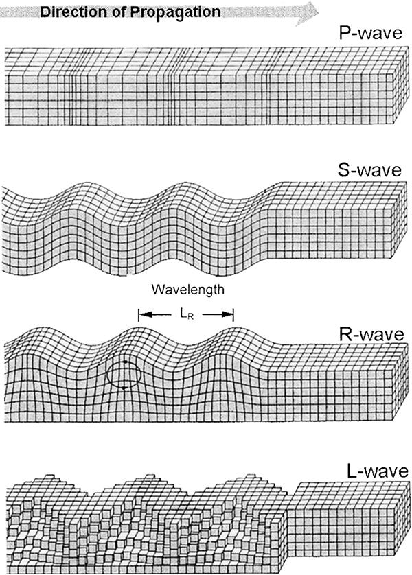
Primary waves, or P waves, are compressional waves, like sound waves in air. The rock alternately compresses and experiences tension, in a direction along the axis of propagation. In fact P waves are essentially sound waves of very large amplitude, and they propagate at the speed of sound in the medium. Within surface rock, this is about 5000 metres per second. Primary waves are so called because they are the fastest seismic waves, and thus the first ones to reach seismic recording stations located at any distance from the epicentre. They travel through the body of the Earth. And like sound waves, they can travel through any medium: solid, liquid, or gas.

Secondary waves, or S waves, are transverse waves, like light waves, or waves travelling along a jiggled rope. The rock jiggles from side to side as the wave propagates perpendicular to the jiggling motions. S waves travel a little over half the speed of P waves, and are the second waves to be detected at remote seismic stations. S waves also travel through the body of the Earth, but only within solid material. Fluids have no shear strength, and so cannot return to an equilibrium position when a transverse wave hits it, so the energy is dissipated within the fluid.

Seismic wave types

Illustrations of rock movement in different types of seismic waves. (Figure reproduced from [1].)

Besides these two types of body waves, there are also surface waves, which travel along the surface of the Earth. One type, Rayleigh waves (or R waves, named after the physicist Lord Rayleigh), are just like the surface waves or ripples on water, and causes the surface of the Earth to heave up and down. Another type of surface wave causes side to side motion; these are known as Love waves (or L waves, named after the mathematician Augustus Edward Hough Love). These waves propagate more slowly than S waves, at around 90% of the speed. Love waves are generally the strongest and most destructive seismic waves.

The P and S waves are thus the first two waves detected from an earthquake, and they are easily distinguishable on seismometer recordings.

Seismogram of P and S waves

Seismogram recording of arrival of P waves and S waves at a seismology station in Mongolia, from an earthquake 307 km away. (Figure reproduced from [2].)

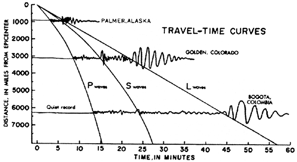
The P waves arrive first and produce a pulse of activity which slowly fades in amplitude, then the S waves arrive and cause a larger amplitude burst of activity. Because the relative speeds of the two waves through the same material are known, the time between the arrival of the P and S waves can be used to determine the distance from the seismic station to the earthquake hypocentre, using a graph such as the following:

Seismic wave travel-time curves

Seismic wave travel-time curves for P, S, and L waves. Also shown are three seismograms detected at seismic stations at different distances from an earthquake. (Public domain image from the United States Geological Survey.)

The graph shows the travel times of P, S, and also L waves, plotted against distance from the earthquake on the vertical axis. As you can see, the time between the detection of the P and S waves increases steadily with the distance from the quake.

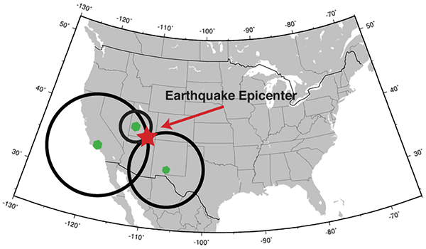
If you have three seismic stations, you can triangulate the location of the epicentre (using trilateration, as we have previously discussed).

Triangulating the location of an earthquake

Triangulating the location of an earthquake using distances from three seismic stations. (Public domain image from United States Geological Survey.)

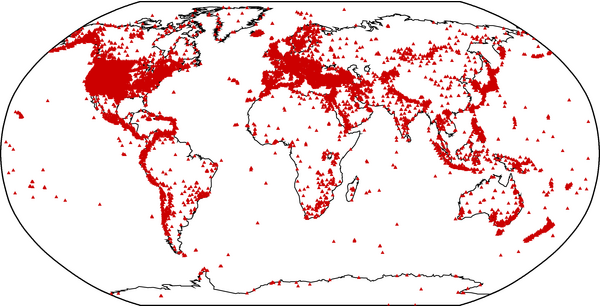
Of course, if you have more than three seismic stations, you can pinpoint the location of the earthquake much more reliably and precisely. According to the International Registry of Seismograph Stations, there are over 26,000 seismic stations around the world.

Location of seismic stations

Location of seismic stations recorded in the International Registry of Seismograph Stations. (Figure reproduced from [3].)

Interestingly, notice how the world’s seismic stations are concentrated along plate boundaries, where earthquakes are most common, particularly around the Pacific rim, as well as heavily in the developed nations of the US and Europe.

As shown in the travel-time curve graph, you can also use the propagation time of L waves to estimate distance to the earthquake. Did you notice the difference between the shapes of the P and S wave curves, and the L wave curve? L waves travel along the surface of the Earth. The distance from an earthquake to a detection station is measured conventionally, like everyday distances, also along the surface of the Earth. Since the L waves propagate at a constant speed, the graph of distance (along the Earth’s surface) versus time is a straight line.

But the P and S waves don’t travel along the surface of the Earth. They propagate through the bulk of the Earth. The distance that a P or S wave needs to travel from earthquake to detection site increases more slowly than the distance along the surface of the Earth, because of the Earth’s spherical shape. The S waves are only about 10% faster than the L waves, and you can see that near the epicentre, they arrive only around 10% earlier than the L waves. But the further away the earthquake is, the more of a shortcut they can take through the Earth, and so the faster they arrive, resulting in the downward curve on the graph. Similarly for the P waves.

This is in fact not the only cause of the P and S waves appearing to get faster the further away you are from an earthquake. They actually do get faster as they travel deeper, because of changes to the rock pressure. Deep in the Earth they can travel at roughly twice the speed that they do near the surface. The combination of these effects causes the shape of the curves in the travel-time graph.

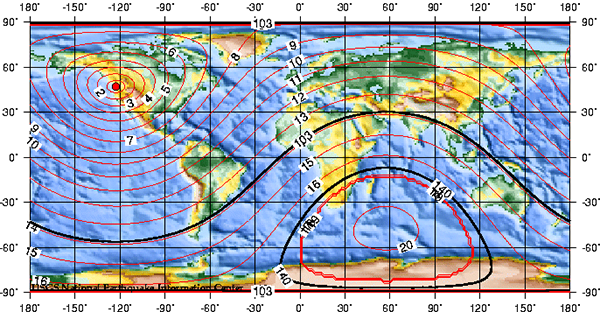
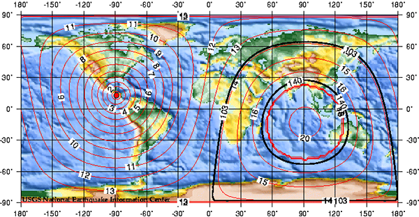
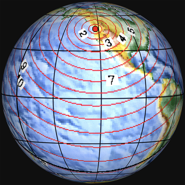
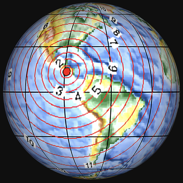
If we consider the propagation of seismic waves from an earthquake, they spread out in circles around the epicentre, like ripples in a pond from where a stone is dropped in. The arrival times of the waves at seismic stations equidistant from the epicentre should be the same, since the speeds in any direction are the same. And this is of course what is observed. The following figures show the predicted spread of P waves across the Earth from earthquake epicentres in Washington State USA, near Panama, and near Ecuador, as plotted by the US Geological Survey.

P wave propagation times from Washington

Predicted P wave propagation time in minutes from an earthquake epicentre in Washington State, USA. (Public domain image from United States Geological Survey.)

P wave propagation times from Panama

Predicted P wave propagation time in minutes from an earthquake epicentre near Panama. (Public domain image from United States Geological Survey.)

P wave propagation times from Ecuador

Predicted P wave propagation time in minutes from an earthquake epicentre near Ecuador. (Public domain image from United States Geological Survey.)

These maps are shown on an equirectangular map projection, which of course distorts the shape of the surface of the Earth (as discussed in 14: Map projections). To get a better idea of how the seismic waves propagate, we need to project these maps onto a sphere.

P wave propagation times from Washington, globe

Predicted P wave propagation time in minutes from an earthquake epicentre in Washington State, USA, projected onto a globe.

P wave propagation times from Panama, globe

Predicted P wave propagation time in minutes from an earthquake epicentre near Panama, projected onto a globe.

P wave propagation times from Ecuador, globe

Predicted P wave propagation time in minutes from an earthquake epicentre near Ecuador, projected onto a globe.

In these projections, you can see that the seismic wave travel time isochrones are circles, spreading out around the globe from the epicentres.

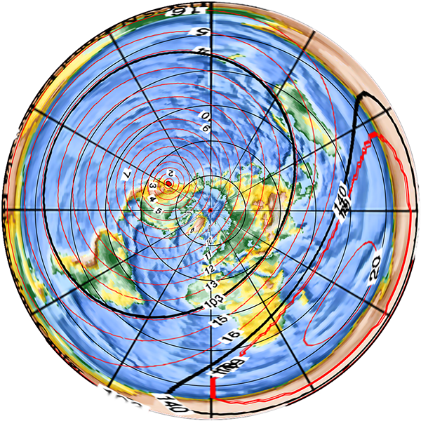
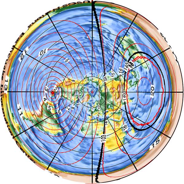
At least, the waves spread out in circles on a spherical Earth. In a flat Earth model, such as the typical “north pole in the middle” one, the spread of seismic waves produces elongated elliptical shapes or kidney shapes (such as the ones drawn in 23: Straight line travel), for no apparent or explicable reason.

P wave propagation times from Washington, flat Earth

Predicted P wave propagation time in minutes from an earthquake epicentre in Washington State, USA, projected onto a flat Earth.

P wave propagation times from Panama, flat Earth

Predicted P wave propagation time in minutes from an earthquake epicentre near Panama, projected onto a flat Earth.

P wave propagation times from Ecuador, flat Earth

Predicted P wave propagation time in minutes from an earthquake epicentre near Ecuador, projected onto a flat Earth.

Why should seismic waves propagate more slowly towards or away from the North Pole, and faster along tangential arcs? Why would they take longer to reach an area in the middle of the opposing half of the disc than to reach the far edge of the disc, which is further away? There is no a priori reason, and any proposed justification is yet another ad hoc bandage on the model.

So the propagation speeds of the various seismic waves and the travel times to recording stations provide another proof that the Earth is a globe.

Note: There is more to be said about the propagation of seismic waves, which will provide another, different proof that the Earth is a globe. Some readers no doubt have a good idea what it is already. Rest assured that I haven’t overlooked it, and it will be covered in detail in a future article.

References:

[1] Athanasopoulos, G., Pelekis, P., Anagnostopoulos, G. A. “Effect of soil stiffness in the attenuation of Rayleigh-wave motions from field measurements”, Soil Dynamics and Earthquake Engineering, 19, p. 277-288, 2000. https://doi.org/10.1016/S0267-7261(00)00009-9

[2] Quang, P. B., Gaillard, P., Cano, Y. “Association of array processing and statistical modelling for seismic event monitoring”, Proceedings of the 23rd European Signal Processing Conference (EUSIPCO 2015), p. 1945-1949, 2015. https://doi.org/10.1109/EUSIPCO.2015.7362723

[3] International Seismological Centre (2020), International Seismograph Station Registry (IR). https://doi.org/10.31905/EL3FQQ40

38. Lunar temperature modulation

Let’s start with a graph.

Latitude averaged temperature anomalies versus date

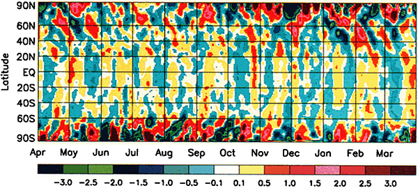
Graph of latitude averaged temperature anomalies (in degrees Celsius), from 1 April 1986 to 31 March 1987. (Figure reproduced from [1].)

This graph shows temperature anomalies on Earth – that is, the difference between the recorded temperature on any given day and the average temperature for the same location on that day over many years. Yellow-red colours indicate the actual temperature was warmer than average, blue-green colours indicate the temperature was cooler than average. The results are averaged across latitudes, so each point on the graph shows the average anomaly for the entire circle of latitude. The data are Goddard Television Infrared Observation Satellite Operational Vertical Sounder surface air temperature readings from NOAA polar weather satellites.

As you might expect, the temperature across Earth varies a bit. Some days are a bit warmer than average and some a bit cooler than average. You might imagine that with all of the different effects that go into the complicated atmospherical systems that control our weather, days would be cooler or warmer than average pretty much at random.

However that’s not what we’re seeing here. There’s a pattern to the anomalies. Firstly, the anomalies in the polar regions are larger (red and dark blue) than the anomalies in the mid-latitudes and tropic (yellow and light blue). Secondly, there are hints of almost regular vertical stripes in the graph – alternating bands of yellow and blue in the middle, and alternating red and dark blue near the poles. If you look at the graph carefully, you may be able to pick out a pattern of higher and lower temperatures, with a period a little bit less than one month.

What could have an effect on the Earth’s climate with a period a little under a month? The answer is, somewhat astonishingly, the moon.

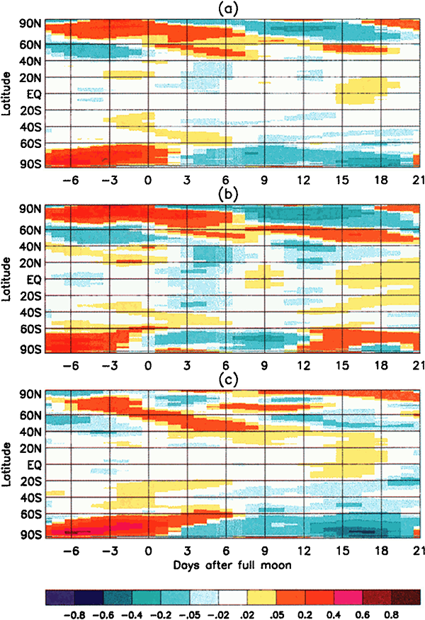
The creators of this graph took the latitude-averaged temperature anomaly data for the 20 years from 1979 to 1998, and plotted it as a function of the phase of the moon:

Latitude averaged temperature anomalies versus lunar phase

Graph of latitude averaged temperature anomalies (in degrees Celsius), from 1979 to 1998, plotted against phase of the moon. (a) annual average, (b) October-March (northern winter), (c) April-September (northern summer). (Figure reproduced from [1].)

These graphs show that the temperature anomalies have a clear relationship to the phase of the moon. In the polar regions, the temperature anomaly is strongly positive around the full moon, and negative around the new moon. In the mid-latitudes and tropics the trend is not so strong, but the anomalies tend to be lower around the full moon and positive around the new moon – the opposite of the polar regions.

What on Earth is going on here?

Aggregated measurements show that the polar latitudes of Earth are systematically around 0.55 degrees Celsius warmer at the full moon than at the new moon. This effect is strong enough that it dominates over the weaker reverse effect of the mid-latitudes/tropics anomaly. The average temperature of the Earth across all latitudes is not constant – it varies with the phase of the moon, dominated by the polar anomalies, being 0.02 degrees Celsius warmer at the full moon than the new moon. That doesn’t sound like a lot, but the signal is consistently there over all sub-periods in the 20-year data, and it is highly statistically significant.

The next puzzle is: What could possibly cause the Earth’s average temperature to vary with the phase of the moon?

Well, the full moon is bright, whereas the new moon is dark. Could the moonlight be warming the Earth measurably? Physicist and climate scientist Robert S. Knox has done the calculations. It turns out that the additional visible and thermal radiation the Earth receives from the full moon is only enough to warm the Earth by 0.0007 degrees Celsius, nowhere near enough to account for the observed difference[2].

There’s another effect of the moon’s regular orbit around the Earth. According to Newton’s law of gravity, strictly speaking the moon does not move in an orbit around the centre of the Earth. Two massive bodies in an orbital relationship actually each orbit around the centre of mass of the system, known as the barycentre. When one body is much more massive than the other, for example an artificial satellite orbiting the Earth, the motion of the larger body is very small. But our moon is over 1% of the mass of the Earth, so the barycentre of the system is over 1% of the distance from the centre of the Earth to the centre of the moon.

It turns out the Earth-moon barycentre is 4670 km from the centre of the Earth. This is still inside the Earth, but almost 3/4 of the way to the surface.

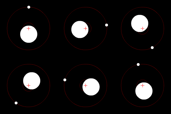
Animation of lunar orbit

Animation showing the relative positions of the Earth and moon during the lunar orbital cycle. The red cross is the barycentre of the Earth-moon system, and both bodies orbit around it. Diagram is not to scale: relative to the Earth the moon is actually a bit larger than that (1/4 the diameter), and much further away (30× the Earth’s diameter). (Public domain image from Wikimedia Commons.)

The result of this is that during a full moon, when the moon is farthest from the sun, the Earth is 4670 km closer to the sun than average, whereas during a new moon the Earth is 4670 km further away from the sun than average. The Earth oscillates over 9000 km towards and away from the sun every month. And the increase in incident radiation from the sun during the phases around the full moon comes to about 43 mW per square metre, or an extra 5450 GW over the entire Earth. The Earth normally receives nearly 44 million GW of solar radiation, so the difference is relatively small, but it’s enough to heat the Earth by almost 0.01 degrees Celsius, which is near the observed average monthly temperature variation.

Why are the polar regions so strongly affected by this lunar cycle, while the tropics are weakly affected, and even show an opposing trend? Earth’s weather systems are complex and involve transport of heat across the globe by moving air masses. The burst of heat at the poles during a full moon actually migrates towards lower latitudes over several days – you can see the trend in the slope of the warm parts of the graph. The exact details of the physical mechanisms for these observations are still under discussion by the experts. What is clear though is that there is a definite cycle in the Earth’s average temperature with a period equal to the orbit of the moon, and it is most likely driven by the fact that the Earth is closer to the sun during a full moon.

How might one possibly explain this in a flat Earth model? Well, the “orbital” mechanics are completely different. The phase of the moon should have no effect on the distance of the Earth to the sun. The only moderately sensible idea might be that the full moon emits enough extra radiation to warm up the Earth. But the observations of the moon’s radiant energy and the amount of heating it can supply end up the same as the round Earth case (if you believe the same laws of thermodynamics). The full moon simply doesn’t supply anywhere near enough extra heat to the flat Earth to account for the observations.

One could posit that the sun varies in altitude above the flat Earth, coincidentally with the same period as the moon, thus providing additional heating during the full moon. However one of the main modifications to the geometry of the Earth-sun system made in flat Earth models is to fix the sun at a given distance (usually a few thousand kilometres) above the surface of the Earth, in an attempt to explain various geometrical properties such as the angle of the sun as seen from different latitudes. Letting the sun move up and down would mess up the geometry, and should easily be observable from the surface of the flat Earth.

So, observations of the global average temperature, and its periodic variation with the phase of the moon provides another proof that the Earth is a globe.

References:

[1] Anyamba, E.K., Susskind, J. “Evidence of lunar phase influence on global surface air temperature”. Geophysical Research Letters, 27(18), p.2969-2972, 2000. https://doi.org/10.1029/2000GL011651

[2] Knox, R.S. “Physical aspects of the greenhouse effect and global warming”. American Journal of Physics, 67(12), p.1227-1238, 1999. https://doi.org/10.1119/1.19109

37. Sundials

The earliest method of marking time during the day was by following the movements of the sun as it crossed the sky, from sunrise in the east to sunset in the west. The apparent motion of the sun makes the shadows of fixed objects move during the day too. If you poke a stick into the ground, the shadow of the stick moves across the ground as time passes. By making marks on the ground and seeing which one the shadow is near, you get a method of telling the time of day. This is a simple form of sundial.

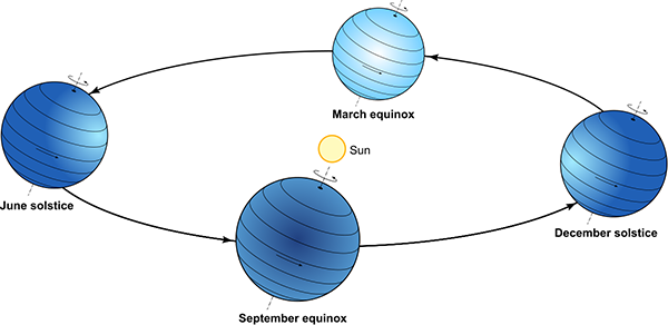
The apparent motion of the sun in the sky is caused by the interaction between the Earth’s orbit around the sun and the rotation of the Earth on its axis, which is inclined at approximately 23.5° to the axis of the orbital plane. At the June solstice (roughly 21 June), the northern hemisphere is maximally pointed towards the sun, making it summer while the southern hemisphere has winter. Half a year later at the December solstice, the sun is on the other side of the Earth, making it summer in the south and winter in the north. Midway between the solstices, at the March and September equinoxes, both hemispheres receive the same amount of sun.
The seasons

Diagram of the interaction between Earth’s orbit and its tilted axis of rotation, showing the solstices and equinoxes that generate the seasons.

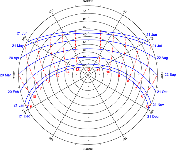
From the point of view of an observer standing on the Earth’s surface, the motions of the Earth make it appear as though the sun moves across the sky once per day, and drifts slowly north and south throughout the year. The following diagram shows the path of the sun across the sky for different dates, for my home of Sydney (latitude 34°S).
Sun’s path across the sky

Sun’s path across the sky for different dates at latitude 34°S. (Diagram produced using [1].)

In the diagram, the horizon is around the edge, and the centre of the circles is directly overhead. The blue lines show the sun’s path for the indicated dates of the year. The sun is lowest in the sky to the north, and visible for the shortest time, on the June solstice (the southern winter), while it is highest in the sky and visible for the longest on the December solstice (in summer). The red lines show the position of the sun along each arc at the labelled hour of the day. For a location in the northern hemisphere north of the tropics, the sun paths would be curved the other way, passing south of overhead. In the tropics (between the Tropics of Capricorn and Cancer), some paths are to the north while some are to the south. On the equinoxes (20 March and 21 September), the sun rises due east at 06:00 and sets due west at 18:00 – this is true for every latitude.

If you have a fixed object cast a shadow, that shadow moves throughout the course of a day. The next day, if the sun has moved north or south because of the slowly changing seasons, the path the shadow traces moves a little bit above or below the previous day’s path.

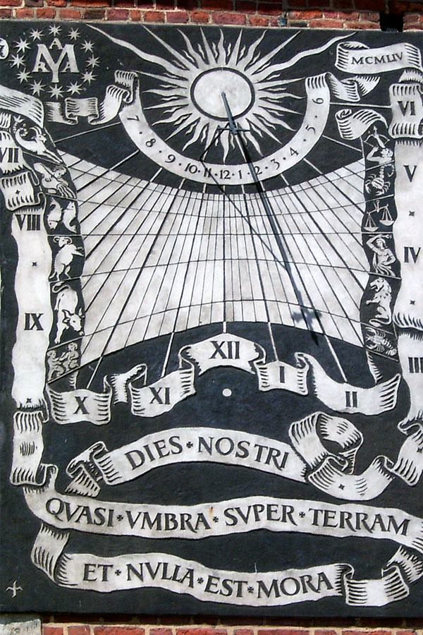
The ancient Babylonians and Egyptians used sundials, and the ancient Greeks used their knowledge of geometry to develop several different styles. Greek sundials typically used a point-like object, called the nodus, as the reference marker. The nodus could be the very tip of a stick, a small ball or disc supported by thin wires, or a small hole that lets a spot of sunlight through. The shadow of the nodus (or the spot of light in the case of a hole nodus) moves across a surface in a regular way, not just with time of day, but also with the day of the year. During the day, the point-like shadow of a nodus traces a path from west to east (as the sun moves east to west in the sky). Throughout the year, the daily path moves north and south as the sun moves further south or north in the sky due to the seasons.
ALT TEXT

A nodus-based sundial, on St. Mary’s Basilica, Kraków, Poland. The nodus is a small hole in the centre of the cross. The horizontal position of the spot of light in the centre of the cross’s shadow indicates a time of just after 1:45 pm; the vertical position indicates the date (as indicated by the astrological symbols on the sides). It could be either about 1/3 of the way into the sign of Gemini (about 31 May), or 2/3 of the way through Cancer (about 12 July). The EXIF data on the photo indicates it was taken on 16 July, so the nodus date is fairly accurate. This sundial is mounted on a vertical wall, not horizontally, so the shadow travels left to right in the northern hemisphere, rather than right to left as it does for a horizontal sundial. (Public domain image from Wikimedia Commons.)

There are two slight complications. The red lines in the sun’s path diagram show timing of the sun paths assuming the Earth’s orbit is perfectly circular, but in reality it is an ellipse, with the Earth nearest the sun in January and furthest away in June. Earth travels around that elliptical path at different speeds—due to Newton’s law of gravity and laws of motion—moving fastest at closest approach in January, and slowest in June. The result of this is that the daily interval between when the sun crosses the north-south line is 24 hours on average, but varies systematically through the year. This variation in the sun’s apparent motion has a period of one year.

The second complication occurs because of the tilt of the Earth’s axis to the ecliptic plane in which it orbits. The sun’s apparent movement in the sky is due west (parallel to the Earth’s equator) only at the equinoxes. On any other date it moves at an angle, with a component of motion north or south, as it moves up or down the sky with the seasons. This north-south motion is maximal at the solstices. So at the solstices the westward component of the sun’s motion is less than it is at the equinoxes, meaning that it appears to move westward across the sky more slowly (because part of its speed is being used to move north or south). This variation in the sun’s apparent motion has a period of half a year.

To get the total variation in the sun’s motion, we need to add these two components. Doing so gives us the equation of time. This is the amount of time by which the sun’s position varies from the ideal “circular orbit, non-inclined axial spin” case, as a function of the day of the year.
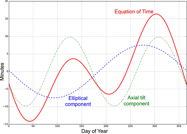
The equation of time

The equation of time (red), showing the two components that make it up: the component due to Earth’s elliptical orbit (blue dashed line) and the component caused by the Earth’s axial tilt (green dot-dash line). The total shows the number of minutes that the sun’s apparent motion is ahead of its average position.

What this means is that if you have a standard sort of simple sundial, the shadow moves at different speeds across the face on different dates of the year, resulting in the shadow getting a little bit ahead or a little bit behind clock time. To get the correct time as shown by a clock, you need to read the time off the sundial’s shadow and subtract the number of minutes given by the equation of time for that date.

But this is thinking about sundials with our modern mindest about how time works. We have decided to make the unit of time we call a “day” the average length of time that it takes the sun to return to its highest position in the sky, and then we’ve divided that day into 24 exactly equal hours. An hour on 20 March is exactly the same length as an hour on 21 June, or on 21 December. “Of course it is!” you say.

But it wasn’t always so. For most of history, a “day” was defined as either the time between one sunrise and the next, or one sunset and the next, or the time between when the sun was due south in the sky and when it returned to being due south again (in the northern hemisphere). Each of these definitions of a “day” vary in length throughout the year. Saudi Arabia officially used Arabic time up until 1968, which defined midnight (the start of a new day) to be at sunset each day, and clocks needed to be adjusted every day to track the shift in sunset through the seasons.

The definition of a day as the period between the sun being due south (or north) and returning to that position the next day, is called solar time. For most of human timekeeping history, this is what was used. The fact that some days were a bit longer or shorter than others was of no consequence when the sun itself was the best timekeeping tool that anyone had access to.

Our modern concept of an hour has its origins in ancient Egypt, around 2,500 BC. The Egyptians originally divided the night time period into 12 parts, marked by the rising of particular stars in the sky. Because the stars change with the seasons (as discussed in 36. The visible stars), they had tables of which stars marked which hours for different dates of the year. Because of precession of the Earth’s orbit, the stars fell out of synch with the tables over the course of several centuries.

The oldest non-sundial timekeeping device that still exists is a water clock dating from the reign of Amenhotep III, around 1350 BC. It was a conical bowl, which was filled with water at sunset, and had a small outflow drip hole that let water out at a roughly constant rate. Inside the bowl is a set of 12 level marks, showing the water level at each of the 12 divisions of the night. But not just one set of 12 marks – there are multiple sets of 12 markings, with different spacings, that show the passage of the night time hours for different months of the year, when the length of the night is different.
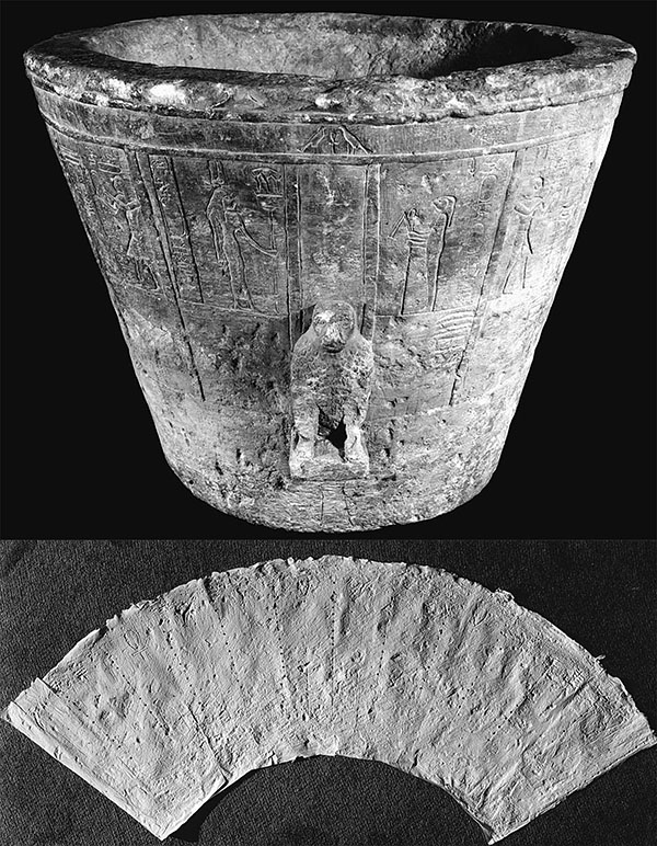
Egyptian water clock

Ancient Egyptian water clock (not Amenhotep’s one mentioned in the text). Dating uncertain, but possibly a much later Roman-era piece (circa 30 BC). The lower panel shows an unrolled cast of the interior of the conical bowl, showing the 12 different vertical rows of 12 differently spaced holes, indicating variable length hours for different months of the year. (Figure reproduced from [2].)

The oldest sundial we have is also from ancient Egypt, dating from around 1500 BC, a piece of limestone with a hole bored in it for a stick, and shadow marks, 12 of them, for dividing the daylight hours into 12 parts.
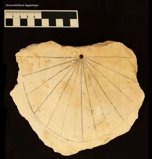
Ancient Egyptian sundial

Ancient Egyptian sundial, circa 1500 BC, found in the Valley of the Kings. (Public domain image from Wikimedia Commons.)

So the ancient Egyptians were dividing both the daylight and night time parts of each day into 12 different-length parts for a total of 24 divisions. Through cultural contact, sundials became a common way to mark the 12 hours of daylight in many other Mediterranean and Middle Eastern civilisations too, including the ancient Greeks and Romans.

By the Middle Ages, Catholic Europe was still keeping time based on a division of daylight time into 12 variable-length hours, and this carried across to the canonical hours, marking the times of day for liturgical prayers:

  • Matins: the night time prayer, recited some time after midnight, but before dawn.
  • Lauds: the dawn prayer, taking place at first light.
  • Prime: recited during the first hour of daylight.
  • Terce: at the third hour of the day time.
  • Sext: at midday, at the sixth hour, when the sun is due south.
  • Nones: the ninth hour of the day time.
  • Vespers: the sunset prayer, at the twelfth hour of the daylight period.
  • Compline: the end of the working day prayer, just before bed time.

In the modern world we might interpret “the third hour” to be 9:00 am, halfway between 6:00 am and midday, but the canonical hours are guided by the sun, so Terce would be earlier in summer and later in winter, in the same way that sunrise, and hence the celebration of Lauds, are. Nones, in contrast, would be earlier in winter and later in summer. (Incidentally, we get our modern word “noon” from “Nones” – although you’ll notice that Nones was defined as the ninth hour, or around 3:00 pm. For some reason it moved to become associated with the middle of the day. We’re not sure exactly why, but historians believe that the monks who observed this liturgy fasted each day until after the prayer of Nones, so there was constant pressure to make it slightly earlier, which eventually moved it back a full three hours!)

You might think that when mechanical clocks were invented, people suddenly realised that they’d been doing things wrong the whole time, and they quickly moved to the modern system of an hour being of a constant length. But that’s not what happened. The first mechanical clocks used a verge escapement to regulate the motion of the gear wheels, and this remained the most accurate clock mechanism from the 13th century to the 17th. But it wasn’t very accurate, varying by around 15 minutes per day, and so verge clocks had to be reset daily to match the motion of the sun.

Salisbury Cathedral clock

Verge escapement clock at Salisbury Cathedral (circa 1386). (My photo.)

Christiaan Huygens invented the pendulum clock in 1656, vastly improving the accuracy of mechanical clocks, down to around 15 seconds per day. With this new level of accuracy, people fully realised for the first time that the length of a full day as measured by the time it took the sun to return to the highest position in the sky didn’t match a regularly ticking clock. But rather than adjust their definition of what an hour was, people decided there must be a way to get these regular clocks to tell proper solar time! Thus were invented equation clocks.

The first equation clocks had a correction dial, which essentially displayed the equation of time value for the current day of the year. You read the time off the main clock dial, and then added the correction displayed on the correction dial, and that gave you the “correct” solar time. By the 18th century, the correction gearing was incorporated into the main clock face display, so that the hands of the clock actually ran faster or slower at different times of the year, to match the movement of the sun. It wasn’t until the early 19th century that European society moved to a mean time system (“mean” as in “average”), in which each “day” was defined to be exactly the same length, and the hour was a fixed period of time (thus simplifying clockmakers’ lives considerably).

Just to complete this story, clocks in the early 19th century were set to local mean time, which was the mean time of their meridian of longitude. Towns a few tens of miles east or west would have different mean times by a few minutes. This caused problems beginning with the introduction of rapid travel enabled by the railways, eventually leading to the adoption of standard time zones in the 1880s, in which all locations in slices of roughly 1/24 of the Earth share the same time.

What this means is that people were still living their lives by local solar time up until the early 19th century. In other words, a sundial was still the most accurate method of telling the time up until just 200 years ago – and it didn’t need any corrections based on the equation of time because people weren’t using mean time yet. It’s only in the past 200 years that we’ve had to correct a sundial to give what we consider to be the correct clock time.

So, back to sundials. Assuming we are happy with solar time (and can use the equation of time to correct to mean time if we wish), the main thing we need to contend with is that the sun moves north and south in the sky throughout the year. A nodus-type sundial accounts for this by marking lines that indicate the time when the shadow of the nodus crosses them on different days of the year. But many sundials use the whole edge of a stick or post as the shadow marker – this edge is called the gnomon. As the sun moves north and south throughout the year, different parts of the gnomon will cast their shadows in different places. If the gnomon is aligned parallel to the axis of the Earth, then these motions will be along the edge of the shadow, rather shifting the edge of the shadow laterally. You can then read solar time using a single marking, at any time of the year.

Another way to think about it is that from a viewpoint on Earth, the sun appears to revolve in the sky about the Earth’s axis. So if your sundial has a gnomon that is parallel to the Earth’s axis, the sun appears to rotate with the gnomon as its axis once per day, and the shadow of the gnomon indicates solar time on the marked surface below. As the sun moves north or south with the seasons, it is still revolving around the gnomon, so the shadow still tracks solar time accurately. If the gnomon is not parallel to the revolution axis, then as the sun moves north and south, the shadow of the gnomon will shift positions on the marked surface, and the time will be inaccurate at different times of the year.

This is why sundials with gnomons all have them inclined at an angle from the horizontal equal to the latitude of where the sundial is placed. At the North Pole, a vertical stick will indicate solar time accurately throughout the entire summer (when the sun is above the horizon 24 hours a day). At London (latitude 51.5°N), sundial gnomons are pointed north at 51.5° from the horizontal.
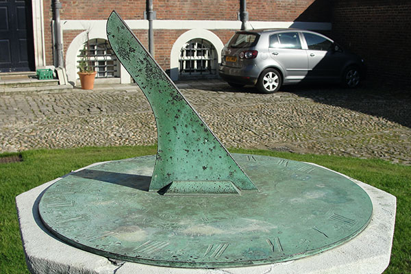
Sundial in London

A sundial in London. The gnomon is inclined at 51.5° to the horizontal. (Creative Commons Attribution 2.0 Generic image by Maxwell Hamilton, from Wikimedia Commons.)

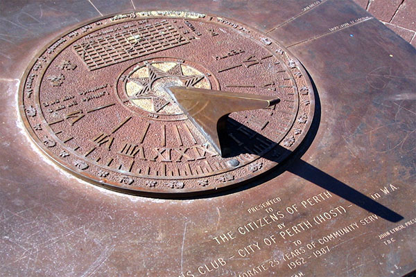
At Perth, Australia (32°S), they point south and are 32° from the horizontal, noticeably flatter.
Sundial in Perth

A sundial in Perth, Australia. The gnomon is noticeably at a flatter angle than sundials in London. (Public domain image from Wikimedia Commons.)

A sundial on the equator must have a gnomon that is horizontal.

Sundial in Singapore

A sundial in Singapore (latitude 1.3°N). The gnomon is the thin bar, angled at 1.3° to the horizontal. North is to the left. The sun shines from the north in June, from the south in December, but the shadow of the bar tracks the hours on the semicircular scale correctly at each date. (Creative Commons Attribution 2.0 Generic image by Michael Coghlan, from Wikimedia Commons.)

So, in order to work properly, gnomon-sundials must have a gnomon angled parallel to the Earth’s axis of rotation. The fact that sundials at different latitudes need to have their gnomons at different angles to the ground plane shows that the ground plane is only perpendicular to the Earth’s rotation axis at the North and South Poles, and the angle between the ground and Earth’s axis of rotation varies everywhere else in a way consistent with the Earth being a globe.

If the Earth were flat… well, all of this would just be a huge coincidence in the motion of the sun above the flat Earth, that for some unexplained reason exactly mimics the geometry of a spherical Earth in orbit about the sun. In fact, to get all of the angles to match sundial observations you need to posit that the sun’s rays don’t even travel in straight lines.

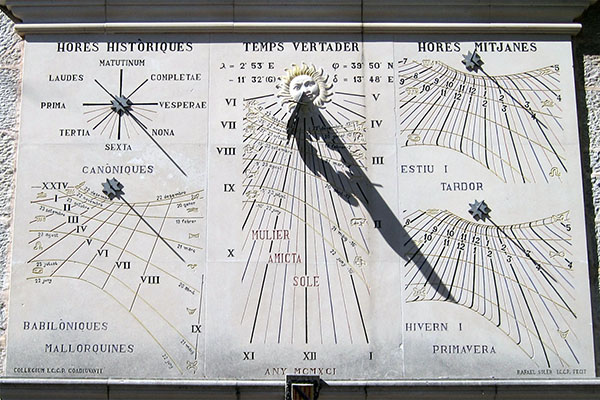
Addendum: I just wanted to show you this magnificent sundial, in the Monastery of Lluc, in Mallorca, Spain.
Sundial in the Monastery of Lluc

This sundial has five separate faces:

Top left shows the canonical hours. At sunrise (no matter what time sunrise happens to be), the shadow of the stick indicates the liturgy of Prime. Sext occurs at solar noon, when the sun is directly overhead, with Terce halfway between Prime and Sext. Vespers is at sunset (again, regardless of the modern clock time), with Nones halfway between Sext and Vespers. The night time hours of Complice, Matins, and Lauds are marked above the horizontal (and in fact would correctly indicate the times if the Earth were transparent, so the sun could cast a shadow from underneath the horizon).

Bottom left shows a nodus sundial, the tip of the stick marking “Babylonian” hours, which were used in Mallorca historically. This counts 0 (or 24) at sunrise, and then equal numbered hours thereafter. The vertical position of the nodus shadow marks the date (similar to the Krakow sundial above).

The central dial is a gnomon indicating “true solar time”. The shadow of the edge of the gnomon indicates the solar hour.

Finally the two dials on the right are nodus dials, showing mean time horizontally, and date of the year vertically. The top dial is to be read in summer and autumn, whole the lower dial is for winter and spring. It looks like the dials also include a daylight saving adjustment, assuming it begins and ends on the equinoxes!

The time (confirmed from the photo EXIF data) is 4:15 pm, and the date is 9 September, 12 days before the autumnal equinox (read on the top right dial).

References:

[1] “Polar sun path chart program”, University of Oregon Solar Radiation Monitoring Laboratory. http://solardat.uoregon.edu/PolarSunChartProgram.html

[2] Ritner, Robert. “Oriental Institute Museum Notes 16: Two Egyptian Clepsydrae (OIM E16875 and A7125)”. Journal of Near Eastern Studies, 75, p. 361-389, 2016. https://doi.org/10.1086/687296