22. Plate tectonics

Following the rediscovery of the New World by Europeans in the 15th century, the great seafaring nations of Europe rapidly mapped the eastern coastlines of the Americas. Demand for maps grew, not just of the New World, but of the Old as well. This made it possible for a young man (unfortunately women were shepherded into more domestic jobs) to seek his fortune as a mapmaker. One such man was Abraham Ortelius, who lived in Antwerp in the Duchy of Brabant (now part of Belgium).

Abraham Ortelius

Abraham Ortelius, painted by Peter Paul Rubens. (Public domain image from Wikimedia Commons.)

In 1547, at the age of 20, Ortelius began his career as a map engraver and illuminator. He travelled widely across Europe, and met cartographer and mapmaker Gerardus Mercator (15 years his senior, and whose map projection we met in 14. Map projections) in 1554. The two became friends and travelled together, reinforcing Ortelius’s passion for cartography, as well as the technical and scientific aspects of geography. Ortelius went on to produce and publish several maps of his own, culminating in his 1570 publication, Theatrum Orbis Terrarum (“Theatre of the Orb of the World”), now regarded as the first modern atlas of the world (as then known). Previously maps had been sold as individual sheets or bespoke sets customised to specific needs, but this was a curated collection intended to cover the entire known world in a consistent style. The Theatrum was wildly successful, running to 25 editions in seven languages by the time of Ortelius’s death in 1598.

Theatrum Orbis Terrarum

World map plate from Theatrum Orbis Terrarum. (Public domain image from Wikimedia Commons.)

Being intimately familiar with his maps, Ortelius noticed a strange coincidence. In his publication Thesaurus Geographicus (“Geographical Treasury”) he wrote about the resemblance of the shapes of the east coast of the Americas to the west coasts of Europe and Africa across the Atlantic Ocean. He suggested that the Americas may have been “torn away from Europe and Africa … by earthquakes and floods. … The vestiges of the rupture reveal themselves, if someone brings forward a map of the world and considers carefully the coasts of the three.” This is the first known suggestion that the uncanny jigsaw-puzzle appearance of these coastlines might not be a coincidence, but rather a vestige of the continents actually having fitted together in the past.

Ortelius wasn’t the only one to make this observation and reach the same conclusion. Over the next few centuries, similar thoughts were proposed by geographers Theodor Christoph Lilienthal, Alexander von Humboldt, Antonio Snider-Pellegrini, Franklin Coxworthy, Roberto Mantovani, William Henry Pickering, Frank Bursley Taylor, and Eduard Suess. Suess even suggested (in 1885) that at some time in the past all of the Earth’s continents were joined in a single mass, which he gave the name “Gondwana”.

Snider-Pellegrini illustration

Illustration by Antonio Snider-Pellegrini, of his proposal that the Americas had once been adjacent to Europe and Africa. (Public domain image from Wikimedia Commons.)

Although many people had suggested that the continents had once been adjacent, nobody had produced any supporting evidence, nor any believable mechanism for how the continents could move. This changed in 1912, when the German meteorologist and polar scientist Alfred Wegener proposed the theory which he named continental drift. He began with the same observation of the jigsaw nature of the continent shapes, but then he applied the scientific method: he tested his hypothesis. He looked at the geology of coastal regions, examining the types of rocks, the geological structures, and the types of fossils found in places around the world. What he found were remarkable similarities in all of these features on opposite sides of the Atlantic Ocean, and in other locations around the world where he supposed that now-separate landmasses had once been in contact. This is exactly what you would expect to find if a long time ago the continents had been adjacent: plants and animals would have a range spanning across what would later split open and become an ocean, and geological features would be consistent across the divide as well[1].

fossil distribution across continents

Map of similar fossils of non-sea-going lifeforms found across landmasses, providing evidence that they were once joined. (Public domain image from Wikimedia Commons.)

In short, Wegener found and presented evidence in support of his hypothesis. He presented his theory, with the evidence he had gathered, in his 1915 book, Die Entstehung der Kontinente und Ozeane (“The Emergence of the Continents and Oceans”). He too proposed that all of the Earth’s continents were at one stage joined into a single landmass, which he named Pangaea (Greek for “all Earth”)[2].

But Wegener had two problems. Firstly, he still didn’t know how continents could possibly move. Secondly, he wasn’t a geologist, and so the establishment of geologists didn’t take him very seriously, to say the least. But as technology advanced, detailed measurements of the sea floor were made beginning in the late 1940s, including the structures, rock types, and importantly the magnetic properties of the rocks. Everything that mid-20th century geologists found was consistent with the existence of a large crack running down the middle of the Atlantic Ocean, where new rock material was welling up from beneath the ocean floor, and spreading outwards. They also found areas where the Earth’s crust was being squashed together, and either being thrust upwards like wrinkles in a tablecloth (such as the Himalayas mountain range), or plunged below the surface (such as along the west coast of the Americas).

Confronted with overwhelming evidence—which it should be pointed out was both consistent with many other observations, and also explained phenomena such as earthquakes and volcanoes better than older theories—the geological consensus quickly turned around[3]. The newly formulated theory of plate tectonics was as unstoppable as continental drift itself, and revolutionised our understanding of geology in the same way that evolution did for biology. Suddenly everything made sense.

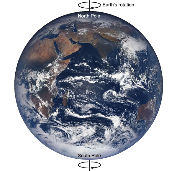
The Earth, we now know, has a relatively thin, solid crust of rocks making up the continents and sea floors. Underneath this thin layer is a thick layer known as the mantle. The uppermost region of the mantle is solid and together with the crust forms what is known as the lithosphere. Below this region, most of the mantle is hot enough that the material there is visco-elastic, meaning it behaves like a thick goopy fluid, deforming and flowing under pressure. This viscous region of the mantle is known as the asthenosphere.

structure of the Earth

Diagram of the Earth’s layers. The lithosphere region is not to scale and would appear much thinner if drawn to scale. (Public domain image from Wikimedia Commons.)

Heat wells up from the more central regions of the Earth (generated by radioactive decay). Just like a boiling pot of water, this sets up convection currents in the asthenosphere, where the hot material flows upward, then sideways, then back down to form a loop. The sideways motion at the top of these convection cells is what carries the crust above, moving it slowly across the surface of the planet.

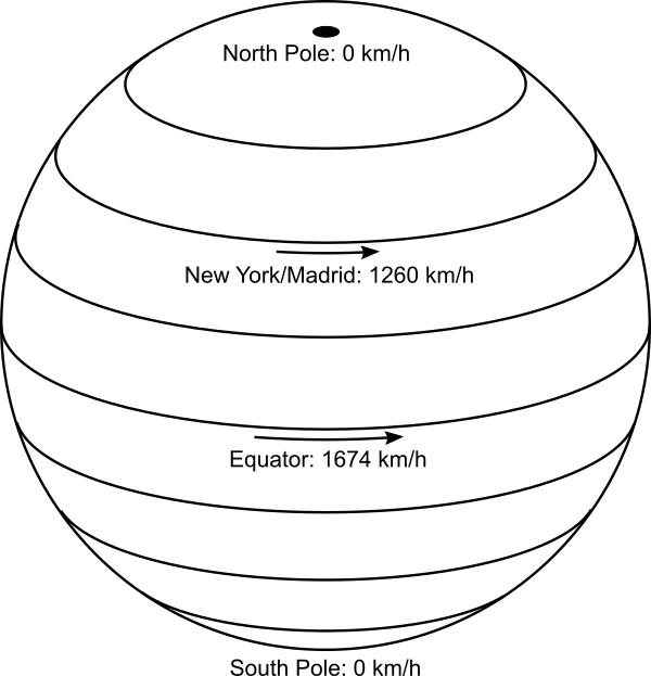
The Earth’s crust is broken into pieces, called tectonic plates, which fit together along their edges. Each plate is relatively rigid, but moves relative to the other plates. Plates move apart where the upwelling of the convection cells occurs, such as along the Mid-Atlantic Ridge (the previously mentioned crack in the Atlantic Ocean floor), and collide and subduct back down along other edges. At some plate boundaries the plates slide horizontally past one another. All of this motion causes earthquakes and volcanoes, which are mostly concentrated along the plate boundaries. The motion of the plates is slow, around 10-100 millimetres a year. This is too slow to notice over human history, except with high-tech equipment. GPS navigation and laser ranging systems can directly measure the movements of the continents relative to one another, confirming the speed of the motion.

The tectonic plates, then, are shell-like pieces of crust that fit together to form the spherical shape of the Earth’s surface. An equal amount of area is lost at subduction zones as is gained by spreading on sea-floors and in places such as Africa’s Rift Valley, keeping the Earth’s surface area constant. As the plates drift around, they don’t change in size or deform geometrically very much.

Earth's tectonic plates

Sketch of the major tectonic plates as they fit together to form the surface of the Earth.

All of this is consistent and supported by many independent pieces of evidence. Direct measurement shows that the continents are moving, so it’s really just a matter of explaining how. But the motions of the tectonic pates only make sense on a globe.

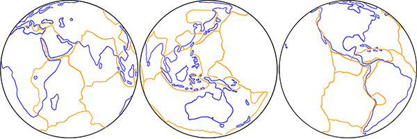
If the Earth were flat, then sure, you could conceivably have some sort of underlying structure that supports the same sort of convection cells and geological processes of spreading and subduction, leading to earthquakes and volcanoes, and so on. But look at the shapes of the tectonic plates.

Earth's tectonic plates on a flat Earth

Sketch of the major tectonic plates on a flat Earth.

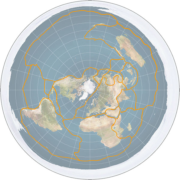
Because of the distortions in the shape of the map relative to a globe, the tectonic plates need to change shape and size as they move across the surface. Not only that, but consider the Antarctic plate, which is a perfectly normal plate on the globe. On the typical Flat Earth model where Antarctica is a barrier of ice around the edge of the circle, the Antarctic plate is a ring. And when it moves, it not only has to deform in shape, but crust has to disappear off one side of the disc and appear on the other side.

So plate tectonics, the single most fundamental and important discovery in the entire field of geology, only makes sense because the Earth is a globe.

Notes:

[1] For readers interested in this particular aspect of continental drift, I’ve previously written about it at greater length in the annotation to this Irregular Webcomic! http://www.irregularwebcomic.net/1946.html

[2] Pangaea is now the accepted scientific term for the unified landmass when all the continents were joined. Eduard Suess’s Gondwana lives on as the name now used to refer to the conjoined southern continents before merging with the northern ones to form Pangaea.

[3] Alfred Wegener is often cited by various people in support of the idea that established science often laughs at revolutionary ideas proposed by outsiders, only for the outsider to later be vindicated. Often by people proposing outlandish or fringe science theories that defy not only scientific consensus but also the boundaries of logic and reason. What they fail to point out is that in all the history of science, Wegener is almost the only such case, whereas almost every other outsider proposing a radical theory is shown to be wrong. As Carl Sagan so eloquently put it in Broca’s Brain:

The fact that some geniuses were laughed at does not imply that all who are laughed at are geniuses. They laughed at Columbus, they laughed at Fulton, they laughed at the Wright brothers. But they also laughed at Bozo the Clown.

Colour naming experiment, part 2

A couple of months ago I wrote about a colour naming experiment that I was planning to perform with the students in the Science Club that I volunteer to teach at a local primary school. You may want to go back and review that post, as today I’m going to talk about the results of the experiment.

I go back to teach the Science Club again next Monday, so it was time to sit down and analyse the results. I went through the answer sheets that the children filled (there were 12 of them, one of the students was sick that day) in and typed the names of each colour from each child into a spreadsheet. I thought it could accumulate the totals and make pie charts for me, but I discovered that I needed to manipulate the data first using a COUNT() function or something. While pondering whether to do this or to export all the data to CSV and write a Python program to do the gruntwork, one of my friends pointed me at this pertinent xkcd comic.

That inspired me to do all the processing in Python, and I discovered to my pleasant surprise that my machine already had the matplotlib library installed, so I could produce pie charts directly from Python. (Without sucking the munged data back into a spreadsheet again to to the graphs as I feared I might have to do.) Anyway, long story short, here are the results (click the image for a huge readable version):

lots of pie charts

[I should point out that of course the colours in this image as displayed on your computer screen are not exactly the same as the colours printed on the paint sample charts that I assembled and gave to the children, because of the vagaries of colour calibration of monitors and the limited colour gamut of the graphic file format. Consider them only an approximation of what the children actually saw.]

That’s a lot to digest. Here are some highlights:

Firstly, here are the colours for which the largest number of people agreed on the name:

most agreed colours

Out of 12 people, three colours had 7 of them agree on what the colour should be called, and one colour had 6 people agree. There was no colour in the entire sample for which a 2/3 majority agreed on the name, let alone anything approaching unanimity. 31 of the 35 colours sampled had less than half the people agree on the name of the colour.

At the other end of the spectrum (ha ha!), here are the colours that had the most different names assigned:

most disagreed colours

Four colours had, in a sample of just 12 people, nine different colour names assigned to them. Three of these colours also had one or two students unable to decide on a name in the time allowed, and they left it blank on the answer sheet.

I should point out that names that were on the answer sheet are written in lower case with an initial capital, while names that the students chose to write-in are written in all-capitals, and “NONE” indicates a student who didn’t give that colour any name. I gave them what I thought was a generous amount of time, but some of the students complained that it was too difficult and obviously struggled to complete the task. I did ask them beforehand if any of them knew they were colourblind, and none of them did. While there are two or three somewhat bizarre names assigned (“brown” for the colour that most kids identified as “lavender” for example), I don’t see any real evidence that any of them are indeed colourblind (confusing reds and greens, for example).

Another thing you’ll notice if you examine the large image of all the pie charts is that the same colour word is used for several different colours, many times over. For example, “olive” is used to describe three different shades of green, as is “tree green”, while “carrot” is used to describe three different shades of orange, “turquoise” is used for three different shades of blue, and so on.

The conclusion from all of this? This basically confirms the research findings that I quoted in the first post on this experiment – that people are incredibly inconsistent when it comes to naming colours. If you say “olive”, or “carrot”, or “turquoise”, people have a reasonable general idea what sort of colour you mean, but many will not be thinking of the same shade of colour that you will, and will fail to pick it out of a line-up.

The second part of the experiment – showing that people are inconsistent with themselves would require me to ask the children to do this entire task a second time. I was planning on doing this, but given how much some of them complained about it the first time, I think I’ll spare them doing it again, and do something a bit more fun with them instead. Hopefully however, when I show them the results on Monday they’ll think it’s pretty amazing and cool, like I do.

20.a Rocket launch sites update

I’ve been busy this week so there won’t be a new article until next week, but today there was an interesting news article on ABC News: NASA scientists visit NT site which could eventually blast rockets to the Moon.

NASA is interested in building a rocket launch site in Australia. Where have they chosen to build it? Near Nhulunbuy, in the far north of the Northern Territory. As well as Cape York Peninsula (mentioned in 20. Rocket launch sites), this is also pretty much as close to the equator as you can get within Australia. In fact it’s even a tiny bit further north than Weipa.

21. Zodiacal light

Brian May is best known as the guitarist of the rock band Queen.[1] The band formed in 1970 with four university students: May, drummer Roger Taylor (not the drummer Roger Taylor who later played for Duran Duran), singer Farrokh “Freddie” Bulsara, and bassist Mike Grose, playing their first gig at Imperial College in London on 18 July. Freddie soon changed his surname to Mercury, and after trying a few other bass players the band settled on John Deacon.

Brian May 1972

Brian May, student, around 1972, with some equipment related to his university studies. (Reproduced from [2].)

While May continued his studies, the fledgling band recorded songs, realeasing a debut self-titled album, Queen, in 1973. It had limited success, but they followed up with two more albums in 1974: Queen II and Sheer Heart Attack. These met with much greater success, reaching numbers 5 and 2 on the UK album charts respectively. With this commercial success, Brian May decided to drop his academic ambitions, leaving his Ph.D. studies incomplete. Queen would go on to become one of the most successful bands of all time.

Lead singer Freddie Mercury died of complications from AIDS in 1991. This devastated the band and they stopped performing and recording for some time. In 1994 they released a final studio album, consisting of reworked material recorded by Mercury before he died plus some new recording to fill gaps. And since then May and Taylor have performed occasional concerts with guest singers, billed as Queen + (singer).

The down time and the wealth accumulated over a successful music career allowed Brian May to apply to resume his Ph.D. studies in 2006. He first had to catch up on 33 years of research in his area of study, then complete his experimental work and write up his thesis. He submitted it in 2007 and graduated as a Doctor of Philosophy in the field of astrophysics in 2008.

Brian May 2008

Dr Brian May, astrophysicist, in 2008. (Public domain image from Wikimedia Commons.)

May’s thesis was titled: A Survey of Radial Velocities in the Zodiacal Dust Cloud.[2] May was able to catch up and complete his thesis because the zodiacal dust cloud is a relatively neglected topic in astrophysics, and there was only a small amount of research done on it in the intervening years.

We’ve already met the zodiacal dust cloud (which is also known as the interplanetary dust cloud). It is a disc of dust particles ranging from 10 to 100 micrometres in size, concentrated in the ecliptic plane, the plane of orbit of the planets. Backscattered reflection off this disc of dust particles causes the previously discussed gegenschein phenomenon, visible as a glow in the night sky at the point directly opposite the sun (i.e. when the sun is hidden behind the Earth).

But that’s not the only visible evidence of the zodiacal dust cloud. As stated in the proof using gegenschein:

Most of the light is scattered by very small angles, emerging close to the direction of the original incoming beam of light. As the scattering angle increases, less and less light is scattered in those directions. Until you reach a point somewhere around 90°, where the scattering is a minimum, and then the intensity of scattered light starts climbing up again as the angle continues to increase. It reaches its second maximum at 180°, where light is reflected directly back towards the source.

This implies that there should be another maximum of light scattered off the zodiacal dust cloud, along lines of sight close to the sun. And indeed there is. It is called the zodiacal light. The zodiacal light was first described scientifically by Giovanni Cassini in 1685[3], though there is some evidence that the phenomenon was known centuries earlier.

Title page of Cassini's discovery

Title page of Cassini’s discovery announcement of the zodiacal light. (Reproduced from [3].)

Unlike gegenschein, which is most easily seen high overhead at midnight, the zodiacal light is best seen just after sunset or just before dawn, because it appears close to the sun. The zodiacal light is a broad, roughly triangular band of light which is broadest at the horizon, narrowing as it extends up into the sky along the ecliptic plane. The broad end of the zodiacal light points directly towards the direction of the sun below the horizon. This in itself provides evidence that the sun is in fact below the Earth’s horizon at night.

zodiacal light at Paranal

Zodiacal light seen from near the tropics, Paranal Observatory, Chile. Note the band of light is almost vertical. (Creative Commons Attribution 4.0 International image by ESO/Y.Beletsky, from Wikimedia Commons.)

The zodiacal light is most easily seen in the tropics, because, as Brian May writes: “it is here that the cone of light is inclined at a high angle to the horizon, making it still visible when the Sun is well below the horizon, and the sky is completely dark.”[2] This is because the zodiacal dust is concentrated in the plane of the ecliptic, so the reflected sunlight forms an elongated band in the sky, showing the plane of the ecliptic, and the ecliptic is at a high, almost vertical angle, when observed from the tropics.

zodiacal light at Washington

Zodiacal light observed from a mid-latitude, Washington D.C., sketched by Étienne Léopold Trouvelot in 1876. The band of light is inclined at an angle. (Public domain image from Wikimedia Commons.)

Unlike most other astronomical phenomena, this shows us in a single glance the position of a well-defined plane in space. From tropical regions, we can see that the plane is close to vertical with respect to the ground. At mid-latitudes, the plane of the zodiacal light is inclined closer to the ground plane. And at polar latitudes the zodiacal light is almost parallel to the ground. These observations show that at different latitudes the surface of the Earth is inclined at different angles to a visible reference plane in the sky. The Earth’s surface must be curved (in fact spherical) for this to be so.

zodiacal light from Europe

Zodiacal light observed from higher latitude, in Europe. The band of light is inclined at an even steeper angle. (Public domain image reproduced from [4].)

[I could not find a good royalty-free image of the zodiacal light from near-polar latitudes, but here is a link to copyright image on Flickr, taken from Kodiak, Alaska. Observe that the band of the zodiacal light (at left) is inclined at more than 45° from the vertical. https://www.flickr.com/photos/photonaddict/39974474754/ ]

zodiacal light at Mauna Kea

Zodiacal light seen over the Submillimetre Array at Mauna Kea Observatories. (Creative Commons Attribution 4.0 International by Steven Keys and keysphotography.com, from Wikimedia Commons.)

Furthermore, at mid-latitudes the zodiacal light is most easily observed at different times in the different hemispheres, and these times change with the date during the year. Around the March equinox, the zodiacal light is best observed from the northern hemisphere after sunset, while it is best observed from the southern hemisphere before dawn. However around the September equinox it is best observed from the northern hemisphere before dawn and from the southern hemisphere after sunset. It is less visible in both hemispheres at either of the solstices.

seasonal variation in zodiacal light from Tenerife

Seasonal variation in visibility of the zodiacal light, as observed by Brian May from Tenerife in 1971. The horizontal axis is day of the year. The central plot shows time of night on the vertical axis, showing periods of dark night sky (blank areas), twilight (horizontal hatched bands), and moonlight (vertical hatched bands). The upper plot shows the angle of inclination of the ecliptic (and hence the zodiacal light) at dawn, which is a maximum of 87° on the September equinox, and a minimum of 35° on the March equinox. The lower plot shows the angle of inclination of the ecliptic at sunset, which is a maximum of 87° on the March equinox. (Reproduced from [2].)

This change in visibility is because of the relative angles of the Earth’s surface to the plane of the dust disc. At the March equinox, northern mid-latitudes are closest to the ecliptic at local sunset, but far from the ecliptic at dawn, while southern mid-latitudes are close to the ecliptic at dawn and far from it at sunset. The situation is reversed at the September equinox. At the solstices, mid-latitudes in both hemispheres are at intermediate positions relative to the ecliptic.

seasonal variation of Earth with respect to ecliptic

Diagram of the Earth’s tilt relative to the ecliptic, showing how different latitudes are further from or closer to the ecliptic at certain times of year and day.

So the different seasonal visibility and angles of the zodiacal light are also caused by the fact that the Earth is spherical, and inclined at an angle to the ecliptic plane. This natural explanation does not carry over to a flat Earth model, and none of the observations of the zodiacal light have any simple explanation.

References:

[1] Google search, “what is brian may famous for”, https://www.google.com/search?q=what+is+brian+may+famous+for (accessed 2019-07-23).

[2] May, B. H. A Survey of Radial Velocities in the Zodiacal Dust Cloud. Ph.D. thesis, Imperial College London, 2008. https://doi.org/10.1007%2F978-0-387-77706-1

[3] Cassini, G. D. “Découverte de la lumière celeste qui paroist dans le zodiaque” (“Discovery of the celestial light that resides in the zodiac”). De l’lmprimerie Royale, par Sebastien Mabre-Cramoisy, Paris, 1685. https://doi.org/10.3931/e-rara-7552

[4] Guillemin, A. Le Ciel Notions Élémentaires D’Astronomie Physique, Libartie Hachette et Cie, Paris, 1877. https://books.google.com/books?id=v6V89Maw_OAC

20. Rocket launch sites

Suppose you are planning to build an orbital rocket launching facility. Where are you going to put it? There are several issues to consider.

  • You want the site to be on politically friendly and stable territory. This strongly biases you to building it in your own country, or a dependent territory. Placing it close to an existing military facility is also useful for logistical reasons, especially if any of the space missions are military in nature.
  • You want to build it far enough away from population centres that if something goes catastrophically wrong there will be minimal damage and casualties, but not so far away that it is logistically difficult to move equipment and personnel there.
  • You want to place the site to take advantage of the fact that the rocket begins its journey with the momentum it has from standing on the ground as the Earth rotates. This is essentially a free boost to its launch speed. Since the Earth rotates west to east, the rocket stationary on the pad relative to the Earth actually begins with a significant momentum in an easterly direction. Rocket engineers would be crazy to ignore this.

One consequence of the rocket’s initial momentum is that it’s much easier to launch a rocket towards the east than towards the west. Launching towards the east, you start with some bonus velocity in the same direction, and so your rocket can get away with being less powerful than otherwise. This represents a serious saving in cost and construction difficulty. If you were to launch a rocket towards the west, you’d have to engineer it to be much more powerful, since it first has to overcome its initial eastward velocity, and then generate the entirety of the westward velocity from scratch. So virtually no rockets are ever launched towards the west. Rockets are occasionally launched to the north or south to put their payloads into polar orbits, but most are placed into so-called near-equatorial orbits that travel substantially west-to-east.

In turn, this means that when selecting a launch site, you want to choose a place where the territory to the eastern side of the site is free of population centres, again to avoid disaster if something goes wrong during a launch. The easiest way to achieve this is to place your launch site on the eastern coast of a landmass, so the rockets launch out over the ocean, though you can also do it if you can find a large unpopulated region and place your launch site near the western side.

When we look at the major rocket launch facilities around the world, they generally follow these principles. The Kennedy Space Center at Cape Canaveral is acceptably near Orlando, Florida, but far enough away to avoid disasters, and adjacent to Cape Canaveral Air Force Station for military logistics. It launches east over the Atlantic Ocean.

Kennedy Space Center

Kennedy Space Center launch pads A (foreground) and B (background). The Atlantic Ocean is to the right. (Public domain image by NASA.)

A NASA historical report has this to say about the choice of a launch site for Saturn series rockets that would later take humans to the moon[1]:

The short-lived plan to transport the Saturn by air was prompted by ABMA’s interest in launching a rocket into equatorial orbit from a site near the Equator; Christmas Island in the Central Pacific was a likely choice. Equatorial launch sites offered certain advantages over facilities within the continental United States. A launching due east from a site on the Equator could take advantage of the earth’s maximum rotational velocity (460 meters per second) to achieve orbital speed. The more frequent overhead passage of the orbiting vehicle above an equatorial base would facilitate tracking and communications. Most important, an equatorial launch site would avoid the costly dogleg technique, a prerequisite for placing rockets into equatorial orbit from sites such as Cape Canaveral, Florida (28 degrees north latitude). The necessary correction in the space vehicle’s trajectory could be very expensive – engineers estimated that doglegging a Saturn vehicle into a low-altitude equatorial orbit from Cape Canaveral used enough extra propellant to reduce the payload by as much as 80%. In higher orbits, the penalty was less severe but still involved at least a 20% loss of payload. There were also significant disadvantages to an equatorial launch base: higher construction costs (about 100% greater), logistics problems, and the hazards of setting up an American base on foreign soil.

Russia’s main launch facility, Baikonur Cosmodrome in Kazakhstan (former USSR territory), launches east over the largely uninhabited Betpak-Dala desert region. China’s Jiuquan Satellite Launch Centre launches east over the uninhabited Altyn-Tagh mountains. The Guiana Space Centre, the major launch facility of the European Space Agency, is located on the coast of French Guiana, an overseas department of France on the north-east coast of South America, where it launches east over the Atlantic Ocean.

Guiana Space Centre

Guiana Space Centre, French Guiana. The Atlantic Ocean is in the background. (Photo: ESA-Stephane Corvaja, released under ESA Standard Licence.)

Another consideration when choosing your rocket launching site is that the initial momentum boost provided by the Earth’s rotation is greatest at the equator, where the rotational speed of the Earth’s surface is greatest. At the equator, the surface is moving 40,000 km (the circumference of the Earth) per day, or 1670 km/h. Compare this to latitude 41° (roughly New York City, or Madrid), where the speed is 1260 km/h, and you see that our rockets get a free 400 km/h boost by being launched from the equator compared to these locations. So you want to place your launch facility as close to the equator as is practical, given the other considerations.

Rotation of Earth

Because the Earth is a rotating globe, the equatorial regions are moving faster than anywhere else, and provide more of a boost to rocket launch velocities.

The European Space Agency, in particular, has problems with launching rockets from Europe, because of its dense population, unavailability of an eastern coastline, and distance from the equator. This makes French Guiana much more attractive, even though it’s so far away. The USA has placed its major launch facility in just about the best location possible in the continental US. Anywhere closer to the equator on the east coast is taken up by Miami’s urban sprawl. The former USSR went for southern Kazakhstan as a compromise between getting as far south as possible, and being close enough to Moscow. China’s more southern and coastal regions are much more heavily populated, so they went with a remote inland area (possibly also to help keep it hidden for military reasons).

All of these facilities so far are in the northern hemisphere. There are no major rocket launch facilities in the southern hemisphere, and in fact only two sites from where orbital flight has been achieved: Australia’s Woomera Range Complex, which is a remote air force base chosen historically for military logistical reasons (including nuclear weapons testing as well as rocketry in the wake of World War II), and New Zealand’s Rocket Lab Launch Complex 1, a new private facility for launching small satellites, whose location was governed by the ability to privately acquire and develop land.

But if you were to build a major launch facility in the southern hemisphere, where would you put it?

A major space facility was first proposed for Australia in 1986, with plans for it to be the world’s first commercial spaceport. The proposed site? Near Weipa, on the Cape York Peninsula, essentially as close to the equator as it’s possible to get in Australia.

Site of Weipa in Australia

Site of Weipa in Australia. Apart from Darwin which is at almost exactly the same latitude, there is no larger town further north in Australia. (Adapted from a Creative Commons Attribution 4.0 International image by John Tann, from Wikimedia Commons.)

The proposal eventually floundered due to lack of money and protests from indigenous land owners, but there is now a current State Government inquiry into constructing a satellite launching facility in Queensland, again in the far north. As a news story points out, “From a very simple perspective, we’ve got potential launch capacity, being closer to the equator in a place like Queensland,” and “the best place to launch satellites from Australia is the coast of Queensland. The closer you are to the equator, the more kick you get from the Earth’s spin.”[2]

So rocket engineers in the southern hemisphere definitely want to build their launch facilities as close to the equator as practically possible too. Repeating what I said earlier, you’d be crazy not to. And this is a consequence of the fact that the Earth is a rotating globe.

On the other hand, if the Earth were flat and non-rotating (as is the case in the most popular flat Earth models), there would be no such incentive to build your launch facility anywhere compared to anywhere else, and equatorial locations would not be so coveted. And if the Earth were flat and rotating around the north pole, then you’d get your best bang for buck not near the equator, but near the rim of the rotating disc, where the linear speed of rotation is highest. If that were the case, then everyone would be clamouring to build their launch sites as close to Antarctica as possible, which is clearly not the case in the real (globular) world.

[1] Benson, C. D., Faherty, W. B. Moonport: A History of Apollo Launch Facilities and Operations. Chapter 1.2, NASA Special Publication-4204 in the NASA History Series, 1978. https://www.hq.nasa.gov/office/pao/History/SP-4204/contents.html (accessed 2019-07-15).

[2] “Rocket launches touted for Queensland as State Government launches space industry inquiry”. ABC News, 6 September 2018. https://www.abc.net.au/news/2018-09-06/queensland-shoots-for-the-stars-to-become-space-hub/10205686 (accessed 2019-07-15).

19. Bridge towers

When architects design and construction engineers build towers, they make them vertical. By “vertical” we mean straight up and down or, more formally, in line with the direction of gravity. A tall, thin structure is most stable if built vertically, as then the centre of mass is directly above the centre of the base area.

If the Earth were flat, then vertical towers would all be parallel, no matter where they were built. On the other hand, if the Earth is curved like a sphere, then “vertical” really means pointing towards the centre of the Earth, in a radial direction. In this case, towers built in different places, although all locally vertical, would not be parallel.

The Humber Bridge spans the Humber estuary near Kingston upon Hull in northern England. The Humber estuary is very broad, and the bridge spans a total of 2.22 kilometres from one bank to the other. It’s a single-span suspension bridge, a type of bridge consisting of two tall towers, with cables strung in hanging arcs between the towers, and also from the top of each tower to anchor points on shore. (It’s the same structural design as the more famous Golden Gate Bridge in San Francisco.) The cables extend in both directions from the top of each tower to balance the tension on either side, so that they don’t pull the towers over. The road deck of the bridge is suspended below the main cables by thinner cables that hang vertically from the main cables. The weight of the road deck is thus supported by the main cables, which distribute the load back to the towers. The towers support the entire weight of the bridge, so must be strong and, most importantly, exactly vertical.

The Humber Bridge

The Humber Bridge from the southern bank of the Humber. (Public domain image from Wikimedia Commons.)

The towers of the Humber Bridge rest on pylons in the estuary bed. The towers are 1410 metres apart, and 155.5 metres high. If the Earth were flat, the towers would be parallel. But they’re not. The cross-sectional centre lines at the tops of the two towers are 36 millimetres further apart than at the bases. Using similar triangles, we can calculate the radius of the Earth from these dimensions:

Radius = 155.5×1410÷0.036 = 6,090,000 metres

This gives the radius of the Earth as 6100 kilometres, close to the true value of 6370 km.

Size of the Earth from the Humber Bridge

Diagram illustrating use of similar triangles to determine the radius of the Earth from the Humber Bridge data. (Not to scale!)

If this were the whole story, it would pretty much be case closed at this point. However, despite a lot of searching, I couldn’t find any reference to the distances between the towers of the Humber Bridge actually being measured at the top and the bottom. It seems that the figure of 36 mm was probably calculated, assuming the curvature of the Earth, which makes this a circular argument (pun intended).

Interestingly, I did find a paper about measuring the deflection of the north tower of the Humber Bridge caused by wind loading and other dynamic stresses in the structure. The paper is primarily concerned with measuring the motion of the road deck, but they also mounted a kinematic GPS sensor at the top of the northern tower[1].

GPS sensor on Humber Bridge north tower

Kinematic GPS sensor mounted on the top of the north tower of the Humber Bridge. (Reproduced from [1].)

The authors carried out a series of measurements, and show the results for a 15 minute period on 7 March, 1996.

Deflections of Humber Bridge north tower

North-south deflection of the north tower of the Humber Bridge over a 15 minute period. The vertical axis is metres relative to a standard grid reference, so the full vertical range of the graph is 30 mm. (Reproduced from [1].)

From the graph, we can see that the tower wobbles a bit, with deflections of up to about ±10 mm from the mean position. The authors report that the kinematic GPS sensors are capable of measuring deflections as small as a millimetre or two. So from this result we can say that the typical amount of flexing in the Humber Bridge towers is smaller than the supposed 36 mm difference that we should be trying to measure. So, in principle, we could measure the fact that the towers are not parallel, even despite motion of the structure in environmental conditions.

A similar result is seen with the Severn Bridge, a suspension bridge over the Severn River between England and Wales. It has a central span of 988 metres, with towers 136 metres tall. A paper reports measurements made of the flexion of both towers, showing typical deflections at the top are less than 10 mm[2].

Deflections of Severn Bridge towers

Plot of deflection of the top of the suspension towers along the axis of the Severn Bridge. T1 and T2 (upper two lines) are measurements made by two independent sensors at the top of the west tower; T3 and T4 (lower lines) are measurements made by sensors on the east tower. Deflection is in units of metres, so the scale of the maximum deflections is about 10 mm. (Reproduced from [2].)

Okay, so we could in principle measure the mean positions of the tops of suspension bridge towers with enough precision to establish that the towers are further apart at the top than the base. A laser ranging system could do this with ease. Unfortunately, in all my searching I couldn’t find any citations for anyone actually doing this. (If anyone lives near the Humber Bridge and has laser ranging equipment, climbing gear, a certain disregard for authority, and a deathwish, please let me know.)

Something I did find concerned the Verrazzano-Narrows Bridge in New York City. It has a slightly smaller central span than the Humber Bridge, with 1298 metres between its two towers, but the towers are taller, at 211 metres. The tops of the towers are reported as being 41.3 mm further apart than the bases, due to the curvature of the Earth. There are also several citations backing up the statement that “the curvature of the Earth’s surface had to be taken into account when designing the bridge” (my emphasis).[3]

Verrazzano-Narrows Bridge

Verrazzano-Narrows Bridge, linking Staten Island (background) and Brooklyn (foreground) in New York City. (Public domain image from Wikimedia Commons.)

So, this prompts the question: Do structural engineers really take into account the curvature of the Earth when designing and building large structures? The answer is—of course—yes, otherwise the large structures they build would be flawed.

There is a basic correction listed in The Engineering Handbook (published by CRC) to account for the curvature of the Earth. Section 162.5 says:

The curved shape of the Earth… makes actual level rod readings too large by the following approximate relationship: C = 0.0239 D2 where C is the error in the rod reading in feet and D is the sighting distance in thousands of feet.[4]

To convert to metric we need to multiply the constant by the number of feet in a metre (because of the squared factor), giving the correction in metres = 0.0784×(distance in km)2. What this means is that over a distance of 1 kilometre, the Earth’s surface curves downwards from a perfectly straight line by 78.4 millimetres. This correction is well known among civil and structural engineers, and is applied in surveying, railway line construction, bridge construction, and other areas. It means that for engineering purposes you can’t treat the Earth as both flat and level over distances of around a kilometre or more, because it isn’t. If you treat it as flat, then a kilometre away your level will be off by 78.4 mm. If you make a surface level (as measured by a level or inclinometer at each point) over a kilometre, then the surface won’t be flat; it will be curved parallel to the curvature of the Earth, and 78.4 mm lower than flat at the far end.

An example of this can be found at the Volkswagen Group test track facility near Ehra-Lessien, Germany. This track has a circuit of 96 km of private road, including a precision level-graded straight 9 km long. Over the 9 km length, the curvature of the Earth drops away from flat by 0.0784×92 = 6.35 metres. This means that if you stand at one end of the straight and someone else stands at the other end, you won’t be able to see each other because of the bulge of the Earth’s curvature in between. The effect can be seen in this video[5].

One set of structures where this difference was absolutely crucial is the Laser Interferometer Gravitational-Wave Observatory (LIGO) constructed at two sites in Hanford, Washington, and Livingston, Louisiana, in the USA.

LIGO site at Hanford

The LIGO site at Hanford, Washington. Each of the two arms of the structure are 4 km long. (Public domain image from Wikimedia Commons.)

LIGO uses lasers to detect tiny changes in length caused by gravitational waves from cosmic sources passing through the Earth. The lasers travel in sealed tubes 4 km long, which are under high vacuum. Because light travels in a straight line in a vacuum, the tubes must be absolutely straight for the machine to work. The tubes are level in the middle, but over the 2 km on either side, the curvature of the Earth falls away from a straight line by 0.0784×22 = 0.314 metres. So either end of the straight tube is 314 mm higher than the centre of the tube. To build LIGO, they laid a concrete foundation, but they couldn’t make it level over the distance; they had to make it straight. This required special construction techniques, because under normal circumstances (such as Volkswagen’s track at Ehra-Lessien) you want to build things level, not straight.[6]

So, the towers of large suspensions bridges almost certainly are not parallel, due to the curvature of the Earth, although it seems nobody has ever bothered to measure this. But it’s certainly true that structural engineers do take into account the curvature of the Earth for large building projects. They have to, because if they didn’t there would be significant errors and their constructions wouldn’t work as planned. If the Earth were flat they wouldn’t need to do this and wouldn’t bother.

UPDATE 2019-07-10: NASA’s Jet Propulsion Laboratory has announced a new technique which they can use to detect millimetre-sized shifts in the position of structures such as bridges, using aperture synthesis radar measurements from satellites. So maybe soon we can have more and better measurements of the positions of bridge towers![7]

References:

[1] Ashkenazi, V., Roberts, G. W. “Experimental monitoring of the Humber bridge using GPS”. Proceedings of the Institution of Civil Engineers – Civil Engineering, 120, p. 177-182, 1997. https://doi.org/10.1680/icien.1997.29810

[2] Roberts, G. W., Brown, C. J., Tang, X., Meng, X., Ogundipe, O. “A Tale of Five Bridges; the use of GNSS for Monitoring the Deflections of Bridges”. Journal of Applied Geodesy, 8, p. 241-264, 2014. https://doi.org/10.1515/jag-2014-0013

[3] Wikipedia: “Verrazzano-Narrows Bridge”, https://en.wikipedia.org/wiki/Verrazzano-Narrows_Bridge, accessed 2019-06-30. In turn, this page cites the following sources for the statement that the curvature of the Earth had to be taken into account during construction:

[3a] Rastorfer, D. Six Bridges: The Legacy of Othmar H. Ammann. Yale University Press, 2000, p. 138. ISBN 978-0-300-08047-6.

[3b] Caro, R.A. The Power Broker: Robert Moses and the Fall of New York. Knopf, 1974, p. 752. ISBN 978-0-394-48076-3.

[3c] Adler, H. “The History of the Verrazano-Narrows Bridge, 50 Years After Its Construction”. Smithsonian Magazine, Smithsonian Institution, November 2014.

[3d] “Verrazano-Narrows Bridge”. MTA Bridges & Tunnels. https://new.mta.info/bridges-and-tunnels/about/verrazzano-narrows-bridge, accessed 2019-06-30.

[4] Dorf, R. C. (editor). The Engineering Handbook, Second Edition, CRC Press, 2018, ISBN 978-0-849-31586-2.

[5] “Bugatti Veyron Top Speed Test”. Top Gear, BBC, 2008. https://youtu.be/LO0PgyPWE3o?t=200, accessed 2019-06-30.

[6] “Facts about LIGO”, LIGO Caltech web site. https://www.ligo.caltech.edu/page/facts, accessed 2019-06-30.

[7] “New Method Can Spot Failing Infrastructure from Space”, NASA JPL web site. https://www.jpl.nasa.gov/news/news.php?feature=7447, accessed 2019-07-10.

18. Polar motion

The Earth rotates around an axis, an imaginary straight line that all points not on the line move around in circles. The axis passes through the Earth’s North Pole and the South Pole. So the positions of the two Poles are defined by the position of the rotation axis.

Earth rotation and poles

The Earth’s North and South Poles are defined as the points where the axis of rotation passes through the surface of the planet. (Earth photo is a public domain image from NASA.)

Interestingly, the Earth’s rotation axis is not fixed – it moves slightly. This means that the Earth’s poles move.

The positions of the Earth’s poles can be determined by looking at the motions of the stars. As we’ve already seen, if you observe the positions of stars throughout a night, you will see that they rotate in the sky about a central point. The point on the Earth’s surface directly underneath the centre of rotation of the stars is one of the poles of the Earth.

Star trails in the northern hemisphere

Star trails above Little Hawk Lake in Canada. The northern hemisphere stars rotate around the North Celestial Pole (the point directly above the Earth’s North Pole). The bright spot in the centre is Polaris, the pole star. The circles are somewhat distorted in the upper corners of the photo because of the wide angle lens used. (Creative Commons Attribution 2.0 image by Dave Doe.)

Through the 19th century, astronomers were improving the precision of astronomical observations to the point where the movement of the Earth’s rotational poles needed to be accounted for in the positions of celestial objects. The motion of the poles was also beginning to affect navigation, because as the poles move, so does the grid system of latitude and longitude that ships rely on to reach their destinations and avoid navigational hazards. In 1899 the International Geodetic Association established a branch known as the International Latitude Service.

The fledgling International Latitude Service established a network of six observatories, all located close to latitude 39° 08’ north, spread around the world. The initial observatories were located in Gaithersburg, Maryland, USA; Cincinatti, Ohio, USA; Ukiah, California, USA; Mizusawa, Japan; Charjui, Turkestan; and Carloforte, Italy. The station in Charjui closed due to economic problems caused by war, but a new station opened in Kitab, Uzbekistan after World War I. Each observatory engaged in a program of observing the positions of 144 selected reference stars, and the data from each station were cross referenced to provide accurate measurements of the location of the North Pole.

International Latitude Service station in Ukiah

International Latitude Service station in Ukiah, California. (Public domain image from Wikimedia Commons.)

In 1962, the International Time Bureau founded the International Polar Motion Service, which incorporated the International Latitude Service observations and additional astronomical observations to provide a reference of higher accuracy, suitable for both navigation and defining time relative to Earth’s rotation. Finally in 1987, the the International Astronomical Union and the International Union of Geodesy and Geophysics established the International Earth Rotation Service (IERS), which took over from the International Polar Motion Service. The IERS is the current authority responsible for timekeeping and Earth-based coordinate systems, including the definitions of time units, the introduction of leap seconds to keep clocks in synch with the Earth’s rotation, and definitions of latitude and longitude, as well as measurements of the motion of the Earth’s poles, which are necessary for accurate use of navigation systems such as GPS and Galileo.

The motion of Earth’s poles can be broken down into three components:

1. An annual elliptical wobble. Over the period of a year, the Earth’s poles move around in an ellipse, with the long axis of the ellipse about 6 metres in length. In March, the North Pole is about 6 metres from where it is in September (though see below). This motion is generally agreed by scientists to be caused by the annual shift in air pressure between winter and summer over the northern and southern hemispheres. In particular there is an imbalance between the Northern Atlantic ocean and Asia, with higher air pressure over the ocean in the northern winter, but higher air pressure over the Asian continent in summer. This change in the mass distribution of the atmosphere is enough to cause the observed wobble.

Annual wobble of North Pole

Annual elliptical wobble of the Earth’s North Pole. Deviation is given in milliarcseconds of axial tilt; 100 milliarcseconds corresponds to a bit over 3 metres at ground level. (Figure adapted from [1].)

2. Superimposed on the annual elliptical wobble is another, circular, wobble, with a period of around 433 days. This is called the Chandler wobble, named after its discoverer, American astronomer Seth Carlo Chandler, who found it in 1891. The Chandler wobble occurs because the Earth is not a perfect sphere. The Earth is slightly elliptical, with the radius at the equator about 20 kilometres larger than the polar radius. When elliptical objects spin, they experience a slight wobble in the rotation known as free nutation. This is the sort of wobble seen in a spinning rugby ball or American football in flight (where the effect is exaggerated by the ball’s exaggerated elliptical shape). This wobble would die away over time, but is driven by changes in the mass distribution of cold and warm water in the oceans and high and low pressure systems in the atmosphere. The Chandler wobble has a diameter of about 9 metres at the poles.

The combined effect of the annual wobble and the Chandler wobble is that the North and South Poles move in a spiralling pattern, sometimes circling with a diameter up to 15 metres, then reducing down to about 3 metres, before increasing again. This beat pattern occurs over a period of about 7 years.

Annual _ Chandler wobble of North Pole

Graph showing the movement of the North Pole over a period of 4500 days (12.3 years), with time on the vertical axis and the spiralling motion mapped in the x and y axes. The motion tickmarks are 0.1 arcsecond in rotation angle of the axis apart, corresponding to about 3 metres of motion along the ground at the Pole. (Public domain image from Wikimedia Commons.)

3. The third and final motion of the Earth’s poles is a systematic drift, of about 200 millimetres per year. Since 1900, the central point of the spiral wobbles of the North Pole has drifted by about 20 metres. This drift is caused by changes in the mass distribution of Earth due to shifts in its structure: movement of molten rock in the mantle, isostatic rebound of crust following the last glacial period, and more recently the melting of the Greenland ice sheet. The melting of the Greenland ice sheet in the last few decades has shifted the direction of polar drift dramatically; one of the serious indications of secondary changes to the Earth caused by human-induced climate change. Changes in Earth’s mass distribution alter its rotational moment of inertia, and the rotational axis adjusts to conserve angular momentum.

Motion of North Pole since 1900

Plot of motion of the North Pole since 1900. The actual position of the Pole from 2008 to 2014 is shown with blue crosses, showing the annual and Chandler wobbles. The mean position (i.e. the centre of the wobbles) is shown for 1900 to 2014 as the green line. The pole has mostly drifted towards the 80° west meridian, but has changed direction dramatically since 2000. (Figure reproduced from [2].)

Each of the three components of Earth’s polar motion are: (a) observable with 19th century technology, (b) accurately measurable using current technology, and (c) understandable and quantitatively explainable using the fact that the Earth is a rotating spheroid and our knowledge of its structure.

If the Earth were flat, it would not be possible to reconcile the changes in position of the North and South Poles with the known shifts in mass distribution of the Earth. The Chandler wobble would not even have any reason to exist at close to its observed period unless the Earth was an almost spherical ellipsoid.

References:

[1] Höpfner, J. “Polar motion at seasonal frequencies”. Journal of Geodynamics, 22, p. 51-61, 1996. https://doi.org/10.1016/0264-3707(96)00012-9

[2] Dick, W., Thaller, D. IERS Annual Report 2013. International Earth Rotation Service, 2014. https://www.iers.org/IERS/EN/Publications/AnnualReports/AnnualReport2013.html

17. Light time corrections

In the 16th century, the naval powers of Europe were engaged in a race to explore and colonise lands previously unknown to Europeans (though many were of course already inhabited), and reap the rewards of the new found resources. They were limited by the accuracy of navigation at sea. Determining latitude was a relatively simple matter of sighting the angle of a star or the sun through a sextant. But because of the daily rotation of the Earth, determining the longitude by sighting a celestial object required knowing the time of day. Mechanical clocks of the era were rendered useless by the rocking of a ship, making this a major problem.

Solving the problem would give such an advantage to the country holding the secret that in 1598 King Philip III of Spain offered a prize of 6000 ducats plus an annual pension of 2000 ducats for life to whoever could devise a means of measuring longitude at sea. In 1610 the prize was still unclaimed, and in that year Galileo Galilei trained his first telescope on Jupiter, becoming the first person to observe the planet’s largest four moons. He studied their movements, and a couple of years later had produced orbital tables that allowed their positions to be calculated months or years in advance. These tables included the times when a moon would slip into Jupiter’s shadow, and be eclipsed, disappearing from view because it no longer reflected sunlight.

Galileo wrote to King Philip in 1616, proposing a method of telling the time at sea by observing the eclipses of Jupiter’s moons. One could pinpoint the time by observing an eclipse, and then use an observation of a star to calculate the longitude. Although the method could work in principle, observing an eclipse of a barely visible object through the narrow field of view of a telescope while standing on a rocking ship was practically impossible, and it never worked in practice.

Jupiter and Io

Jupiter and its innermost large moon, Io, as seen by NASA’s Cassini space probe. (Galileo’s view was nowhere near as good as this!) (Public Domain image by NASA.)

By the 1660s, Giovanni Cassini had developed Galileo’s method as a way of measuring precise longitudes on land, as an aid to calculating distances and making accurate maps. In 1671 Cassini moved to take up directorship of the Royal Observatory in Paris. He dispatched his assistant Jean Picard to Uraniborg, the former observatory of Tycho Brahe, near Copenhagen, partly to make measurements of eclipses of Jupiter’s moon Io, to accurately calculate the longitude difference between the two observatories. Picard himself employed the assistance of a young Dane named Ole Rømer.

Ole Rømer

Portrait of Ole Rømer by Jacob Coning. (Public domain image from Wikimedia Commons.)

The moon Io orbits Jupiter every 42.5 hours and is close enough to be eclipsed on each orbit, so an eclipse is visible every few days, weather and daylight hours permitting. After observing well over 100 eclipses, Rømer moved to Paris to assist Cassini himself, and continued recording eclipses of Io over the next few years. In these observations Cassini noticed some odd discrepancies. In particular, the time between successive eclipses got shorter when the Earth was approaching Jupiter in its orbit, and longer several months later when the Earth was moving away from Jupiter. Cassini realised that this could be explained if the light from Io did not arrive at Earth instantaneously, but rather took time to travel the intervening distance. When the Earth is closer to Jupiter, the light has less distance to cover, so the eclipse appears to occur earlier, and vice versa: when the Earth is further away the eclipse appears to be later because the light takes longer to reach Earth. Cassini made an announcement to this effect to the French Academy of Sciences in 1676.

Ole Rømer's eclipse notes

Ole Rømer’s notebook showing recordings of the dates and times of eclipses of Io from 1667 to 1677. “Imm” means immersion into Jupiter’s shadow, and “Emer” means emergence from Jupiter’s shadow. (Public domain image from Wikimedia Commons.)

However, it was common wisdom at the time that light travelled instantaneously, and Cassini later retreated from his suggestion and did not pursue it further. Rømer, on the other hand, was intrigued and continued to investigate. In 1678 he published his findings. He argued that as the Earth moved in its orbit away from Jupiter, successive eclipses would each occur with the Earth roughly 200 Earth-diameters further away from Jupiter than the previous one. Using the geometry of the orbit and his observations, Rømer calculated that it must take light approximately 11 minutes to cross a distance equal to the diameter of the Earth’s orbit. This is a little low—it actually takes about 16 and a half minutes—but it’s the right order of magnitude. So for the first time, we had some idea how fast light travels. And as we’ve just seen, the finite speed of light can have a significant effect on the observed timing of astronomical observations.

Ole Rømer's figure

Figure 2 from Rømer’s paper, illustrating the difference in distance between Earth and Jupiter between successive eclipses as Earth recedes from Jupiter (LK) and approaches Jupiter (FG). Reproduced from [1].

The finite speed of light means that astronomical events don’t occur when we see them. We only see the event after enough time has elapsed for the light to travel to Earth. This is important for events with precisely measurable times, such as eclipses, occultations, the brightness variations of variable stars, and the radio pulses of remote pulsars.

Not only do you need to correct for the time it takes light to reach Earth, but the correction is different depending on where you are on Earth. An observer observing an object that is directly overhead is closer to it than an observer seeing the same object on the horizon. The observer seeing the object on the horizon is further away by the radius of the Earth. The radius of the Earth is 6370 km, and it takes light a little over 21 milliseconds to travel this distance. So astronomical events observed on the horizon appear to occur 21 milliseconds later than they do to someone observing the same event overhead. This effect is significant enough to be mentioned explicitly in a paper discussing the timing of variable stars:

“More disturbing effects become significant which require more conventions and more complex reduction procedures. By far the biggest effect is the topocentric light-time correction (up to 20 msec).”[2]

Topocentric refers to measuring from a specific point on the surface of the Earth. Depending where on Earth you are, the timing of observed astronomical events can appear to vary by up to 20 ms.

Not only does the light travel time affect the observed time of astronomical events, it also affects the observed position of some astronomical objects, most importantly solar system objects that move noticeably over the few hours that light takes to travel to Earth from them. When we observe an object such as a planet or an asteroid, we see it in the position that it was when the light left it, not where it is at the time that we see it. So for such objects, a corrected position needs to be calculated. The correction in observed position of a moving astronomical object due to the finite speed of light is, somewhat confusingly, also known as light time correction.

Light time correction of observed position is critical in determining the orbits of bodies such as asteroids and comets with accuracy. A paper describing general methods for determining orbital parameters from observations notes that Earth-based observations are necessarily topocentric, and states in the description of the method that:

“In the case of asteroid or comet orbits, the light-time correction has been computed.”[3]

Finally, a recent paper on determining the orbital parameters of near-Earth objects (which pose a potential threat of catastrophic collision with Earth) points out, where ρ is the topocentric distance:

“Note that we include a light-time correction by subtracting ρ/c from the observed epochs for any propagation computation with c as speed of light.”[4]

All of these corrections, which must be applied to astronomical observations where either (a) timings must be known to less than a second or (b) positions must be known accurately to determine orbits, are different by a light travel time of 21 ms for observers looking at objects directly overhead versus observers looking towards the horizon. And in between the light time corrections are 21 ms × (1 minus the sine of the observation zenith angle).

light time corrections on a spherical Earth

Diagram of light time corrections. Observation points where an astronomical event are on the horizon are 6370 km further away than observation points where the event is directly overhead.

This implies that places on Earth where an astronomical object appears near the horizon are a bit over 6000 km further away from the object than the location where the object is directly overhead. This is true no matter which object is observed, meaning it is independent of which position on Earth is directly under it. This cannot be so if the Earth is flat.

light time corrections on a flat Earth

Geometry of light time corrections on a flat Earth.

Observation points on Earth where an astronomical event is overhead and on the horizon are separated by 10,000 km. If the Earth is flat, then the geometry must be something like that shown in the diagram above. The astronomical event is a distance x above the flat Earth, such that the distance from the event to a point 10,000 km along the surface is x plus the measured light travel time distance of 6370 km. Applying Pythagoras’s theorem:

(6370 + x)2 = 100002 + x2

Solving for x gives 4660 km. So measurements of light time correction imply that all astronomical events are 4660 km above the flat Earth. This means the elevation angle of the event seen from 10,000 km away is arctan(4660/10,000) = 25°, well above the horizon, which is inconsistent with observation (and the trigonometry of all the intermediate angles doesn’t work either). It’s also easy to show by other observations that astronomical objects are not all at the same distance – some are thousands, millions, or more times further away than others, and they are all much further away than 4660 km.

So the measurement of light time corrections imply that observers on Earth are positioned on the surface of a sphere. In other words, that the Earth is spherical in shape.

References:

[1] Rømer, O. (“A Demonstration Concerning the Motion of Light”.) Philosophical Transactions of the Royal Society, 12, p. 893-94, 1678. (Originally published in French as “Demonstration touchant le mouvement de la lumiere trouvé”. Journal des Sçavans, p. 276-279, 1677.) https://www.jstor.org/stable/101779

[2] Bastian, U. “The Time Coordinate Used in the Variable-star Community”. Information Bulletin on Variable Stars, No. 4822, #1, 2000. https://ui.adsabs.harvard.edu/abs/2000IBVS.4822….1B/abstract

[3] Dumoulin, C. “Unified Iterative Methods in Orbit Determination”. Celestial Mechanics and Dynamical Astronomy, 59, 1, p. 73-89, 1994. https://doi.org/10.1007/BF00691971

[4] Frühauf, M., Micheli, M., Santana-Ros, T., Jehn, R., Koschny, D., Torralba, O. R. “A systematic ranging technique for follow-ups of NEOs detected with the Flyeye telescope”. Proceedings of the 1st NEO and Debris Detection Conference, Darmstadt, 2019. https://ui.adsabs.harvard.edu/abs/2019arXiv190308419F/abstract

16. Lunar eclipses

Lunar eclipses occur when the Earth is positioned between the sun and the moon, so that the Earth blocks some or all of the sunlight from directly reaching the moon. Because of the relative sizes of the sun, Earth, and moon, and their distances from one another, the Earth’s shadow is large enough to completely cover the moon.

To talk about eclipses, we need to define some terms. The sun is a large, extended source of light, not a point source, so the shadows that objects cast in sunlight have two components: the umbra, where light from the sun is totally blocked, and the penumbra, where light from the sun is partially blocked.

Umbra and penumbra

Diagram showing the umbra and penumbra cast by the Earth. Not to scale. Public domain image from Wikimedia Commons.

When the moon passes entirely inside the Earth’s umbra, that is a total lunar eclipse. Although no sunlight reaches the moon directly, the moon is not completely dark, because some sunlight refracts (bends) through the Earth’s atmosphere and reaches the moon. This light is red for the same reason that sunsets on Earth tend to be red: the atmosphere scatters blue light more easily than red, so red light penetrates large distances of air more easily. This is why during a total lunar eclipse the moon is a reddish colour. Although a totally eclipsed moon looks bright enough to our eyes, it’s actually very dark compared to a normal full moon. Our eyes are very good at compensating for the different light levels without us being aware of it.

Total lunar eclipse

Total lunar eclipse of 28 August 2007 (photographed by me). 1 second exposure at ISO 800 and aperture f/2.8.

The amount of refracted light reaching the moon depends on the cleanliness of the Earth’s atmosphere. If there have been recent major volcanic eruptions, then significantly less light passes through to reach the moon. The brightness of the moon during a total lunar eclipse can be measured using the Danjon scale, ranging from 0 for very dark eclipses, to 4 for the brightest ones. After the eruption of Mount Pinatubo in the Philippines in 1991, the next few lunar eclipses were extremely dark, with the eclipse of December 1992 rating a 0 on the Danjon scale.

When the moon is only partly inside the Earth’s umbra, that is a partial lunar eclipse. A partial phase occurs on either side of a total lunar eclipse, as the moon passes through the Earth’s shadow, and it can also occur as the maximal phase of an eclipse if the moon’s orbit isn’t aligned to carry it fully within the umbra. During a partial eclipse phase, you can see the edge of the Earth’s umbral shadow on the moon.

Partial lunar eclipse phase

Partial phase of the same lunar eclipse of 28 August 2007. 1/60 second exposure at ISO 100 and f/8, which is 1/3840 the exposure of the totality photo above. If this photo was 3840 times as bright, the dark part at the bottom would look as bright as the totality photo (and the bright part would be completely washed out).

Lunar eclipses can only occur at the full moon – those times when the sun and moon are on opposite sides of the Earth. The moon orbits the Earth roughly once every 29.5 days and so full moons occur every 29.5 days. However, lunar eclipses occur only two to five times per year, because the moon’s orbit is tilted by 5.1° relative to the plane of the Earth’s orbit around the sun. This means that sometimes when the moon is full it is above or below the Earth’s shadow, rather than inside it.

Okay, so what can lunar eclipses tell us about the shape of the Earth? A lunar eclipse is a unique opportunity to see the shape of the Earth via its shadow. A shadow is the same shape as a cross-section of the object casting the shadow. Let’s have another look at the shape of Earth’s shadow on the moon, in a series of photos taken during a lunar eclipse:

Lunar eclipse montage

Montage of photos taken over 83 minutes during the lunar eclipse of 28 August 2007. Again, the bottom row of photos have 3840 times the exposure of the top row, so the eclipsed moon is nearly 4000 times dimmer than the full moon.

As you can see, the edge of the Earth’s shadow is curved. The fact that the moon’s surface is curved doesn’t affect this, because we are looking from the same direction as the Earth, so we see the same cross-section of the moon. (Your own shadow looks the shape of a person to you, even if it falls on an irregular surface where it looks distorted to someone else.) So from this observation we can conclude that the edge of the Earth is rounded.

Many shapes can cause a rounded shadow. However, if you observe multiple lunar eclipses, you will see that the Earth’s shadow is always round, and what’s more, it always has the same radius of curvature. And different lunar eclipses occur at any given location on Earth with the moon at different points in the sky, including sometimes when the moon is not in the sky (because the location is facing away from the moon). This means that different lunar eclipses occur when different parts of the Earth are facing the moon, which means that different parts of the Earth’s edge are casting the shadow edge on the moon. So from these observation, we can see that the shape of the shadow does not depend on the orientation of the Earth to the moon.

There is only one solid shape for which the shape of its shadow doesn’t depend on the object’s orientation. A sphere. So observations of lunar eclipses show that the Earth is a globe.

Addendum: A common rebuttal by Flat Earthers is that lunar eclipses are not caused by the Earth’s shadow, but by some other mechanism entirely – usually another celestial object getting between the sun and moon and blocking the light. But any such object is apparently the same colour as the sky, making it mysteriously otherwise completely undetectable, and does not have the simple elegance of explanation (and the supporting evidence from numerous other observations) of the moon moving around the Earth and entering its shadow.

Colour naming experiment

Firstly, sorry for the delay in getting a new proof written. I’ve been travelling, and then got sick on the flight home and was mostly incapacitated for two weeks. And I have deadlines for other stuff that then got in the way.

But one of those deadlines also involves science, and it’s pretty cool so I thought I’d share it with you. I do volunteer work with CSIRO’s STEM Professional in Schools program. As a professional scientist, I am partnered with a primary school and visit the school several times a year to talk to and engage the students with science topics. In past years I’ve mostly done presentations and Q&A sessions, but this year the school science coordinator suggested running a science club with some of the keenest science students from each year.

My Science Club is made of 13 students from years 2 to 6 (so ages 7 to 11). I’m running several experiments with them throughout the year. One of them is actually Eratosthenes’ method of measuring the size of the Earth, modified slightly. I’m getting the kids to measure the length of a vertical stick’s shadow every day at noon. At the end of the year I’ll help them plot the length versus day of the year, and we’ll fit a sine curve and extract the parameters to let us calculate the size of the Earth.

This Monday, I have another Science Club meeting, and I’ve been preparing a different experiment, on colour perception and naming. This is a cool topic that I’ve been interested in ever since I attended an imaging conference and saw some talks about the psychophysics and cultural psychology of colour perception. What I’ve done is to visit a local hardware store and raid their set of house paint sample brochures. Then I cut them up:

Cutting up paint brochures

I had way too many colours, many of which were very similar to others, so I selected a representative subset to try and span as much of the colour space as I could. Then I arranged them and used double sided tape to stick them into manila folders:

Sticking samples into folders

A couple of hours later, and I had 13 folders with identically laid out colour swatches inside:

Colour swatch folders

I used a marker to label all the swatches in each folder with a number. There are 35 swatches:

The 35 colour swatches

Now, here’s the experiment: On Monday in Science Club I’ll give each of the students one of the folders. I’ll also give them a potential list of colour names, with over 100 possible colour names on it:

List of colour names

Their task is to look at each colour, decide which name is the best name for it, and write the colour number on the sheet next to that name. Repeat for all 35 colours. So a lot of the names are going to be left unused. And I’ve included a few write-in slots for any cases where a student is positive that a certain colour really must be called “nasty bruise” or whatever. I’ve been careful to pick names that young children can relate to, and avoid weird things like “heliotrope” and “malachite” that they’ve probably never heard.

The science behind this experiment is that we’re all pretty good and consistent at naming very basic colours like red, and yellow, and blue, but when it comes to naming more subtle shades we are actually highly inconsistent. Is that particular shade of red: rose red, or raspberry, or cherry, or something else? Ask a lot of people and you’ll get a lot of different answers. There are classic studies showing this. (And yes, Randall Munroe of xkcd did a similar thing online a while back and published the results.)

There’s also a study showing that people are inconsistent with themselves, if given exactly the same task a few weeks later. Nearly everyone changes their mind on what certain shades should be called. So this is my experiment with my Science Club! I’m not going to tell the kids that we’ll be repeating this task later in the year. It’ll be interesting to see how closely they can reproduce their own results then, and also how closely their answers align with one another.

Basically, I’m doing something that happens with all good science. I’m replicating an experiment to see if I can reproduce the results. And now that I have this experiment ready to go, I’ll get on to writing up another proof that the Earth is a globe… hopefully within the next few days.