Cartography is the science and art of producing maps – most commonly of the Earth (although there are also maps of astronomical bodies and fictional worlds). The best known problem in cartography is that of representing the Earth on a flat map with minimal distortion.
If the Earth were itself flat, then this problem would not exist. A flat map would simply be a constant scale drawing of the flat Earth, and it woud be accurate and distortion-free at all points. But it is well known that such a map cannot be made. The reason, of course, is that the Earth is spherical, and the surface of a sphere cannot be projected onto a flat plane without some sort of distortion.
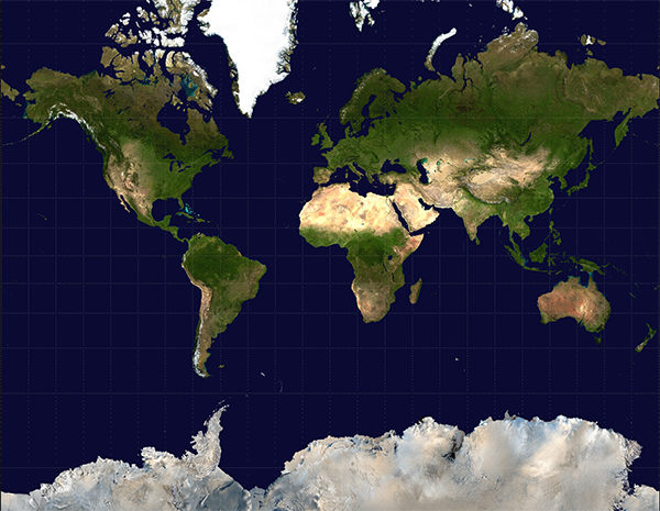
There are numerous different map projections, which render areas of the Earth onto a flat map with varying types and amounts of distortion. In all of these projections, some trade off must be made between the different goals of preservation of distances (i.e. a constant distance scale), preservation of directions (e.g. north is always up, east is always to the right), preservation of shapes (geographical regions look the same shape as they do when viewed from the air or a satellite), and preservation of areas (geographical regions of the same area appear the same area on the map). The familiar Mercator projection preserves directions at the expense of all the others, and is infamous for its large distortions of area between the polar and equatorial regions.
The area distortion is apparent when you consider that Africa has an area of 30.4 million square kilometres, while North America, including Central American, the Caribbean islands, the northern Canadian islands, and Greenland, is only 24.7 million square kilometres. On a Mercator map, Greenland all by itself looks larger than Africa, but it is in reality less than a third the size of Australia.
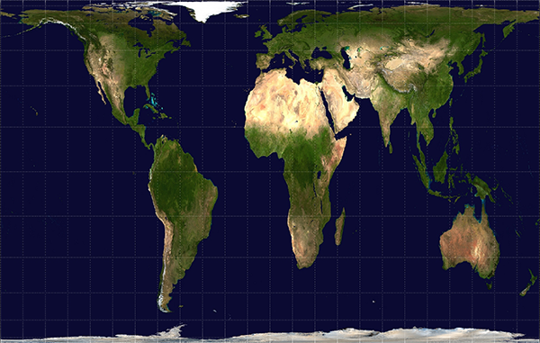
There are projections which give a better impression of the relative areas, but these necessarily distort shapes and distances. The Gall-Peters projection also maps lines of latitude and longitude to straight lines like Mercator, but preserves areas.
Both of these projections have the disadvantage that distortion becomes extreme at the poles. In the Gall-Peters projection, the North and South Poles are mapped to horizontal lines spanning the width of the map, rather than to points. The Mercator projection cannot even show the poles at all, because the projection puts them at infinity.
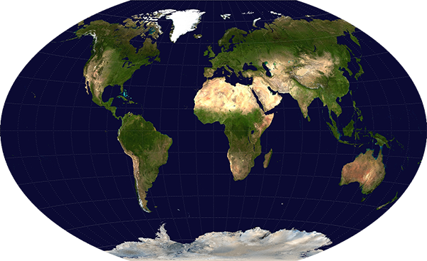
A map specifically designed to compromise between all the various distortions is the Winkel tripel projection. This projection was adopted by the National Geographic Society as its standard world map projection in 1998 (replacing the Robinson projection, a similar compromise projection), and many textbooks and educational materials now use it.
In the Winkel tripel projection, the lines of latitude and longitude are both curved, indicating that directions and shapes are not preserved faithfully. Areas are also distorted somewhat – Greenland looks almost the same size as Australia, even though it is less than a third the area. But all of the different distortions are moderate compared to the more extreme distortions visible in some of these features in other projections.
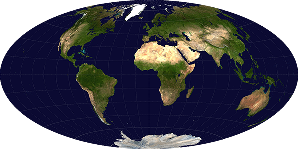
The Hammer projection goes further in rectifying the distance distortion issues with the polar regions, by mapping the North and South Poles to single points, as they are on Earth. However, this distorts the shapes of areas near the poles and away from the central meridian even more.
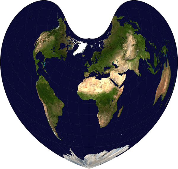
If you want to minimise distortions in a sort of T-shaped area encompassing, say, the Old World continents of Europe, Asia, and Africa, then you can do a bit better by adopting the Bonne projection. This maps a chosen so-called “standard” parallel of latitude to a circular arc, which reduces distortion along that parallel (since in reality parallels of latitude are circles, not straight lines).
Minimising distortions along the straight central meridian and a parallel in the northern hemisphere naturally increases distortions in the southern hemisphere, making this a good choice for Old World maps, which it has been used for extensively, but pretty bad for South America and Oceania.
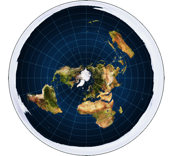
Oddly enough, we’re now not so far from the standard map advocated by most Flat Earthers. If you map all the parallels of latitude to complete circles (rather than partial circular arcs as in the Bonne projection), increasing in radius by a constant amount per degree of latitude, you end up with an azimuthal equidistant projection, centred on the North Pole.
The result is that the northern hemisphere is moderately distorted, but the distortion grows extreme in the south, and the South Pole is mapped to a large circle encircling the whole map. This map projection is good for showing directions relative to the central point (so a variant centred on Mecca is useful for Muslims who wish to know which direction to face during prayer). It’s not a good projection for much else though, because of the severe distance, shape, direction, and area distortions in the southern hemisphere. If you were plotting a trip from Australia to South America, it would be utterly useless.
If the Earth were in fact flat, then it would be possible—indeed trivial—to construct flat maps which accurately show the shapes and distances over large areas of the Earth’s surface at a constant scale. No such maps exist. And the fact that cartographers have struggled for centuries to make flat maps of the world, trading off various compromises with arguable degrees of success, is evidence that it’s not possible, and that the Earth is a globe.
While I like the field of map projections (my personal favourite projection is one which is shape- and area-preserving, but discontinuous everywhere: https://www.win.tue.nl/~vanwijk/myriahedral/), I think as a refutation of a flat earth, it would have been better with an exploration of the history of map making. For Ptolemy or Beatus, the shape of the Earth was not relevant, their maps showing only very rough spatial relationships compared to modern maps. Only as ocean-crossing seafaring based on compass bearings and large-scale surveillance of land based on trigonometry became common, it became necessary to account for the spherical shape of the earth.
We’re now straying towards one of my favourite proofs for the spherical Earth – airline time tables. Looking at the “flat earth” projection, a flight from London to LA should be around the same distance as from Brisbane to Perth, and therefore flight times should be similar. The reality is somewhat different…
Unfortunately, an azimuthal projection centred on Mecca isn’t very helpful for Muslims who wish to face Mecca to pray. What it shows is not the direction to Mecca from each place, but the direction to each place from Mecca; the one is not easy to calculate from the other.
Map projections have been devised (called “retroazimuthal” projections) that perform that function. The first, Craig’s projection, was centred on Mecca for that purpose. See Lem Bugayevskiy and John Snyder, “Map Projections: a Reference Manual” (Taylor & Francis, 1995) p.133.