38. Lunar temperature modulation

Let’s start with a graph.

Latitude averaged temperature anomalies versus date

Graph of latitude averaged temperature anomalies (in degrees Celsius), from 1 April 1986 to 31 March 1987. (Figure reproduced from [1].)

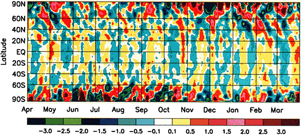
This graph shows temperature anomalies on Earth – that is, the difference between the recorded temperature on any given day and the average temperature for the same location on that day over many years. Yellow-red colours indicate the actual temperature was warmer than average, blue-green colours indicate the temperature was cooler than average. The results are averaged across latitudes, so each point on the graph shows the average anomaly for the entire circle of latitude. The data are Goddard Television Infrared Observation Satellite Operational Vertical Sounder surface air temperature readings from NOAA polar weather satellites.

As you might expect, the temperature across Earth varies a bit. Some days are a bit warmer than average and some a bit cooler than average. You might imagine that with all of the different effects that go into the complicated atmospherical systems that control our weather, days would be cooler or warmer than average pretty much at random.

However that’s not what we’re seeing here. There’s a pattern to the anomalies. Firstly, the anomalies in the polar regions are larger (red and dark blue) than the anomalies in the mid-latitudes and tropic (yellow and light blue). Secondly, there are hints of almost regular vertical stripes in the graph – alternating bands of yellow and blue in the middle, and alternating red and dark blue near the poles. If you look at the graph carefully, you may be able to pick out a pattern of higher and lower temperatures, with a period a little bit less than one month.

What could have an effect on the Earth’s climate with a period a little under a month? The answer is, somewhat astonishingly, the moon.

The creators of this graph took the latitude-averaged temperature anomaly data for the 20 years from 1979 to 1998, and plotted it as a function of the phase of the moon:

Latitude averaged temperature anomalies versus lunar phase

Graph of latitude averaged temperature anomalies (in degrees Celsius), from 1979 to 1998, plotted against phase of the moon. (a) annual average, (b) October-March (northern winter), (c) April-September (northern summer). (Figure reproduced from [1].)

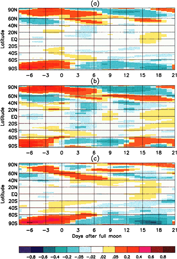
These graphs show that the temperature anomalies have a clear relationship to the phase of the moon. In the polar regions, the temperature anomaly is strongly positive around the full moon, and negative around the new moon. In the mid-latitudes and tropics the trend is not so strong, but the anomalies tend to be lower around the full moon and positive around the new moon – the opposite of the polar regions.

What on Earth is going on here?

Aggregated measurements show that the polar latitudes of Earth are systematically around 0.55 degrees Celsius warmer at the full moon than at the new moon. This effect is strong enough that it dominates over the weaker reverse effect of the mid-latitudes/tropics anomaly. The average temperature of the Earth across all latitudes is not constant – it varies with the phase of the moon, dominated by the polar anomalies, being 0.02 degrees Celsius warmer at the full moon than the new moon. That doesn’t sound like a lot, but the signal is consistently there over all sub-periods in the 20-year data, and it is highly statistically significant.

The next puzzle is: What could possibly cause the Earth’s average temperature to vary with the phase of the moon?

Well, the full moon is bright, whereas the new moon is dark. Could the moonlight be warming the Earth measurably? Physicist and climate scientist Robert S. Knox has done the calculations. It turns out that the additional visible and thermal radiation the Earth receives from the full moon is only enough to warm the Earth by 0.0007 degrees Celsius, nowhere near enough to account for the observed difference[2].

There’s another effect of the moon’s regular orbit around the Earth. According to Newton’s law of gravity, strictly speaking the moon does not move in an orbit around the centre of the Earth. Two massive bodies in an orbital relationship actually each orbit around the centre of mass of the system, known as the barycentre. When one body is much more massive than the other, for example an artificial satellite orbiting the Earth, the motion of the larger body is very small. But our moon is over 1% of the mass of the Earth, so the barycentre of the system is over 1% of the distance from the centre of the Earth to the centre of the moon.

It turns out the Earth-moon barycentre is 4670 km from the centre of the Earth. This is still inside the Earth, but almost 3/4 of the way to the surface.

Animation of lunar orbit

Animation showing the relative positions of the Earth and moon during the lunar orbital cycle. The red cross is the barycentre of the Earth-moon system, and both bodies orbit around it. Diagram is not to scale: relative to the Earth the moon is actually a bit larger than that (1/4 the diameter), and much further away (30× the Earth’s diameter). (Public domain image from Wikimedia Commons.)

The result of this is that during a full moon, when the moon is farthest from the sun, the Earth is 4670 km closer to the sun than average, whereas during a new moon the Earth is 4670 km further away from the sun than average. The Earth oscillates over 9000 km towards and away from the sun every month. And the increase in incident radiation from the sun during the phases around the full moon comes to about 43 mW per square metre, or an extra 5450 GW over the entire Earth. The Earth normally receives nearly 44 million GW of solar radiation, so the difference is relatively small, but it’s enough to heat the Earth by almost 0.01 degrees Celsius, which is near the observed average monthly temperature variation.

Why are the polar regions so strongly affected by this lunar cycle, while the tropics are weakly affected, and even show an opposing trend? Earth’s weather systems are complex and involve transport of heat across the globe by moving air masses. The burst of heat at the poles during a full moon actually migrates towards lower latitudes over several days – you can see the trend in the slope of the warm parts of the graph. The exact details of the physical mechanisms for these observations are still under discussion by the experts. What is clear though is that there is a definite cycle in the Earth’s average temperature with a period equal to the orbit of the moon, and it is most likely driven by the fact that the Earth is closer to the sun during a full moon.

How might one possibly explain this in a flat Earth model? Well, the “orbital” mechanics are completely different. The phase of the moon should have no effect on the distance of the Earth to the sun. The only moderately sensible idea might be that the full moon emits enough extra radiation to warm up the Earth. But the observations of the moon’s radiant energy and the amount of heating it can supply end up the same as the round Earth case (if you believe the same laws of thermodynamics). The full moon simply doesn’t supply anywhere near enough extra heat to the flat Earth to account for the observations.

One could posit that the sun varies in altitude above the flat Earth, coincidentally with the same period as the moon, thus providing additional heating during the full moon. However one of the main modifications to the geometry of the Earth-sun system made in flat Earth models is to fix the sun at a given distance (usually a few thousand kilometres) above the surface of the Earth, in an attempt to explain various geometrical properties such as the angle of the sun as seen from different latitudes. Letting the sun move up and down would mess up the geometry, and should easily be observable from the surface of the flat Earth.

So, observations of the global average temperature, and its periodic variation with the phase of the moon provides another proof that the Earth is a globe.

References:

[1] Anyamba, E.K., Susskind, J. “Evidence of lunar phase influence on global surface air temperature”. Geophysical Research Letters, 27(18), p.2969-2972, 2000. https://doi.org/10.1029/2000GL011651

[2] Knox, R.S. “Physical aspects of the greenhouse effect and global warming”. American Journal of Physics, 67(12), p.1227-1238, 1999. https://doi.org/10.1119/1.19109

34. Earth’s internal heat

Opening disclaimer: I’m going to be talking about “heat” a lot in this one. Formally, “heat” is defined as a process of energy flow, and not as an amount of thermal energy in a body. However to people who aren’t experts in thermodynamics (i.e. nearly everyone), “heat” is commonly understood as an “amount of hotness” or “amount of thermal energy”. To avoid the linguistic awkwardness of using the five-syllable phrase “thermal energy” in every single instance, I’m just going to use this colloquial meaning of “heat”. Even some of the papers I cite use “heat” in this colloquial sense. I’ve already done it in the title, which to be technically correct should be the more awkward and less pithy “Earth’s internal thermal energy”.

The interior of the Earth is hot. Miners know first hand that as you go deeper into the Earth, the temperature increases. The deepest mine on Earth is the TauTona gold mine in South Africa, reaching 3.9 kilometres below sea level. At this depth, the rock temperature is 60°C, and considerable cooling technology is required to bring the air temperature down to a level where the miners can survive. The Kola Superdeep Borehole in Russia reached a depth of 12.2 km, where it found the temperature to be 180°C.

Lava, Hawaii

Lava—molten rock—emerging from the Earth in Hawaii. (Public domain image by the United States Geological Survey, from Wikimedia Commons.)

Deeper in the Earth, the temperature gets hot enough to melt rock. The results are visible in the lava that emerges from volcanic eruptions. How did the interior of the Earth get that hot? And exactly how hot is it down there?

For many years, geologists have been measuring the amount of thermal energy flowing out of the Earth, at thousands of measuring stations across the planet. A 2013 paper analyses some 38,374 heat flow measurements across the globe to produce a map of the mean heat flow out of the Earth, shown below[1]:

Mean heat flow out of the Earth

Mean heat flow out of the Earth in milliwatts per square metre, as a function of location. (Figure reproduced from [1].)

From the map, you can see that most of Earth’s heat emerges at the mid-ocean ridges, deep underwater. This makes sense, as this is where rising plumes of magma from deep within the mantle are acting to bring new rock material to the crust. The coolest areas are generally geologically stable regions in the middle of tectonic plates.

Hydrothermal vent

Subterranean material (and heat) emerging from a hydrothermal vent on Eifuku Seamount, Marianas Trench Marine National Monument. (Public domain image by the United States National Oceanic and Atmospheric Administration, from Wikimedia Commons.)

Although the heat flow out of the Earth’s surface is of the order of milliwatts per square metre, the surface has a lot of square metres. The overall heat flow out of the Earth comes to a total of around 47 terawatts[2]. In contrast, the sun emits close to 4×10¹⁴ terawatts of energy in total, and the solar energy falling on the Earth’s surface is 1360 watts per square metre, over 10,000 times as much as the heat energy leaking out of the Earth itself. So the sun dominates Earth’s heating and weather systems by roughly that factor.

So the Earth generates some 47 TW of thermal power. Where does this huge amount of energy come from? To answer that, we need to go all the way back to when the Earth was formed, some 4.5 billion years ago.

Our sun formed from the gaseous and dusty material distributed throughout the Galaxy. This material is not distributed evenly, and where there is a denser concentration, gravity acts to draw in more material. As the material is pulled in, any small motions are amplified into an overall rotation. The result is an accretion disc, with matter spiralling into a growing mass at the centre. When the central concentration accumulates enough mass, the pressure ignites nuclear reactions and a star is born. Some of the leftover material continues to orbit the new star and forms smaller accretions that eventually become planets or smaller bodies.

The process of accreting matter generates thermal energy. Gravitational potential energy reduces as matter pulls closer together, and the resulting collisions between matter particles convert it into thermal energy, heating up the accumulating mass. Our Earth was born hot. As the matter settled into a solid body, the shrinking further heated the core through the Kelvin-Helmholtz mechanism. The total heat energy from the initial formation of the Earth dissipates only very slowly into space, and that process is still going on today, 4.5 billion years later.

It’s not known precisely how much of this primordial heat is left in Earth or how much flows out, but various different studies suggest it is somewhere in the range of 12-30 TW, roughly a quarter to two-thirds of Earth’s total measured heat flux[3]. So that’s not the only source of the heat energy flowing out of the Earth.

The other source of Earth’s internal heat is radioactive decay. Some of the matter in the primordial gas and dust cloud that formed the sun and planets was produced in the supernova explosions of previous generations of stars. These explosions produce atoms of radioactively unstable isotopes. Many of these decay relatively rapidly and are essentially gone by now. But some isotopes have very long half-lives, most importantly: potassium-40 (1.25 billion years), thorium-232 (14.05 billion years), uranium-235 (703.8 million years), and uranium-238 (4.47 billion years). These isotopes still exist in significant quantities inside the Earth, where they continue to decay, releasing energy.

We have a way of probing how much radioactive energy is released inside the Earth. The decay reactions produce neutrinos (which we’ve met before), and because they travel unhindered through the Earth these can be detected by neutrino observatories. These geoneutrinos have energy ranges that distinguish them from cosmic neutrino sources, and of course always emerge from underground. The observed decay rates from geoneutrinos correspond to a total radiothermal energy production of 10-30 TW, of the same order as the primordial heat flux. (The neutrinos themselves also carry away part of the energy from the radioactive decays, roughly 5 TW, but this is an additional component not deposited as thermal energy inside the Earth.)

Mean heat flow out of the Earth

Approximate radiothermal energy generated within the Earth, plotted as a function of time, from the formation of the Earth 4.5 billion years ago, to the present. The four main isotopes are plotted separately, and the total is shown as the dashed line. (Public domain figure adapted from data in [4], from Wikimedia Commons.)

To within the uncertainties, the sum of the estimated primordial and measured radiothermal energy fluxes is equal to the total measured 47 TW flux. So that’s good.

Once you know how much heat is being generated inside the Earth, you can start to apply heat transfer equations, knowing the thermodynamic properties of rock and iron, how much conduction and convection can be expected, and cross-referencing it with our knowledge of the physical state of these materials under different temperature and pressure conditions. There’s also additional information about the internal structure of the Earth that we get from seismology, but that’s a story for a future article. Putting it all together, you end up with a linked series of equations which you can solve to determine the temperature profile of the Earth as a function of depth.

Mean heat flow out of the Earth

Temperature profile of the Earth’s interior, from the surface (left) to the centre of the core (right). Temperature units are not marked on the vertical axis, but the temperature of the surface (bottom left corner) is approximately 300 K, and the inner core (IC, right) is around 7000 K. UM is upper mantle, LM lower mantle, OC outer core. The calculated temperature profile is the solid line. The two solid dots are fixed points constrained by known phase transitions of rock and iron – the slopes of the curves between them are governed by the thermodynamic equations. The dashed lines are various components of the constraining equations. (Figure reproduced from [5].)

The results are all self-consistent, with observations such as the temperature of the rock in deep mine shafts and the rate of detection of geoneutrinos, with structural constraints provided by seismology, and with the temperature constraints and known modes of heat flow from the core to the surface of the Earth.

That is, they’re all consistent assuming the Earth is a spherical body of rock and iron. If the Earth were flat, the thermal transport equations would need to be changed to reflect the different geometry. As a first approximation, assume the flat Earth is relatively thin (i.e. a cylinder with the radius larger than the height). We still measure the same amount of heat flux emerging from the Earth’s surface, so the same amount of heat has to be either (a) generated inside it, or (b) being input from some external energy source underneath the flat Earth. However geoneutrino energy ranges indicate that they come from radioactive decay of Earthly minerals, so it makes sense to conclude that radiothermal heating is significant.

If radioactive decay is producing heat within the bulk of the flat Earth, then half of the produced neutrinos will emerge from the underside, and thus be undetectable. So the total heat production should be double that deduced from neutrino observations, or somewhere in the range 20-60 TW. To produce twice the energy, you need twice the mass of the Earth. If the flat Earth is a disc with radius 20,000 km (the distance from the North Pole to the South Pole), then to have the same volume as the spherical Earth it would need to be 859 km thick. But we need twice as much mass to produce the observed thermal energy flux, so it should be approximately 1720 km thick. Some fraction of the geoneutrinos will escape from the sides of the cylinder of this thickness, which means we need to add more rock to produce a bit more energy to compensate, so the final result will be a bit thicker.

There’s no obvious reason to suppose that a flat Earth can’t be a bit over 1700 km thick, as opposed to any other thickness. With over twice as much mass as our spherical Earth, the surface gravity of this thermodynamically correct flat Earth would be over 2 Gs (i.e. twice the gravity we experience), which is obviously wrong, but then many flat Earth models deny Newton’s law of gravity anyway (because it causes so many problems for the model).

But just as in the spherical Earth model the observed geoneutrino flux only accounts for roughly half the observed surface heat flux. The other half could potentially come from primordial heat left over from the flat Earth’s formation – although as we’ve already seen, what we know about planetary formation precludes the formation of a flat Earth in the first place. The other option is (b) that the missing half of the energy is coming from some source underneath the flat Earth, heating it like a hotplate. What this source of extra energy is is mysterious. No flat Earth model that I’ve seen addresses this problem, let alone proposes a solution.

What’s more, if such a source of energy under the flat Earth existed, then it would most likely also radiate into space around the edges of the flat Earth, and have observable effects on the objects in the sky above us. What we’re left with, if we trust the sciences of radioactive decay and thermal energy transfer, is a strong constraint on the thickness of the flat Earth, plus a mysterious unspecified energy source underneath – neither of which are mentioned in standard flat Earth models.

References:

[1] Davies, J. H. “Global map of solid Earth surface heat flow”. Geochemistry, Geophysics, Geosystems, 14(10), p.4608-4622, 2013. https://doi.org/10.1002/ggge.20271

[2] Davies, J.H., Davies, D.R. “Earth’s surface heat flux”. Solid Earth, 1(1), p.5-24, 2010. https://doi.org/10.5194/se-1-5-2010

[3] Dye, S.T. “Geoneutrinos and the radioactive power of the Earth”. Reviews of Geophysics, 50(3), 2012. https://doi.org/10.1029/2012RG000400

[4] Arevalo Jr, R., McDonough, W.F., Luong, M. “The K/U ratio of the silicate Earth: Insights into mantle composition, structure and thermal evolution”. Earth and Planetary Science Letters, 278(3-4), p.361-369, 2009. https://doi.org/10.1016/j.epsl.2008.12.023

[5] Boehler, R. “Melting temperature of the Earth’s mantle and core: Earth’s thermal structure”. Annual Review of Earth and Planetary Sciences, 24(1), p.15-40, 1996. https://doi.org/10.1146/annurev.earth.24.1.15

31. Earth’s atmosphere

Earth’s atmosphere is held on by gravity, pulling it towards the centre of the planet. This means the air can move sideways around the planet in a relatively unrestricted manner, creating wind and weather systems, but it has trouble flying upwards into space.

It is possible for a planet’s atmosphere to leak away into space, if the gravity is too weak to hold it. Planets have an escape velocity, which is the speed at which an object fired directly upwards must have in order for it to fly off into space, rather than slow down and fall back down. For Earth, this escape velocity is 11.2 km/s. Almost nothing on Earth goes this fast – but there are some things that do. Gas molecules.

Air is made up of a mixture of molecules of different gases. The majority, around 78%, is nitrogen molecules, made of two atoms of nitrogen bonded together, followed by 21% oxygen molecules, similarly composed of two bonded oxygen atoms. Almost 1% is argon, which is a noble gas, its atoms going around as unbonded singletons. Then there are traces of carbon dioxide, helium, neon, methane, and a few others. On top of these is a variable amount of water vapour, which depending on local weather conditions can range from almost zero to around 3% of the total.

Gas is the state of matter in which the component atoms and molecules are separated and free to move mostly independently of one another, except for when they collide. This contrasts with a solid, in which the atoms are rigidly connected, a liquid, in which the atoms are in close proximity but able to flow and move past one another, and a plasma, in which the atoms are ionised and surrounded by a freely moving electrically charged cloud of electrons. The deciding factors on which state a material exists in are temperature and pressure.

Diagram of gas

Diagram of a gas. The gas particles are free to move anywhere and travel at high speeds.

Temperature is a measurable quantity related to the amount of thermal energy in an object. This is the form of energy which exists in the individual motion of atoms and molecules. In a solid, the atoms are vibrating slightly. As they increase in thermal energy they vibrate faster, until the energy breaks the bonds holding them together, and they form molecules and start to flow, becoming a liquid. As the temperature rises and more thermal energy is added, the molecules begin to fly off the mass of liquid completely, dispersing as a gas. And if more energy is added, it eventually strips the outer electrons off the atoms, ionising the gas into a plasma.

The speed at which molecules move in a gas is determined by the relationship between temperature and the kinetic energy of the molecules. The equipartition theorem of thermodynamics says that the average kinetic energy of molecules in a gas is equal to (3/2)kT, where T is the temperature and k is the Boltzmann constant. If T is measured in kelvins, the Boltzmann constant is about 1.38×10⁻²³ joules per kelvin. So the kinetic energy of the molecules depends linearly on the temperature, but kinetic energy equals (1/2)mv2, where m is the mass of a molecule and v is the velocity. So the average speed of a gas molecule is then √(3kT/m). This means that more massive molecules move more slowly.

For example, here are the molecular masses of some gases and the average speed of the molecules at room temperature:

Gas Molecular mass (g/mol) Average speed (m/s)
Hydrogen (H2) 2.016 1920
Helium 4.003 1362
Water vapour (H2O) 18.015 642
Neon 20.180 607
Nitrogen (N2) 28.014 515
Oxygen (O2) 32.000 482
Argon 39.948 431
Carbon dioxide (CO2) 44.010 411

Remember that these are the average speeds of the gas molecules. The speeds actually vary according to a statistical distribution known as the Maxwell-Boltzmann distribution. Most molecules have speeds around the average, but there are some with lower speeds all the way down to zero, and some with higher speeds. At the upper end, the speed distribution is not limited (except by the speed of light), although very few molecules have speeds more than 2 or 3 times the average.

Maxwell-Boltzmann distribution

Maxwell-Boltzmann distribution for helium, neon, argon, and xenon at room temperature. Although the average speed for helium atoms is 1362 m/s, a significant number of atoms have speeds well above 2500 m/s. For the heavier gases, the number of atoms moving this fast is extremely close to zero. (Public domain image from Wikimedia Commons.)

These speeds are low enough that essentially all the gas molecules are gravitationally bound to Earth. At least in the lower atmosphere. As you go higher the air rapidly gets thinner—because gravity is pulling it down to the surface—but the pressure means it can’t all just pile up on the surface, so it spreads ever thinly upwards. The pressure drops exponentially with altitude: at 5 km the pressure is half what it is at sea level, at 10 km it’s one quarter, at 15 km one eighth, and so on.

The physics of the atmosphere changes as it moves to higher altitudes and lower pressures. Some 99.998% of the atmosphere by mass is below 85 km altitude. The gas above this altitude, in the thermosphere and exosphere, is so rarefied that it is virtually outer space. Incoming solar radiation heats the gas and it is so thin that heat transport to lower layers is inefficient and slow. Above about 200 km the gas temperature is over 1000 K, although the gas is so thin that virtually no thermal energy is transferred to orbiting objects. At this temperature, molecules of hydrogen have an average speed of 3516 m/s, and helium 2496 m/s, while nitrogen is 943 m/s.

Atmosphere diagram

Diagram of the layers of Earth’s atmosphere, with altitude plotted vertically, and temperature horizontally. The dashed line plots the electron density of the ionosphere, the regions of the atmosphere that are partly ionised by incident solar and cosmic radiation. (Public domain image from Wikimedia Commons.)

While these average speeds are still well below the escape velocity, a small fraction of molecules at the high end of the Maxwell-Boltzmann distribution do have speeds above escape velocity, and if moving in the right direction they fly off into space, never to return to Earth. Our atmosphere leaks hydrogen at a rate of about 3 kg/s, and helium at 50 g/s. The result of this is that any molecular hydrogen in Earth’s atmosphere leaks away rapidly, as does helium.

There is virtually no molecular hydrogen in Earth’s atmosphere. Helium exists at an equilibrium concentration of about 0.0005%, at which the leakage rate is matched by the replacement of helium in the atmosphere produced by alpha decay of radioactive elements. Recall that in alpha decay, an unstable isotope emits an alpha particle, which is the nucleus of a helium atom. Radioactive decay is the only source of helium we have. Decaying isotopes underground can have their alpha particles trapped in petroleum and natural gas traps underground, creating gas reservoirs with up to a few percent helium; this is the source of all helium used by industry. Over the billions of years of Earth’s geological history, it has only built up enough helium to last our civilisation for another decade or two. Any helium that we use and is released to the atmosphere will eventually be lost to space. It will become increasingly important to capture and recycle helium, lest we run out.

Because of the rapid reduction in probabilities for high speeds of the Maxwell-Boltzmann distribution, the leakage rate for nitrogen, oxygen, and heavier gases is much slower. Fortunately for us, these gases leak so slowly from our atmosphere that they take billions of years for any appreciable loss to occur.

This is the case for a spherical Earth. What if the Earth were flat? Well, the atmosphere would spill over the sides and be lost in very quick time. But wait, a common feature of flat Earth models is impassable walls of ice near the Antarctic rim to keep adventurous explorers (and presumably animals) from falling off the edge. Is it possible that such walls could hold the atmosphere in?

If they’re high enough, sure! Near the boundary between the thermosphere and the exosphere, the gas density is extremely low, and most (but not all) of the molecules that make it this high are hydrogen and helium. If the walls were this high, it would stop virtually all of the nitrogen and oxygen from escaping. However, if the walls were much lower, nitrogen and oxygen would start leaking at faster and faster rates. So how high do the walls need to be? Roughly 500-600 kilometres.

That’s well and truly impassable to any explorer using anything less than a spacecraft, so that’s good. But walls of ice 500 km high? We saw when discussing hydrostatic equilibrium that rock has the structural strength to be piled up only around 10 km high before it collapses under its own gravity. The compressive strength of ice, however, is of the order 5-25 megapascals[1][2], about a tenth that of granite.

Compressive strength of ice

Compressive yield (i.e. failure) strength of ice versus confining (applied) pressure, for varying rates of applied strain. The maximum yield strength ranges from around 3 MPa to 25 MPa. (Figure reproduced from [1].)

Ice is also less dense than rock, so a mountain of ice has a lot less mass than a mountain of granite. However, doing the sums shows that an Everest-sized pile of ice would produce a pressure of 30 MPa at its base, meaning it would collapse under its own weight. And that’s more than 50 times shorter than the walls we need to keep the atmosphere in.

So the fact that we can breathe is a consequence of our Earth being spherical. If it were flat, there would be no physically plausible way to keep the atmosphere in. (There are other models, such as the Earth being covered by a fixed firmament, like a roof, to which the stars are affixed, but these have even more physical problems – which will be discussed another day.)

References:

[1] Jones, S. J. “The confined compressive strength of polycrystalline ice”. Journal of Glaciology, 28 (98), p. 171-177, 1982. https://doi.org/10.1017/S0022143000011874

[2] Petrovic, J. J. “Review: Mechanical properties of ice and snow”. Journal of Materials Science, 38, p. 1-6, 2003. https://doi.org/10.1023/A:1021134128038